

Oasis exhibition and Oasis – A Spa Reader by Christiane Peschek
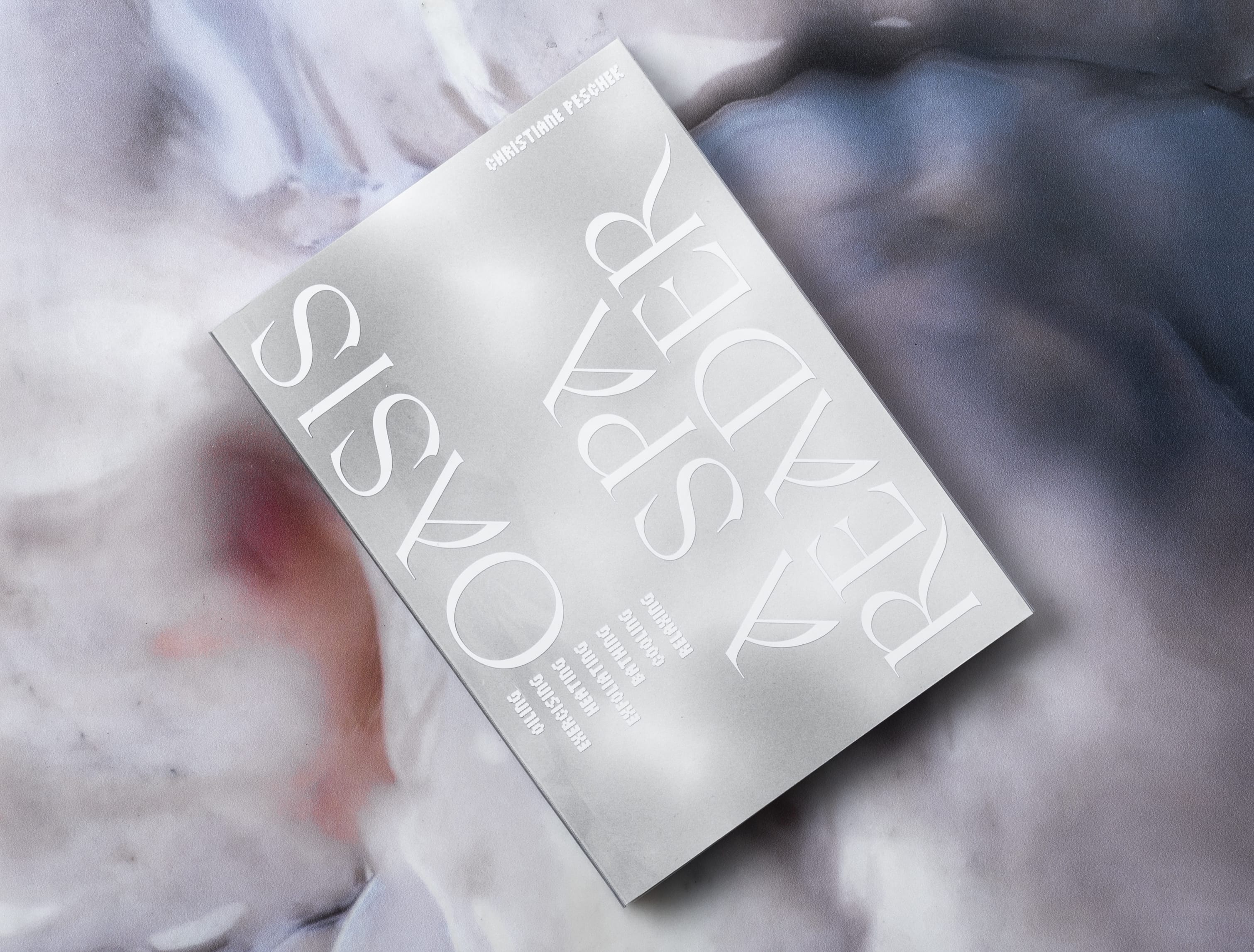
Christiane Peschek’s Oasis gathers seven texts by international theorists, curators, and writers on the topic of queer bathing culture and digital self-care created in dialogue with the artist’s poly-sensual installation.
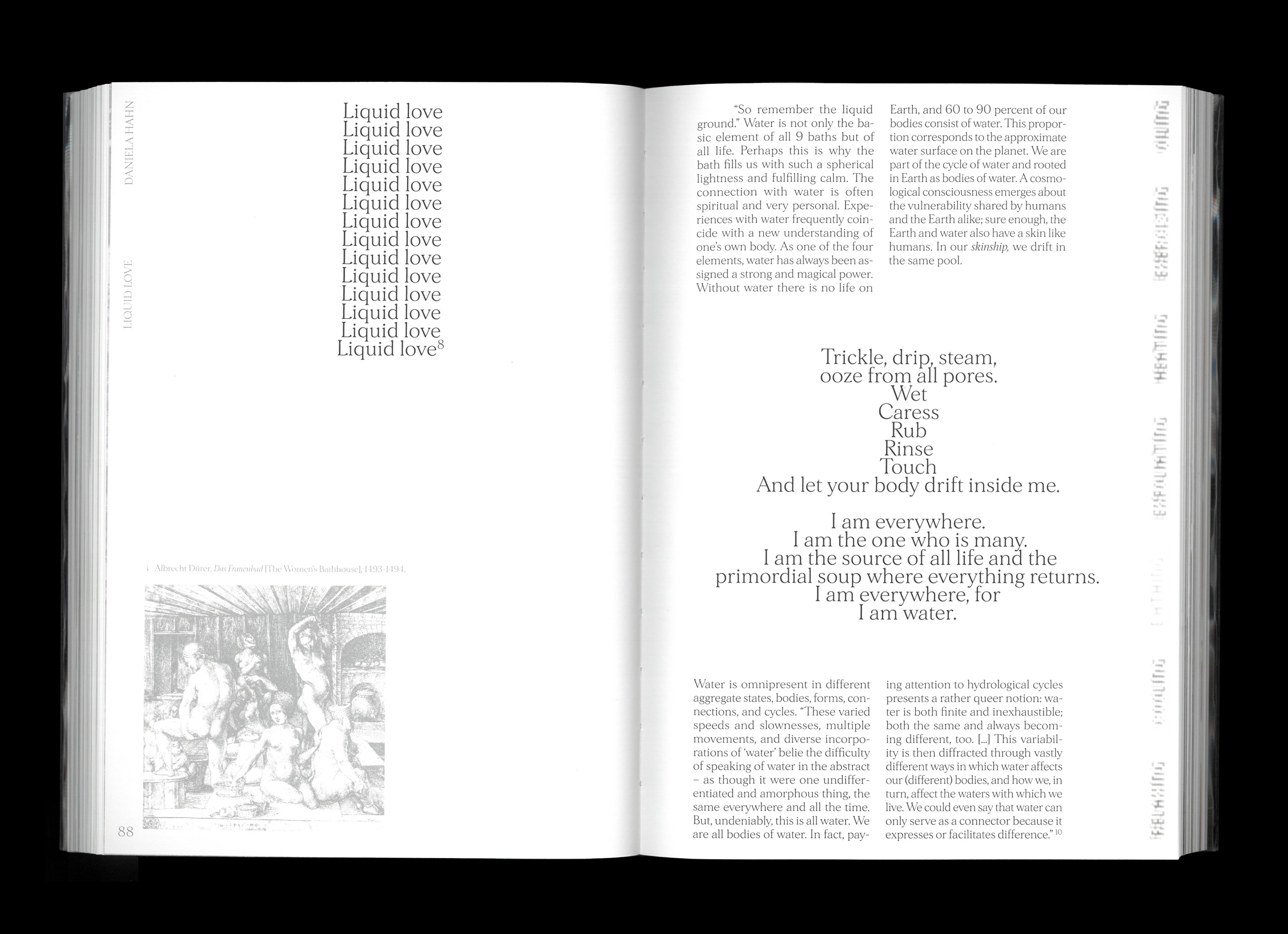
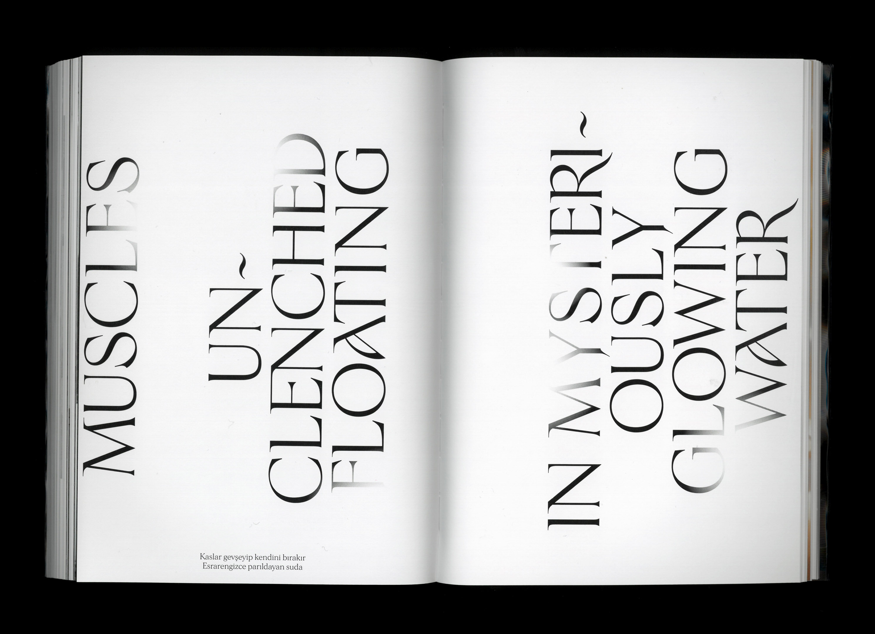
The book was published by Sanatorium, with contributions by Christie Pearson, Seçil Epik, Mohamad Abdouni, Melih Aydemir, Sophie Haslinger, and Elisa Medde. Morion is used as the text typeface, with Sinistre for titles. The jacket additionally features Tiny.
As stated by the designer, Maris Nisu:
The book design of Oasis – The Spa Reader leaves behind the doctrine of functionalism and dismantles the principles of modernist layout. The design ideas are influenced by the feminist theory text ‘Ornament and the feminine’ by Llewellyn Negrin, where she discusses feminine design that emphasis sensuous over rational and pleasurable over serious.
These ideas were transferred into the context of queer bathing culture. As Oasis – The Spa Reader is an abstract sequel to Christiane Peschek’s exhibition, it simulates the exhibition’s experience into a book form. The artwork of Peschek inspires the graphic design of the book. White and grey tones are symbolizing water and salt which are essential elements of our living bodies and were used in her installation. Calm tones are confronted with the colorful digital images of post-human bodies. The graphic interpretation of steam is used as a symbol of censorship in queer bathing culture. The ornamental typeface choice references the sensorial, hedonistic pleasures of the spa. The book is wrapped in a plastic case, which makes it suitable for reading in the humid conditions of the spa.
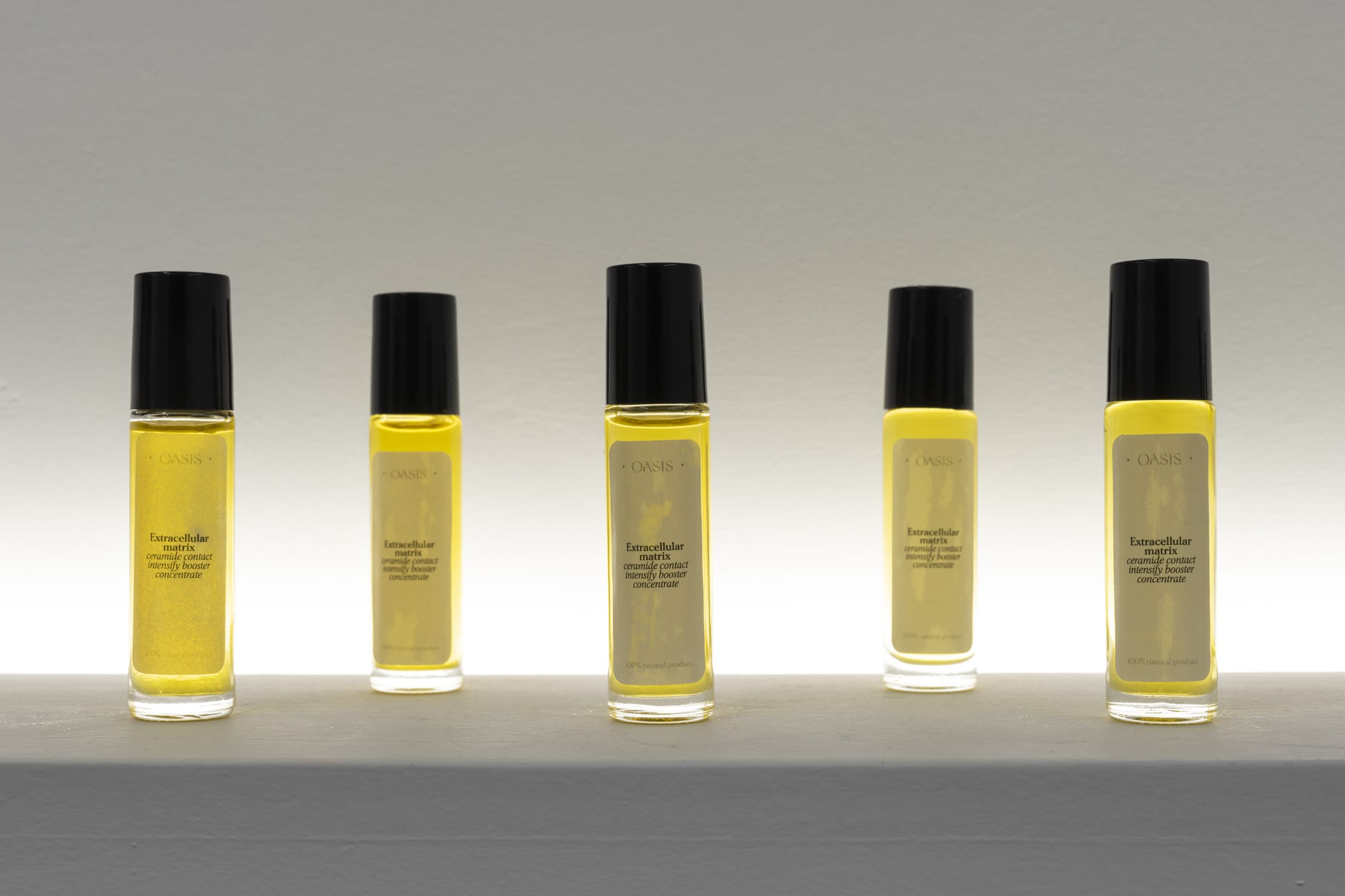
The accompanying exhibition, where the individual works can be seen, includes perfumes, bath salts, and more. All the labels designed for it were printed with Morion.


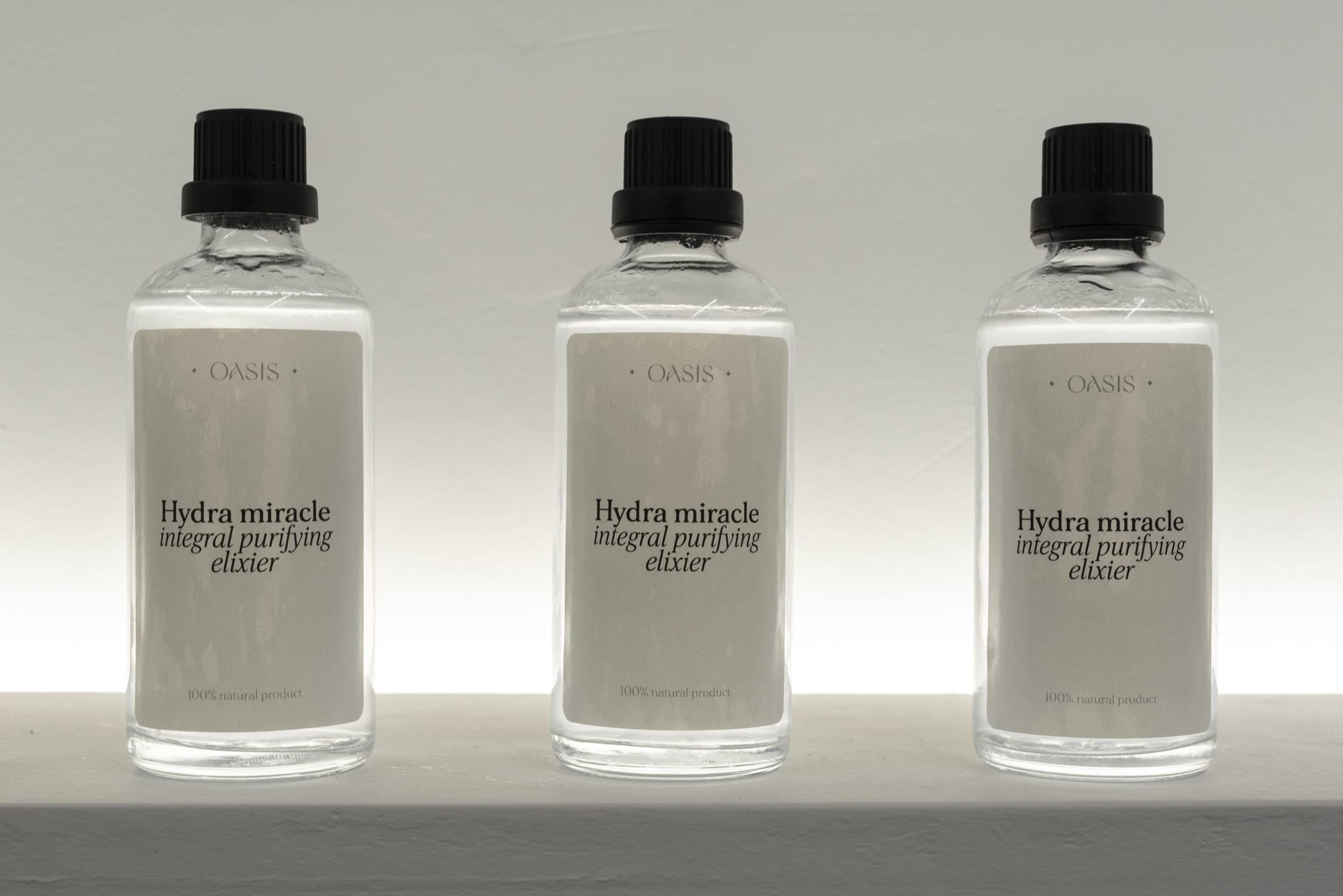


")
