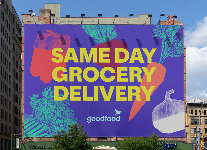
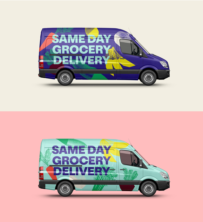
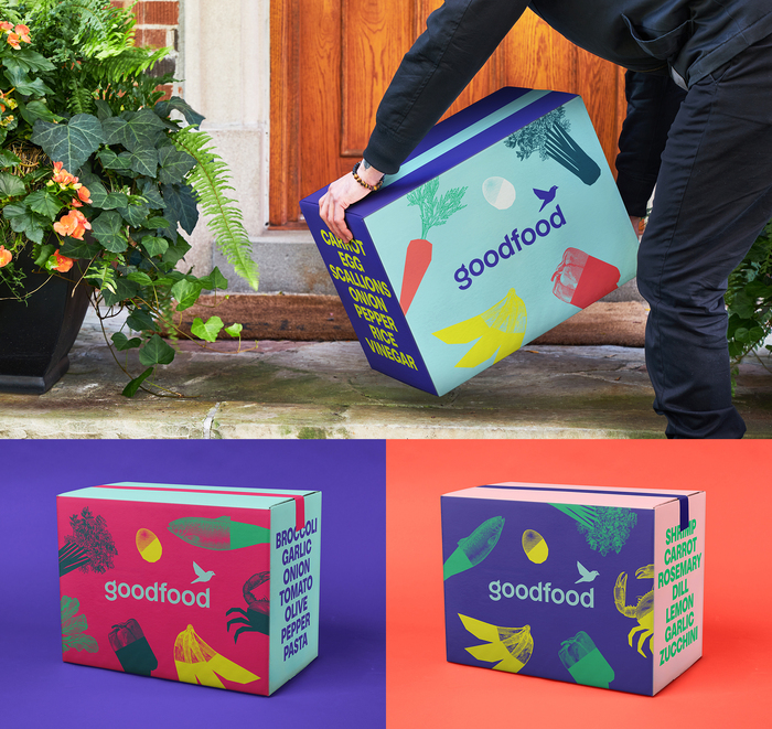
Toronto-based creative agency Quake developed a branding and content system for Goodfood, Canada’s leading meal kit subscription. The delivery vans, boxes, and bags were redesigned to be as tasty and colorful as the food inside. In addition, different versions were created to combat the bias that meal kits didn’t offer variety.
The various brand assets and a modular content system allow Goodfood to easily publish across multiple channels without having to redesign the layout, reset the type or recrop the assets. A grid system was created with images and type retaining their relational sizes to be scaled and used in a “plug and play” manner. The branding system uses a customized version of Oldschool Grotesk developed in collaboration with Quake.

Formats
- Packaging (1495)
- Advertising (1467)
- Branding/Identity (5034)
- Posters/Flyers (3687)
Topics
- Services (894)
- Food/Beverage (2059)
Designers/Agencies
- Quake (1)
Tagged with
- extra bold type (48)
- all caps (4338)
- colorful/multicolored (826)
- custom typefaces (500)
- subscription services (14)
- boxes (257)
- vans (35)
- product brochures (49)
- vegetables (31)
- fruit (68)
- poster series (395)
- one typeface family (1172)


