

ING Talent Award exhibition at the Kunsthal
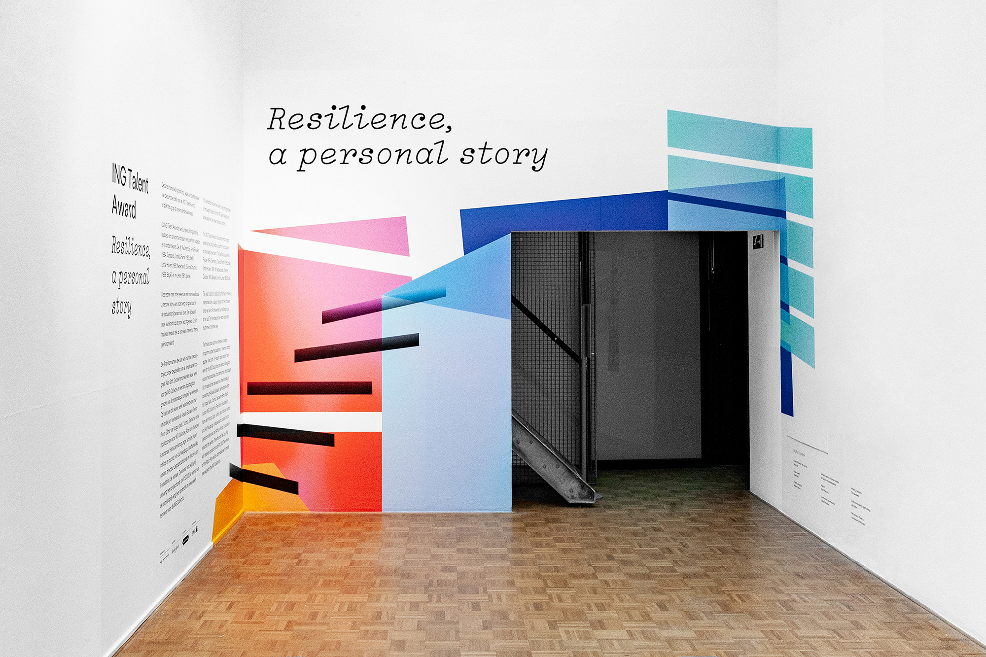
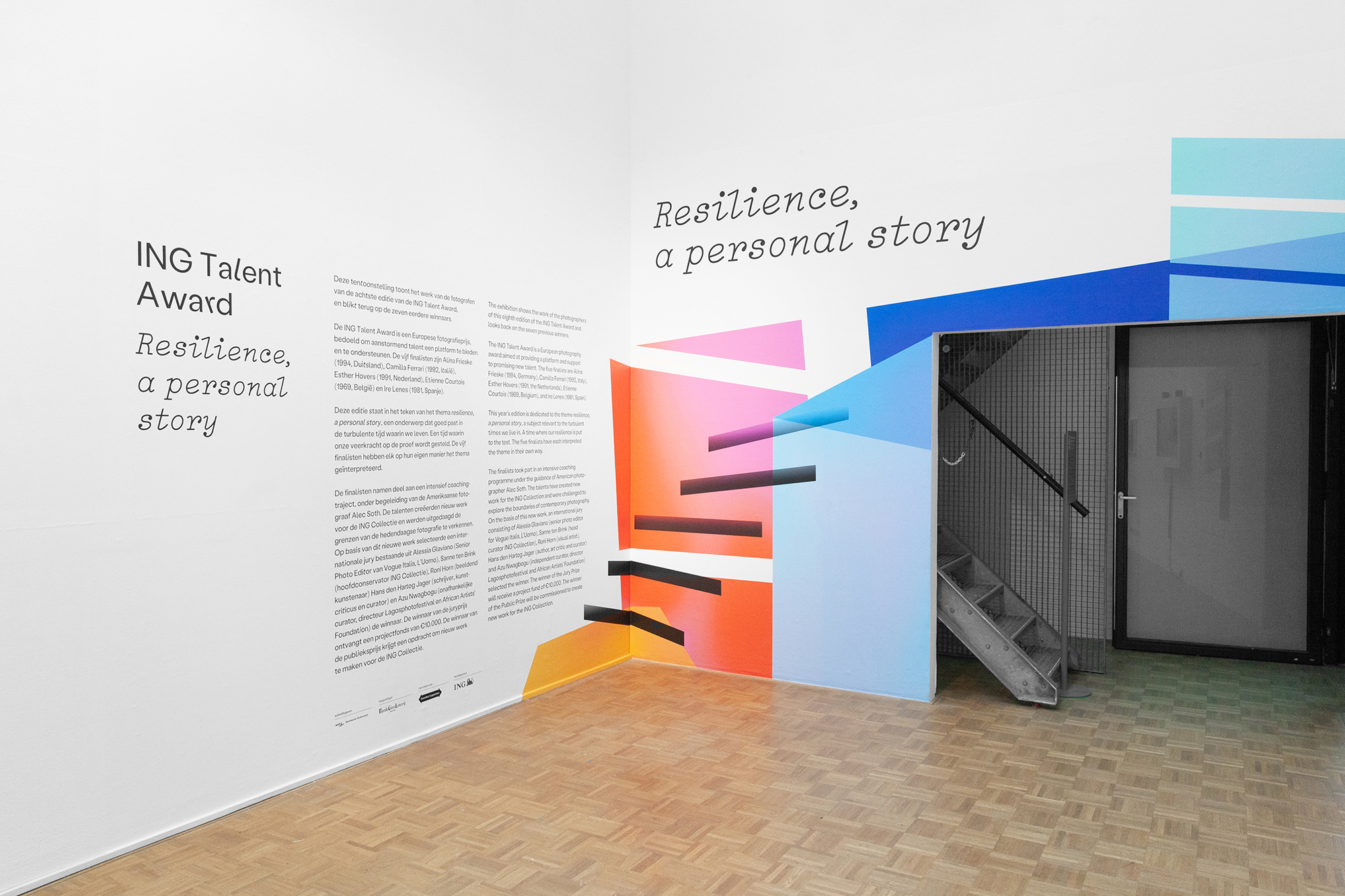
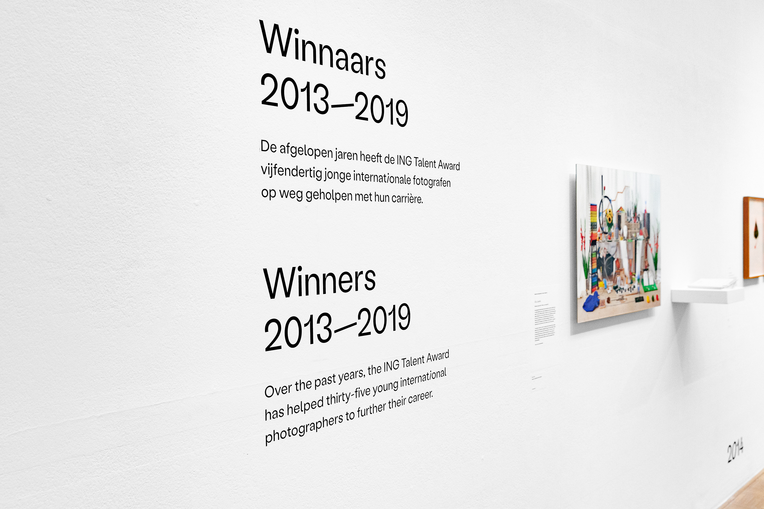
For the presentation of the ING Talent Award finalists at the Kunsthal Rotterdam I created the visual identity that was applied to the walls and guiding texts. The ING Talent Award offers emerging, talented photographers in Europe a platform for showing their own work to an international audience.
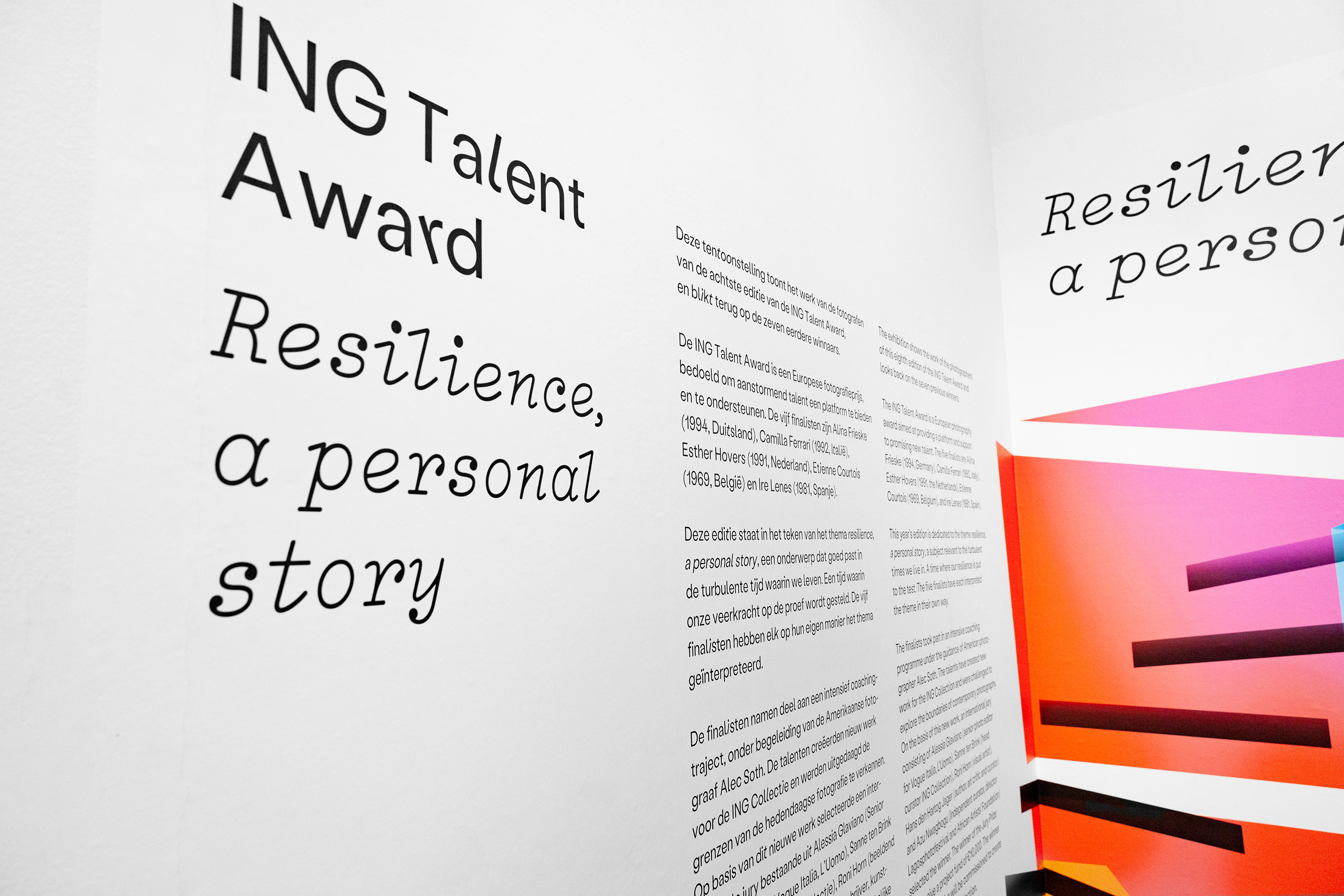
The theme of the exhibition was Resilience, a personal story, which could be interpreted as staying strong in uncertain times. I translated this into typography and form by working with the font Labil Grotesk, making use of its alternative characters, so that a word can suddenly look unstable. It makes the design look sleek, but also playful. To give the identity a personal character I used Lacrima Italic – a serif with the raw characteristics of a typewriter typeface.
As a guideline for colors and shapes, I looked at the work of Andrea Grützner – one of the previous winners. With the shapes I made an abstract spatial design with lines that refers to a staircase – and the colors reflect the positive character of resilience.


")


