Jio logo
Omnes by Darden Studio is the logo typeface of Jio.
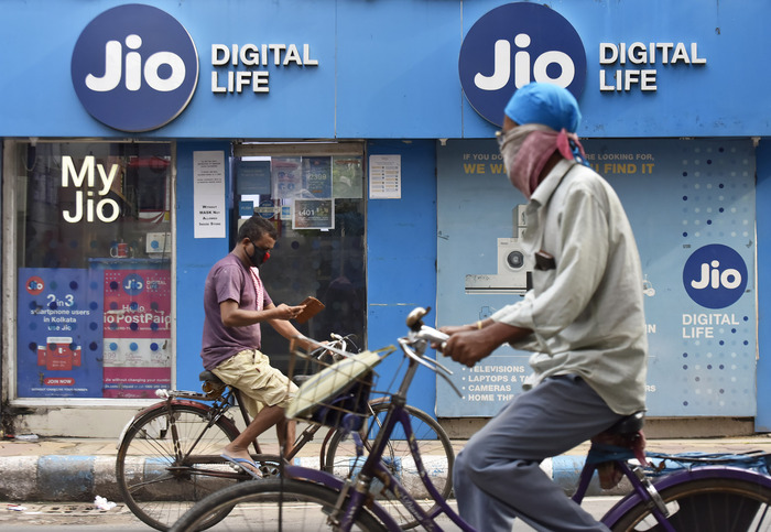
Launched in 2016, Jio is an Indian telecommunications company offering the “world’s largest mobile data network”. While brand company venturethree helped finding the name – Jio is Hindi for “live life” – Studio Schnauze was tasked to develop the corporate identity.
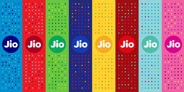
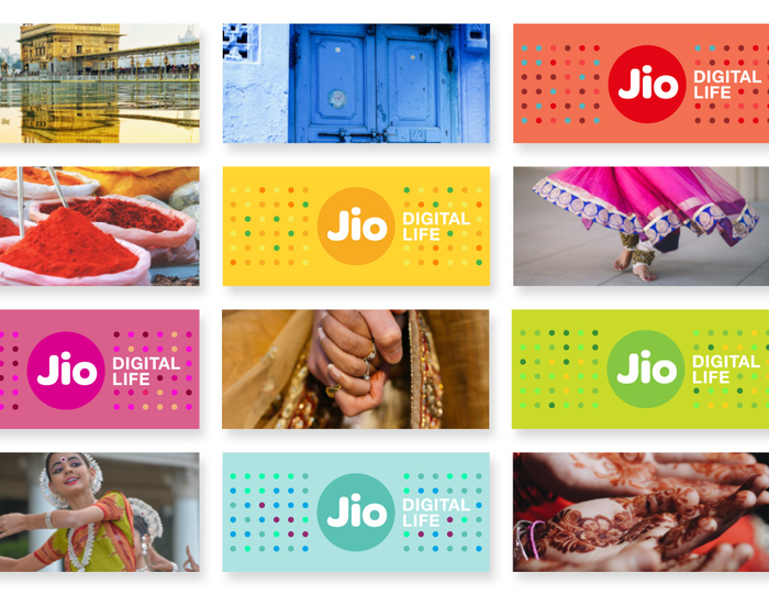
At the core of it is the logo. “Jio” is shown in the Bold weight of Omnes’s standard width. The name is placed in a circle, “the mother of all shapes – deeply rooted in the Indian culture”, according to Studio Schnauze. It comes in eight different colors, “to reflect the vibrancy and colourfulness of India”. The tagline “Digital Life” is added in all-caps Neue Helvetica.
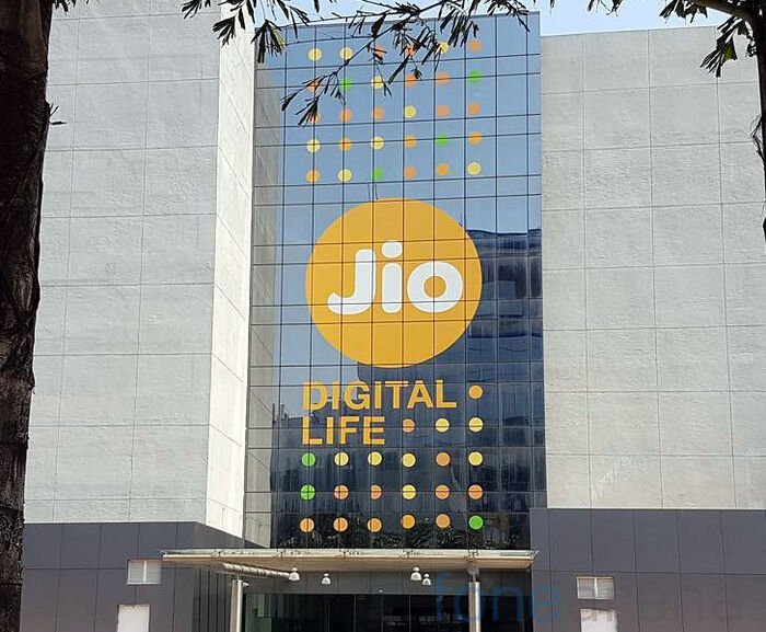
The Jio headquarters in Navi Mumbai, Maharashtra, India

Probably the largest application of Omnes: the Jio logo at Reliance Corporate Park can be seen on Google Maps.
Formats
- Packaging (1590)
- Signs (1530)
- Branding/Identity (5333)
Topics
- Services (952)
- Technology (989)
Designers/Agencies
- Studio Schnauze (1)
- venturethree (1)
- Jio (1)
- Interbrand (5)
Tagged with
- telecommunication (20)
- telecom providers (10)
- tech startups (64)
- identities (1057)
- brands (749)
- logos (3017)
- type in a circle (399)
- reversed type (2271)
- colorful/multicolored (871)
- color variants (60)
- taglines (11)
- dots (78)
- packaging (428)
- shop fronts (294)
- signs (375)
- light box signs (86)
- facades (61)
- parks (34)
- unconventional materials (43)
- XXL type (84)
- high profile (552)
- corporate design (97)
Artwork location
- Germany (2775)
- United Kingdom (2335)
- India (49)
- United States (7004)
- Köln (61)
- Düsseldorf (58)
- London (1305)
- Mumbai (9)
- New York City (1919)

