
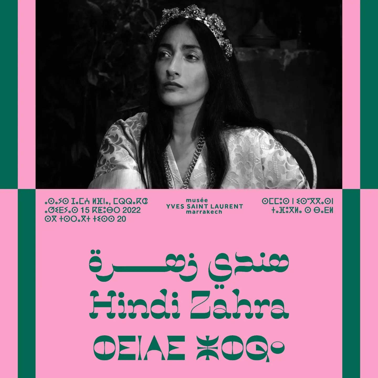
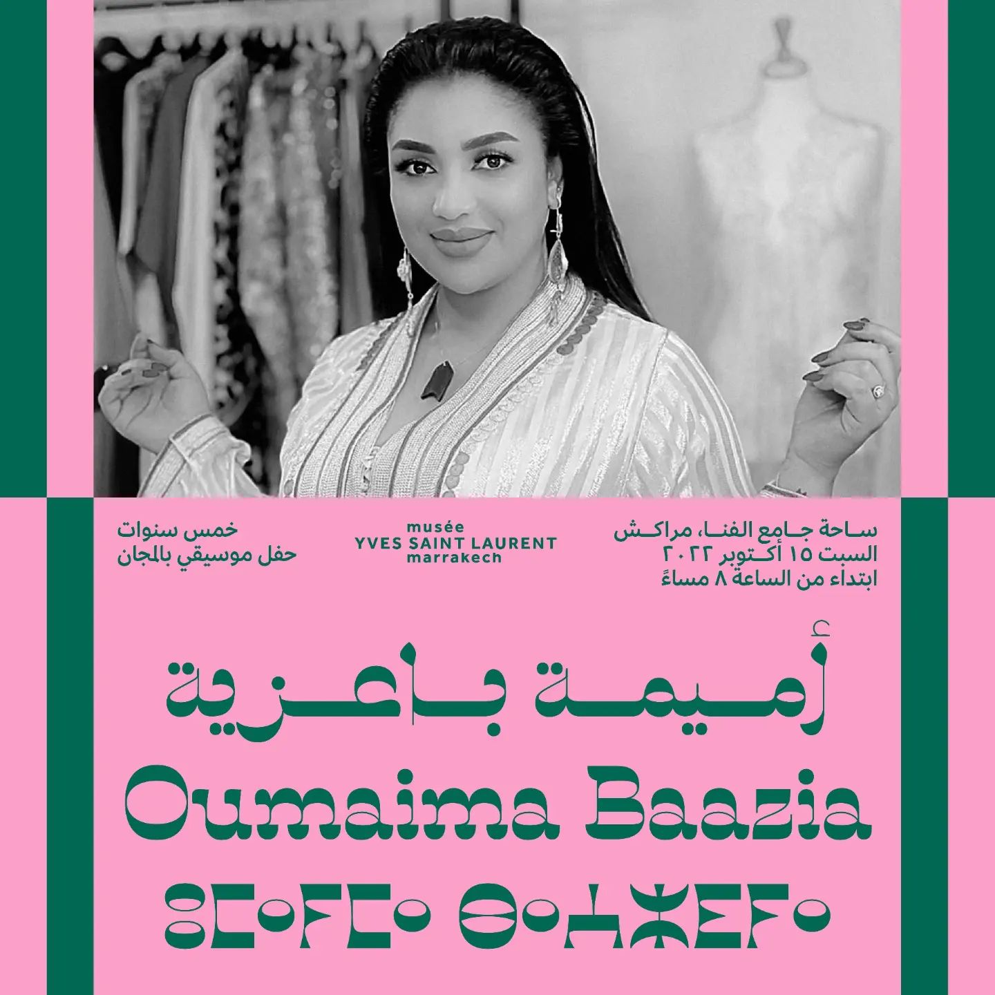
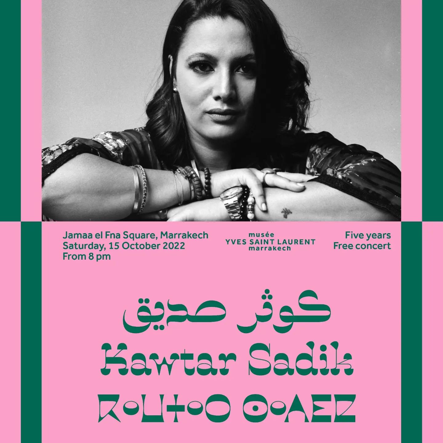
Five years anniversary concert, Musée Yves Saint Laurent Marrakech
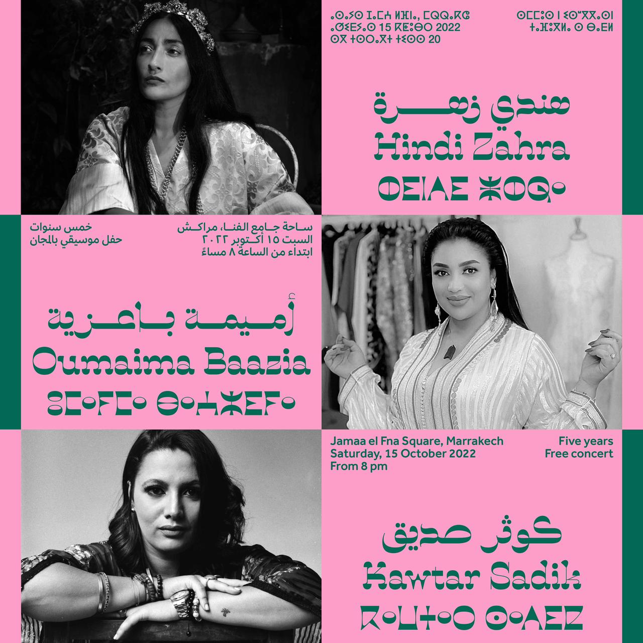
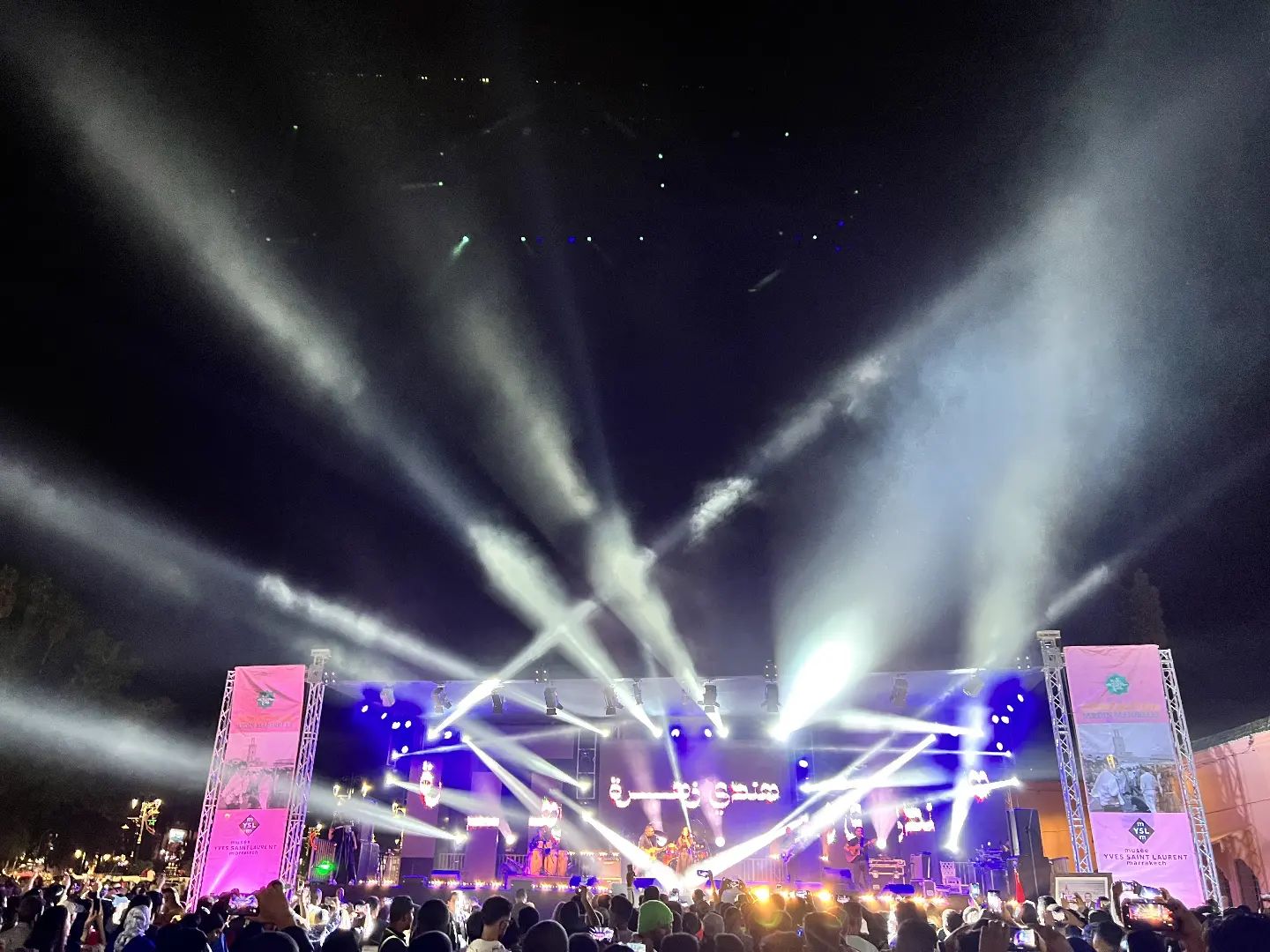
On October 15, 2022, the Musée Yves Saint Laurent Marrakech celebrated its fifth anniversary with a free open air concert at Jemaa el-Fnaa, the city’s main square, organized by the Fondation Jardin Majorelle. Three women artists performed live on stage: Hindi Zahra, Oumaïma Baazia, and Kawtar Sadik. The show was presented by Abdellah Mountassir. More than 30,000 people attended the concert.
The posters advertising the event were designed by Atelier Kissaria and Studio Akakir. The display typeface is one that supports all three scripts needed to write the languages spoken in Morocco: Arabic, Latin (for French and here for English), and Tifinagh. The latter is used for the Amazigh languages, also known as the Berber languages, which are spoken by the indigenous Imazighen communities of North Africa.
La Contraste Horizontale is a design by Naïma Ben Ayed, a graduate of both the École Estienne in Paris and the Type & Media program at the KABK in The Hague, and currently a type and graphic designer based in London. Made available in a beta version in March 2022 via Future Fonts, her Horizontale is the first branch of a superfamily that will eventually comprise two more members: La Contraste Verticale by Redouan Chetuan, and La Contraste Sans by Ben Ayed & Chetuan. From the release notes:
Originally born on a sketchbook in Marrakech during Typographic matchmaking in the Maghreb curated by Huda AbiFarès from the Khatt foundation; La Contraste is the encounter of the non-conformisme of the Maghrebi script, the possibilities of Tifinagh type and hybrid Arabic/Latin letterforms from Andalusia. La Contraste is proudly North African and unapologetically high contrast.
The extreme horizontal contrast helps to harmonize the three otherwise quite different scripts.
The small Latin text is set in Effra, the museum’s standard typeface. The low-contrast Arabic and Tifinagh fonts are yet unidentified – I’m grateful for any pointers [edit: those probably are Effra Arabic and Noto Sans Tifinagh, see comments].
Via Toshi Omagari. Kudos to Oliver Holzweissig for the font ID.


8 Comments on “Five years anniversary concert, Musée Yves Saint Laurent Marrakech”
Beautiful.
I cannot read Arabic, but from the looks of it, the Arabic could be set in Effra as well – using its Arabic counterpart.
The Tifinagh text appears to use Zoto Tifinagh.
Thank you, Matthijs! I missed that Effra was extended to support Arabic. My copy – v1.112 from 2014 – “only” has Latin, Greek, and Cyrillic. Nice.
According to Adam Twardoch, the Zoto fonts “are based on the 2015 Apache-licensed Noto fonts”. They were published by FontLab as part of the GetGo Fonts, a collection of reference fonts made available in their native VFJ format in July 2021.
In terms of design, Zoto Sans Tifinagh seems to be identical to Noto Sans Tifinagh, v2.000 (Monotype Design Team). The current version, v2.005 (JamraPatel), is different, with non-circular rounds. The numerals on the posters don’t match either version, but these might be from fallback font – at least the old Noto Sans Tifinagh doesn’t include numerals. I have tagged Noto Sans.
You are usually right, and I cannot find the older versions of Noto Tifinagh to compare, but if the difference between Noto V2.005 (current version) and Zoto/Noto V2.000 is just .005, that’s quite a big step for such a small number! Hardly any character seems to be identical (compare terminals, width, baseline, etc).
Yep, it’s a completely new design, harmonized with the Latin of Noto Sans.
The reason why I’m reluctant to tag Zoto fonts is that these are primarily intended as reference files for FontLab users, not so much as fonts to use in designs. One would first have to convert them to a format like OTF. The main differences between Zoto and Noto lies in the licence. From Adam:
Yep, licensing seems to be the most important difference between Noto and Zoto.
But in terms of design differences, a small .005 step for Noto would be a giant leap to a “Neue” of “Nova” for a Latin alphabet retail font!
Delighted to learn that there’s a version of Noto under a license more libre than OFL. What are its specific drawbacks compared to newer versions?
Matthijs, the version numbering is indeed odd. I have no insights into the reasoning behnind it. I can imagine that it corresponds to other members of the Noto series. In the context of the greater project, a new Tifinagh design probably constitutes just a small step, even it’s a major update for the user community of this script.
Hrant, my understanding is that the Noto fonts were under the Apache License 2.0 until September 2015. This means that all later additions, extensions and bug fixes – which in sum are considerable – are not included.