
Downward to the Earth by Robert Silverberg (Signet, 1971)
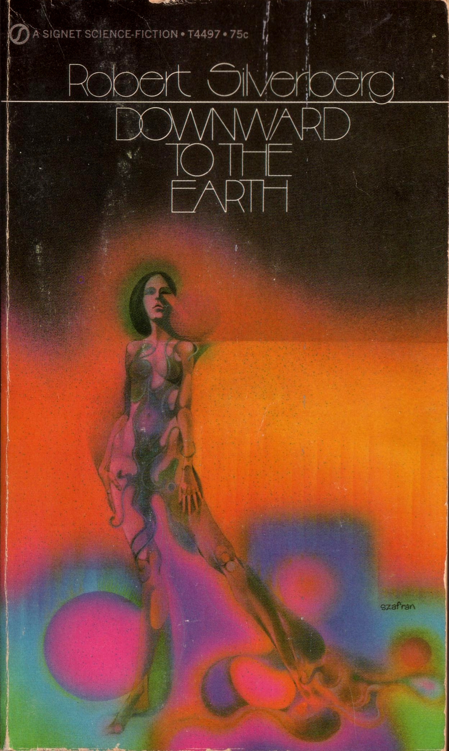
Downward to the Earth “is a tale of the quest for transcendence (a frequent Silverberg theme) set on another planet, and includes references to Heart of Darkness, Joseph Conrad’s classic tale of colonialism”. Originally published as a four-part series starting in the November 1969 edition of Galaxy Science Fiction, it was published in book form by Doubleday in 1970. This is the cover of Signet’s paperback edition from 1971, with cover art by Gene Szafran.
The geometric sans is Arthur Thinline, used with its alternate forms for r and t. It was included in one of the first two volumes of Phil Martin’s Alphabet Innovations, both released in 1969. Roc Mitchell claimed to be its designer. King Arthur is a variant with stroke contrast.
See also Bentley: according to Joe Taylor, he drew this face as a “revision of ‘Arthur Thinline’”, in a single weight, possibly in late 1969 or early 1970, and made it available via Lettergraphics, where it was later extended into five weights with biform alternates. The high waistline in A E H S and the vertically compact g on this cover suggest to me that this is the original Arthur Thinline, and not Bentley Thinline.


")


")


 Polish movie poster")


")
")


