Sign in to participate.
- Topics
- Activism (766)
- Architecture (996)
- Art (3292)
- Automotive (243)
- Business/Finance (509)
- Education/Academia (1568)
- Entertainment (1136)
- Event (2150)
- Fashion/Apparel (1120)
- Film/TV (1450)
- Food/Beverage (2236)
- Governmental/Civic (517)
- Graphic Design (2360)
- Health/Fitness (594)
- Home/Interior (607)
- Industrial Design (397)
- Institutional (958)
- Kids (592)
- Lifestyle (1053)
- Literature (2193)
- Local (1002)
- Music (4471)
- News (482)
- Performing Arts (697)
- Politics (599)
- Product (1245)
- Religion/Spirituality (293)
- Retail/Shopping (776)
- Science/Nature (744)
- Services (1002)
- Social Media (212)
- Sports (527)
- Technology (1019)
- Transportation (254)
- Travel (609)
- Formats
- Advertising (1562)
- Album Art (2969)
- Art/Illustration (429)
- Booklets/Pamphlets (1678)
- Books (4698)
- Branding/Identity (5581)
- Ephemera (897)
- Exhibition/Installation (755)
- Film/Video (762)
- Infographics/Maps (418)
- Magazines/Periodicals (1497)
- Mobile/Tablet (488)
- Newspapers (230)
- Object/Product (806)
- Packaging (1662)
- Posters/Flyers (4047)
- Signs (1585)
- Software/Apps (218)
- Web (3810)
- Typefaces
- Adobe Caslon (72)
- Adobe Garamond (50)
- LL Akkurat (75)
- Aktiv Grotesk (56)
- Akzidenz-Grotesk (334)
- Akzidenz-Grotesk Condensed (62)
- Albertus (68)
- Alternate Gothic (128)
- Amelia (49)
- GT America (120)
- ITC American Typewriter (69)
- Ano (55)
- Antique Olive (71)
- Anzeigen-Grotesk / Neue Aurora IX (52)
- Aperçu (80)
- Apoc (146)
- Arial (162)
- Atlas Grotesk (59)
- ITC Avant Garde Gothic (250)
- Avenir (85)
- Avenir Next (53)
- Baby Teeth (53)
- Baskerville (73)
- Benton Sans (86)
- Berthold Block (50)
- Bodoni (124)
- Brandon Grotesque (94)
- LL Brown (74)
- Brush Script (55)
- Bureau Grot (54)
- Calibre (51)
- Century Expanded (57)
- Century Schoolbook (51)
- Cheltenham (58)
- LL Circular (70)
- Ciutadella (49)
- Clarendon (118)
- Compacta (97)
- Cooper Black (228)
- Copperplate Gothic (61)
- Courier (50)
- Davida (80)
- FF DIN (119)
- Druk (52)
- Druk Condensed (51)
- Druk Wide (68)
- Elephant (Alias) (57)
- Euclid Flex (77)
- Eurostile (190)
- Everett (97)
- Favorit (73)
- Folio (95)
- Founders Grotesk (122)
- Franklin Gothic (225)
- ITC Franklin Gothic (70)
- Futura (938)
- Futura Black (92)
- Futura Condensed (100)
- Futura Display (65)
- Geogrotesque (60)
- Georgia (93)
- Gill Kayo (89)
- Gill Sans (262)
- Gotham (233)
- Grand Slang (50)
- Graphik (121)
- Grotesque No. 9 (46)
- Haas Inserat-Grotesk / Neue Aurora VIII (46)
- Harbour (173)
- Helvetica (1016)
- Helvetica Condensed (109)
- Hobo (69)
- Interstate (90)
- Kabel (83)
- Kabel Black (76)
- Knockout (130)
- Lausanne (161)
- Lydian (66)
- Lyon (72)
- Maison Neue (60)
- Microgramma (63)
- Miller (47)
- Minion (68)
- Monotype Grotesque (73)
- Montserrat (59)
- Monument Grotesk (46)
- Motter Ombra (70)
- Neue Haas Grotesk (152)
- Neue Helvetica (304)
- Neutraface (79)
- News Gothic (230)
- Ogg (84)
- Omnes (76)
- Open Sans (51)
- Optima (131)
- Palatino (71)
- Plaak (51)
- Plantin (59)
- Proxima Nova (101)
- Roboto (57)
- Sabon (47)
- GT Sectra (69)
- ITC Serif Gothic (96)
- Sharp Grotesk (56)
- ITC Souvenir (120)
- Sporting Grotesque (49)
- Suisse Int’l (263)
- Suisse Works (80)
- Surt (81)
- Tempo (50)
- Tiempos (82)
- Times (103)
- Times New Roman (218)
- FB Titling Gothic (50)
- Trade Gothic (157)
- Univers (490)
- Venus (48)
- Venus Extended (70)
- GT Walsheim (87)
- Windsor (91)
- These are the most common typefaces in the database, but there are many more. Try a search!
- Sign in to participate.
Topics▼ |
Formats▼ |
Typefaces▼ |

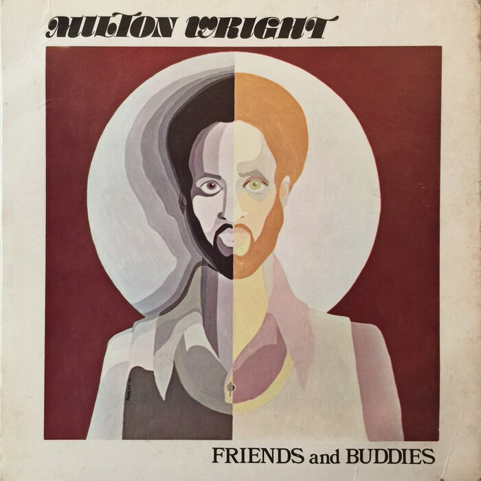
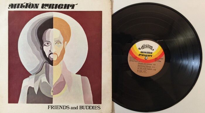

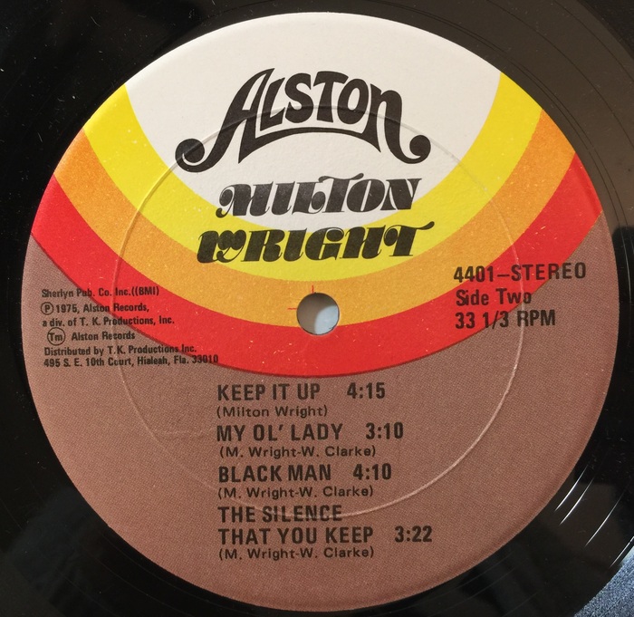

















1 Comment on “Milton Wright – Friends and Buddies album art”
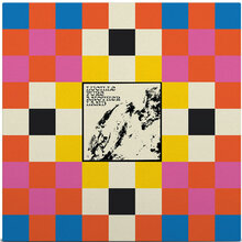
The “brown orange and yellow” tag page strongly confirms your suggestion that this kind of color palette definitely had a moment in the 1970s.😎 (I’ve added the tag to this use accordingly.)
On a separate note: I’ve seen this slightly wonky version of Univers before on other vinyl labels. The odd spacing and proportions make me think it’s the IBM Selectric version of Univers.