
Berlagebrug, Groningen
Contributed by Sander de Jong on Mar 11th, 2023. Artwork published in
circa 2010
.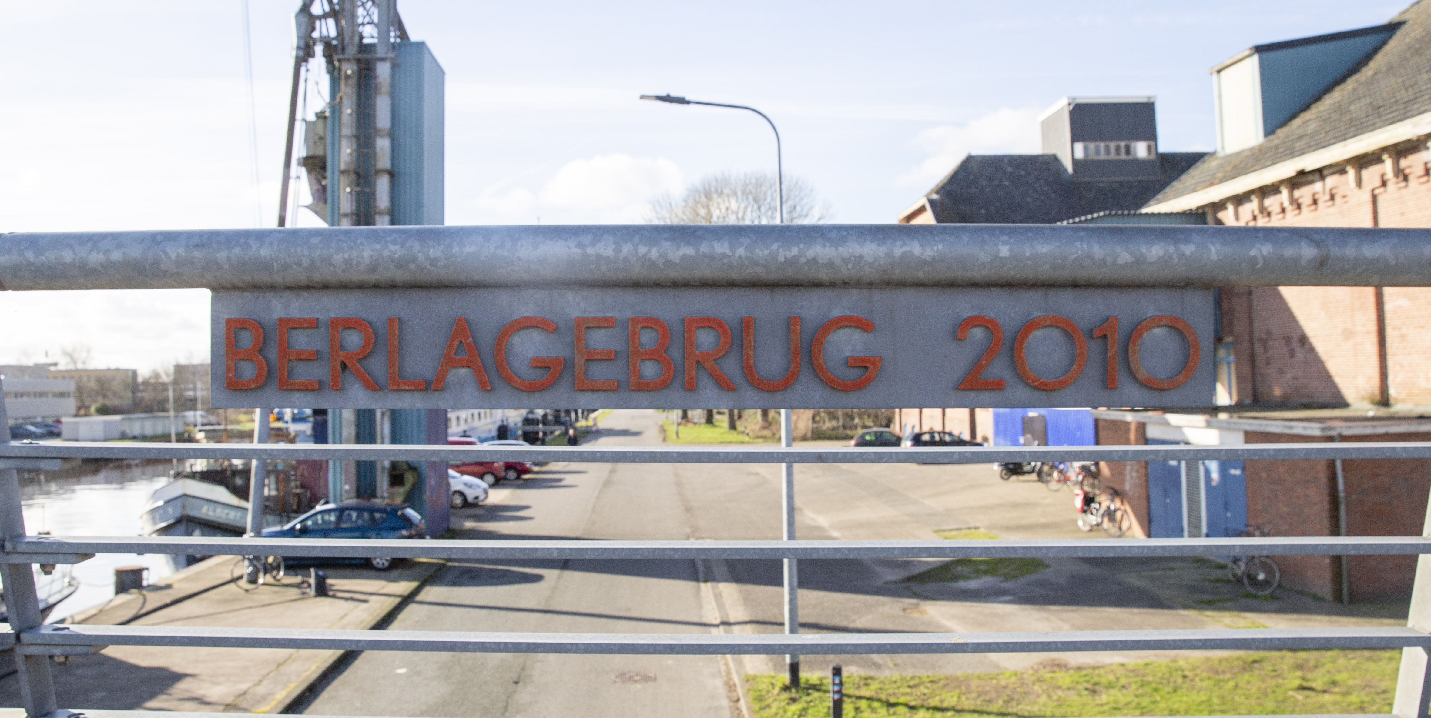
Photo: Sander de Jong. License: All Rights Reserved.
The Berlagebrug was named after Dutch architect Hendrik Petrus Berlage. While he only designed one building in Groningen, he co-authored a plan for the expansion of the city in 1928. Some of this plan was executed, some wasn’t, but the bridge he planned on this spot was finally realised after 80 years.
The sign uses capital O’s instead of 0’s for the year 2010.


 Belvédère(s)")


")


2 Comments on “Berlagebrug, Groningen”
Welcome, Sander!
Assuming that this sign was based on a digital font, then this specific Nobel is the revival made by Tobias Frere-Jones for Font Bureau. The interpretation made by Andrea Fuchs and Fred Smeijers and published by DTL has a pointed A.
Which one stays closer to the original? Well, that depends at what “original” you are focusing on: at some point, Typefoundry Amsterdam offered the “spitse kapitalen” (pointy capitals) for ‘AMNVW’ as alternates, made available on request only. DTL’s page for Nobel further mentions:
On Berlage and typography: Donald Beekman made two typefaces based on lettering found in two of his buildings, the Beurs van Berlage and the Burcht van Berlage, both in central Amsterdam. They were released in 2017, as FF Berlage Beurs and FF Berlage Burcht. A little later, Beekman also did an interpretation of the lettering found on many bridges in Amsterdam, which is probably based on designs by Berlage, too. This typeface is called VLNL Berlagebrug.