
The Story of Our Friend, the Fat Face
Journey back to a time when serifs were Antique, sans serifs were Grotesque, and extra bold faces were Fat.
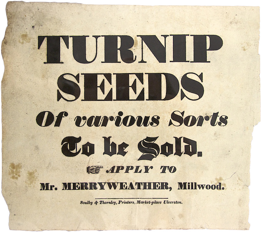
Early 19th-century advertising handbill from the John Soulby collection, University of Reading. (Source: Michael Hochleitner)
The first truly fat roman typeface is believed to have been introduced by prominent London type founder Robert Thorne, in 1803. This was a period of invention and discovery, when Europe was experiencing an enormous expansion of trade and commerce. As innovation in printing technology improved and enterprising new trades began to flourish, so did the demand for print advertising. Job printers who formerly relied on printing books soon discovered new sources of commercial print work. Thorne responded to this new surge in advertising by designing his “improved printing types” expressly for job printers composing short lines of large text. His bold new, all caps fat face, which looked more like a Didone on steroids, proved to be wildly successful and was largely responsible for altering the appearance of advertising in this era. Although Thorne never published another book of specimens after 1803, he came very close to completing one, and he continued turning out bold new fonts at his Fann Street Foundry until his death in 1820.
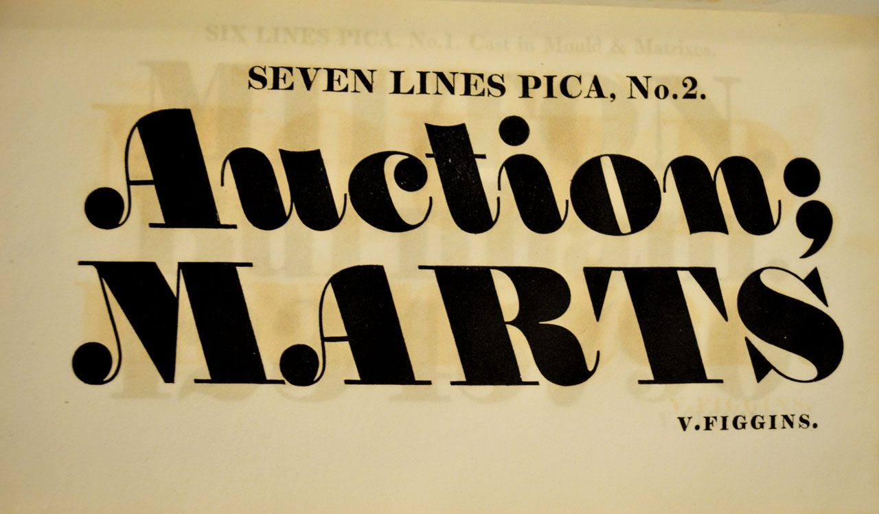
Backslanted italic fat face from the 1815 Figgins type specimen at Butler Library. (Source: Daily Type Specimen)
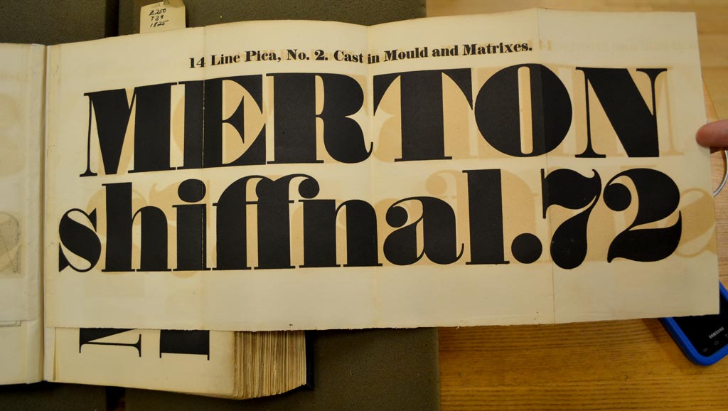
Fold-out of fat face from the 1825 Fann Street Foundry type specimen book at the Butler Library. (Source: Daily Type Specimen)

1826 advertisement from the John Soulby collection, University of Reading, via Michael Hochleitner. The mere size of the fat face display characters often dominated the page, virtually transforming them into images. These characters had a rather affable, friendly nature about them, which made them perfectly suited for advertising.
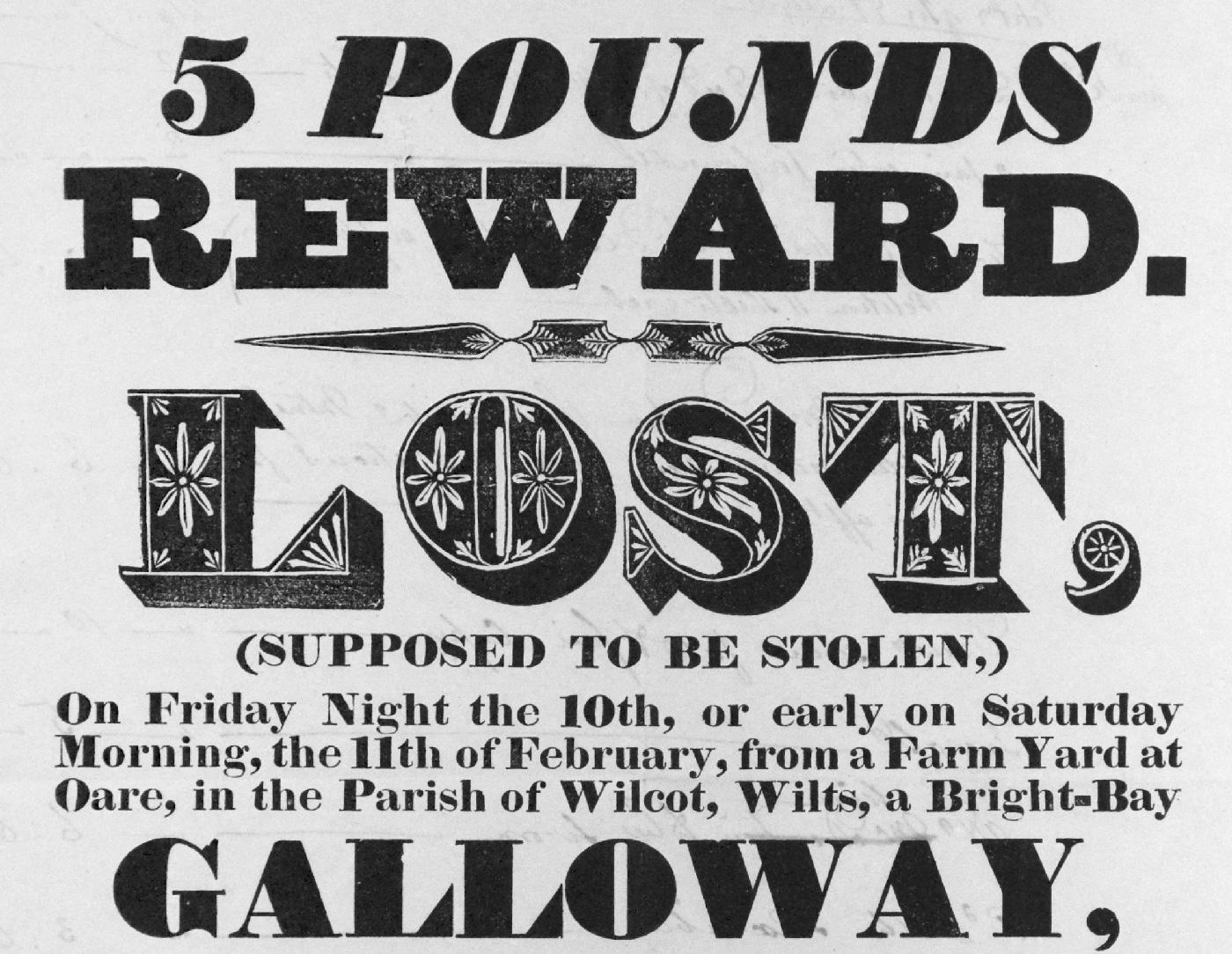
1832 reward poster for lost horse, from the John Soulby collection, University of Reading, via Rafael Dietzsch. This poster includes an italic, an upper and lower case, and a decorative variant of Thorne’s fat face.

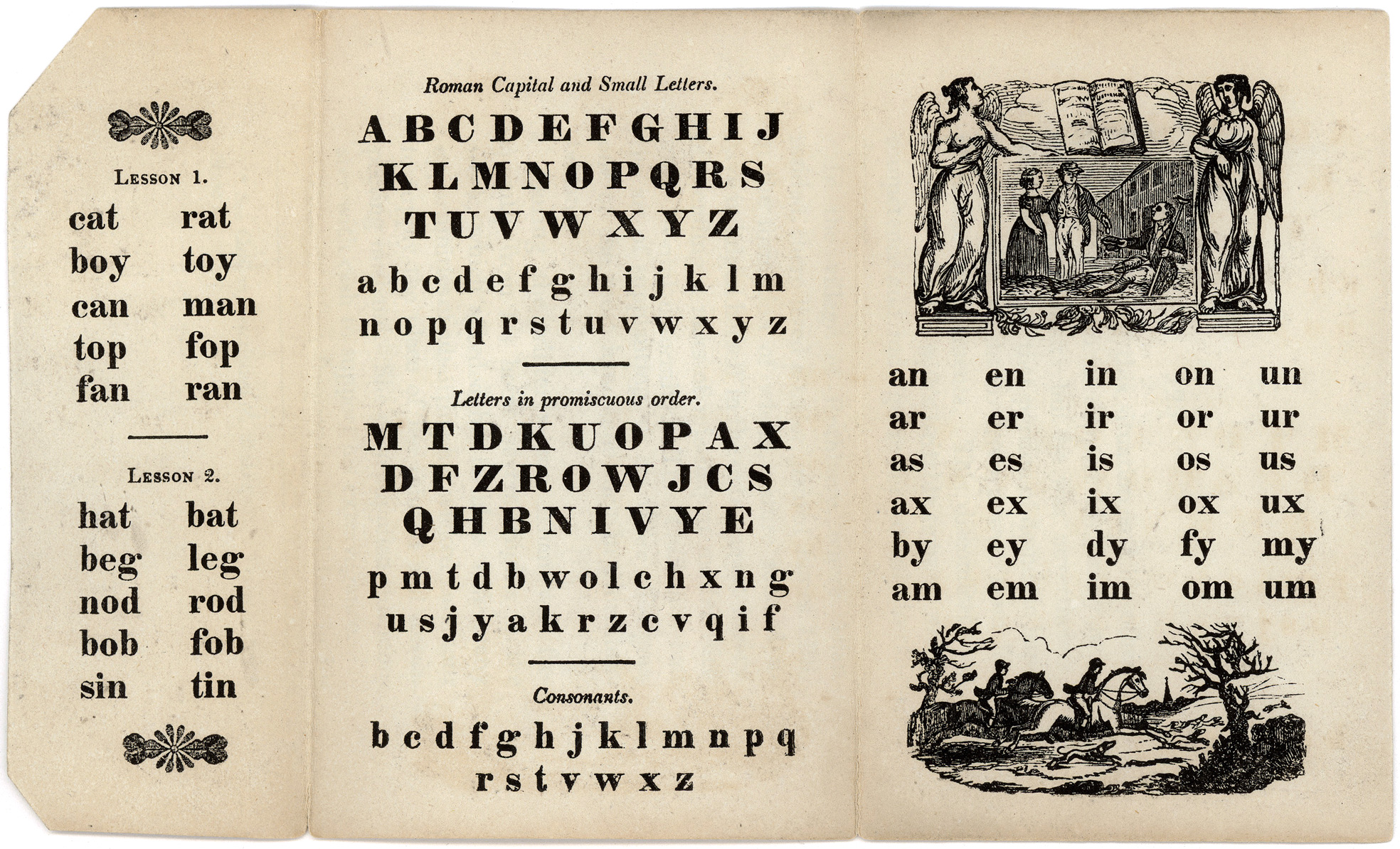
English Battledore published by William Davison in 1830. Battledores were a 19th century children’s primer, which usually contained a printed alphabet, brief samples of text and several wood engravings, printed in a tri-fold format. Many were composed with a fat face font as they were considered friendly and jovial, and suiting to young children. (Source: University of Washington Libraries, Special Collection)
The Fat Face Race
After Robert Thorne’s death, the Fann Street Foundry was put up for auction, and purchased by William Thorowgood in 1820 from winnings he received in a state lottery. Although Thorowgood had no previous experience in type founding, he quickly learned his ‘p’s and ‘q’s. Months later, he published 132 pages of Thorne’s composed specimens which remained after his death, including the first showing of his original fat face with the ill-fitting title of “Five-lines Pica, No. 5”. Over the course of the next century, every successful type foundry issued their own revival of Thorne’s original full-figured fat face font. The first italic cut was released in 1808, the first shaded version was believed to be issued in 1810, followed by compressed, elongated, and expanded versions according to Nicolete Gray in her book, Nineteenth Century Ornamented Types and Title Pages. The Bruce Type Foundry showed a particularly nice version of a regular and italic in their 1828 Specimen. This italic had many of the handsome attributes of Thorowgood’s first italic, including the lovely swashes and ball terminals of many of the cap letters. Initially nameless, it was later shown as No. 1 in their 1869, and then updated to Style 101 by 1901. By 1906, typefounders Stephenson Blake acquired the entire Fann Street Foundry holdings, and Thorne’s original fat faces were among them. It was nearly fifty years later however, that Thorne was finally recut and renamed as Thorowgood.

These showings of Thorowgood Italic and Thorne Shaded are from the 1950 Stephenson Blake catalog. The italic has some fine alternates for the A, M, N, V, W and Y. There was no showing of the standard Thorowgood in their catalogs until their 1953 specimen was published.

From A Book of Typefaces, W.S. Cowell Ltd., 1952, with claim that Ultra Bodoni Italic “lacks the vigor of the Thorowgood face”.
The Move Towards Modernism
The 20th century brought many economic and political changes to the Western world. This fueled reaction from progressive groups of artists, writers, and critics who called for social and economic reforms and rebelled against mass culture and industrialization. A cultural shift towards modernism emerged and gained influence in all aspects of society. Nowhere was this move towards modernism more pronounced than in advertising, book design, and printed arts throughout most of the 20th century. Type foundries responded by releasing dozens of new styles of san serif fonts such as Bernhard Gothic, Agency Gothic, Gill Sans, Futura, and News Gothic.
Not ones to be shy, fat faces came to the dance as well, and this time they were dressed to kill. With new releases from the German foundry Stempel in 1923 (Ratio Modern Extra Bold), the French foundry Deberny & Peignot in 1925 (Sphinx), American Type Founders in 1928 (Ultra Bodoni), Linotype in 1929 (Poster Bodoni), and Monotype in 1931 (Falstaff), the fat face had international appeal. Sizable fat faces were no longer being used exclusively as bursts of attention-grabbing display headlines, but were discreetly used as body copy, or as small, but readable design elements. By their very nature, they could be loud, flamboyant and conspicuous, or speak softly with restrained elegance. Like an addition of spice to a bland dish, the fat face added character and flavor to an otherwise simple design.
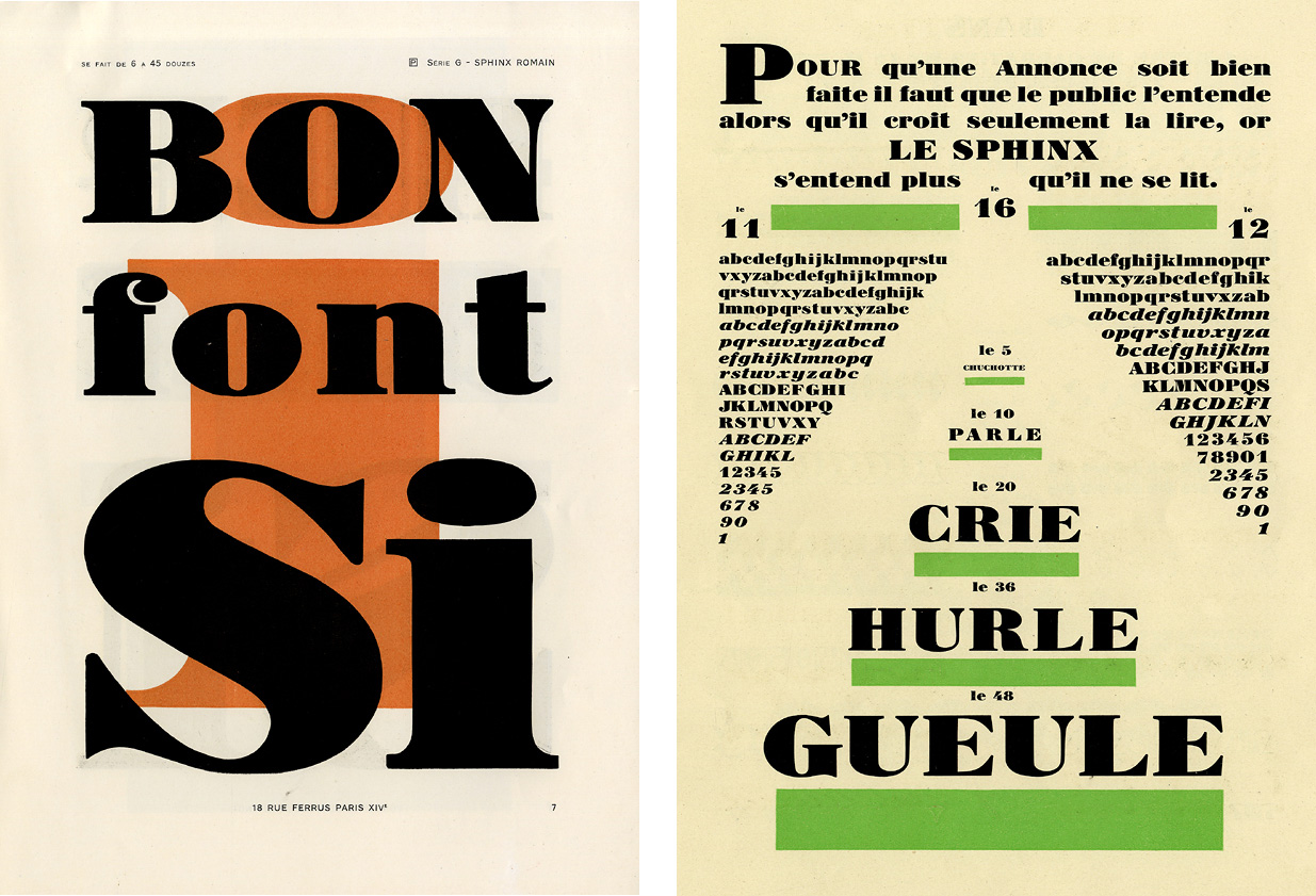
Two showings of the fat face Sphinx from the 1925 Deberny & Peignot type catalogs. (Source: Musée de L’Imprimerie Lyon)
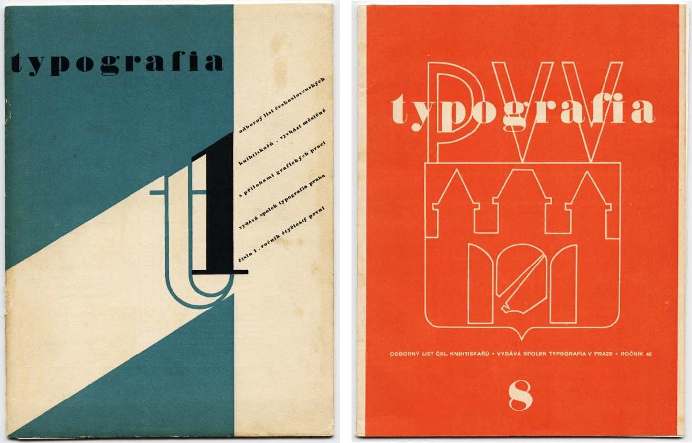
A 1934 and 1935 example of Thorne’s fat face used for the Czech Avant-Garde journal, Typografia. Using a lower case fat face, the designer took advantage of applying it both as a display heading and a body text in the first example. (Source: Modernism 101 Rare Design Books)

A 1932 calendar cover with Normande, designed by Herbert Bayer for the Berthold type foundry. (Source: Mikey Ashworth)

1939 self-promotion brochure designed by Herbert Bayer using Ultra Bodoni. (Source: Herb Lubalin Study Center)


Herbert Bayer cover design using Ultra Bodoni for the 1939 issue of PM Magazine, a journal showcasing the finest examples of quality graphic art reproduction and modern design. (Source: Display)

Catalog cover and poster for an exhibition by British artist Barbara Jones at the Whitechapel Gallery as part of the 1951 Festival of Britain celebrations. These are two very nice examples were designed and illustrated by Jones and use Thorne Shaded and a decorative Thorne Shaded. (Sources: Quad Royal, Mikey Ashworth)

Elaine Lustig Cohen’s 1956 paperback cover design for Meridian Books. The playful polka-dot design pairs nicely with the Thorowgood italic. (Source: Scott Lindberg)

Alongside Thorowgood, another second-generation fat face with a decorative balled italic was the Style 101 from Bruce Type Foundry, later called Bruce Roman and Italic. This typeface was also used for mid-century modern work like these book covers: Svenska Aforismer (1951), and English Fairs and Markets (1953), the latter illustrated by Barbara Jones. (Sources: Martin Klasch, Quad Royal)

These whimsical chapter dividers combining monsters with a fat face are designed by Maximilien Vox for the 1960 French typographic annual, Caractère Noel. All six of the dividers vary slightly in color and design, but the circular path of the text is consistent. The dynamic placement of the chapter numerals also vary, but are easily interpreted.

Italian designer Bruno Munari first published his ABC book in 1960. Munari’s use of Normandia — a mid-century interpretation of the older fat faces — complements his playful illustrations throughout this entire book. (Source: Artists’ Books and Multiples)

Paul Rand’s 1962 simple cover design exploiting size and contrast with almost nothing but Ultra Bodoni. (Source: Scott Lindberg)
Monofil logo design with nice ligature, for the company who developed fabric from the nylon filament. Designer unknown. (Source: Marken und Signete, 1957)
Bridging Centuries
Many fashions have come and gone since the advent of Thorne’s first elephantine fat face in 1803, and the many revivals that followed. From the Victorian era to Modernism and back, the fat face has managed to consistently reinvent itself at the hands of legendary designers such as Herbert Bayer, Paul Rand, and Bruno Munari. Over the course of the past 200 years, its impact and contributions to the printed word have few parallels. Surely there will be more to follow.
Revivals, Reinterpretations, and Progressions


One proof that the style continues its popularity are the many new digital fat faces released in the last few years. Some are faithful revivals of old designs, and some are completely new interpretations of the genre, mixing new ideas with those from the fat faces of the past.
Sybarite and Poster are two of the few digital font families that offer size-specific designs so hairlines aren’t lost at smaller sizes.
Battista is a Thorowgood follower with a set of decorative fill fonts.
Brunel and its corpulent cousin Isambard are part of an extensive family by Paul Barnes and Christian Schwartz, inspired in particular by fat faces of the Caslon foundry and John Isaac Drury.
As a contemporary interpretation of the more idiosyncratic Didot styles, the Ambroise family is quite different from most in this list, but the Black could be classified as a French fat face. Also unusual: three widths, down to the tightly packed François.
Trilogy Fatface only comes in italic, but there are five widths, swashes, and an accompanying superfamily of contrasting and compatible styles from the same historical period.
Ingeborg is a design that is not necessarily cut from the same Didonesque cloth as other fat faces, but its Fat Italic has the familiar balled swashes and its Block brings to mind Thorne Shaded.
Ben Kiel’s Worthe Numerals is a House Industries adventure into the most bulbous and expressive forms of fat face figures.
FB Bodoni is a revival of Ultra Bodoni’s Extra Condensed and adds an even narrower Compressed, while Oban and Geotica reduce Ultra Bodoni’s forms to their most spare and geometric.
In addition to these contemporary releases, the typefaces shown and mentioned in this article are shown, as usual, at the top of the sidebar at right. Click through the names and take your own journey into fat land!


")


")


13 Comments on “The Story of Our Friend, the Fat Face”
Great collection of images and information. Thanks for posting.
It’s clever to use the phrase “minding [or learning] his 'P’s and 'Q’s” here, recognizing that the cliche comes from type composition. But as long as we’re doing that knowingly, I’d propose using lowercase forms of the letters in that phrase, since those are the ones that need to be kept straight!
Those huge ball terminals always strike me as simultaneously the most exciting and the most frustrating part of italic fatface usage. They can really screw up intraword spacing (The word POUNDS in the lost horse poster being a good example). So I really love the ROMANTIC AGONY cover, in which Elaine Lustig Cohen turns the would-be-distracting dots into a design feature of the whole composition. Ingenious!
Right you are about the ‘p’s and ‘q’s, Craig. Fixed.
The Monofil logo, according to the credits in “Marken und Signete” was designed by the Atelier Dorland, (based in Düsseldorf/Berlin). But no individual credit given, other than the agency. Might be by A.E. Wuttke, he did a few lettered pieces for the Dorlan agency, but that could be a long shot.
Just stumbled on another mid-19th-century fat face, this one from Boston Type Foundry in their 1860 catalog:
Also from that specimen book, this “Italic Shade” with swashes which reminds me (for varying reasons) of Thorne Shaded, Ingeborg Block, and ITC Magnifico.
And another page (65) from the Boston specimen where the design was called “Full-Face”.
Elephant by Carter and Cones is a lovely fat face that would fit on your list.
Thanks, Ian! The elephant in the room, so to say. Despite the fact that it came bundled with various Microsoft products, Elephant can easily be overlooked: It is available only from a few select sources, and it has been updated under a different name: Big Figgins.
How can you overlook Madrone from the Adobe Wood Type collection? It is truly elephantine!
Images under “Revivals, Reinterpretations, and Progressions” are not displayed.
Thanks, Arnaud! We will look into this. The images show one-line samples of the typefaces mentioned in this section.
Edit: The images are back up.
Just updated the main article to mention that Bruce’s fat face was issued as early as 1828. Here’s the largest size shown in that catalog:
It looks like the new movie “booksmart” is using Normande for its title, all in lower case. Some of the supplemental materials seem to have been done in Thorowgood (such as this GIF and the Spanish version of the movie poster). The telltale difference, to this amateur’s eye at least, is the lowercase “r,” which connects to the ball in different locations in the two fonts.