An independent archive of typography.
Made possible by sponsors like Mark Simonson
Sign in to participate.
Topics▼ |
Formats▼ |
Typefaces▼ |

![“Occupations” (No. 236) ft. and [see comments].](https://assets.fontsinuse.com/static/use-media-items/133/132555/upto-700xauto/61ffabae/50916816198_2b796f4e33_3k.jpeg)
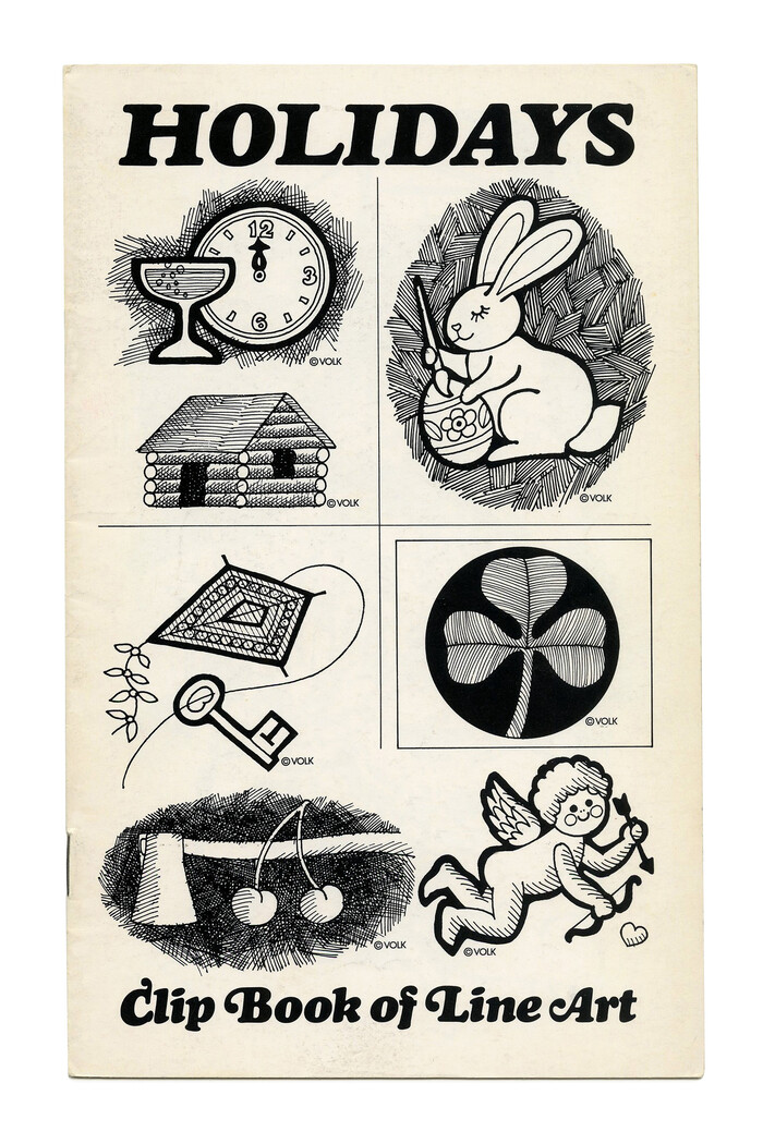
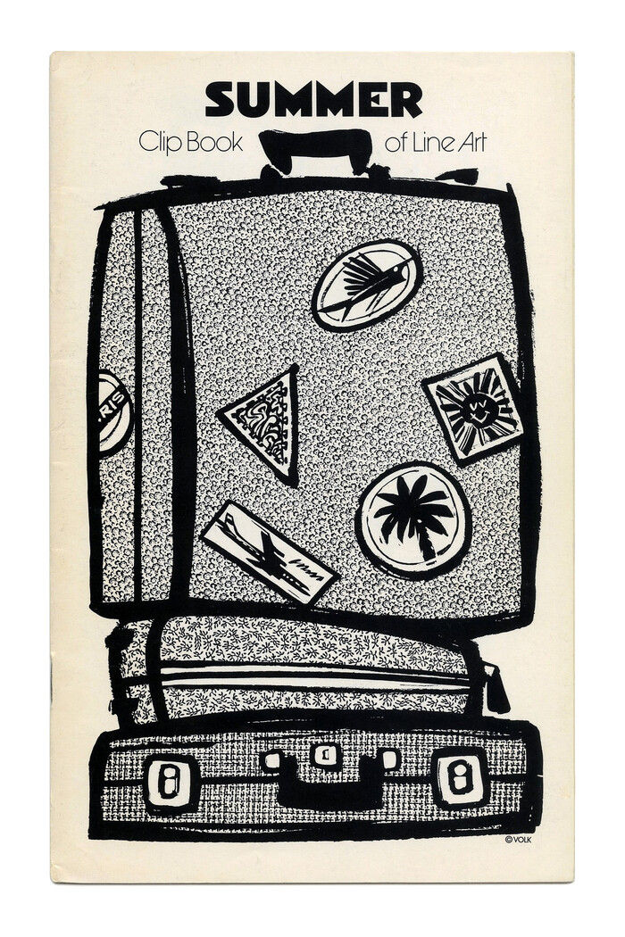
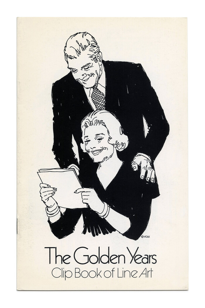
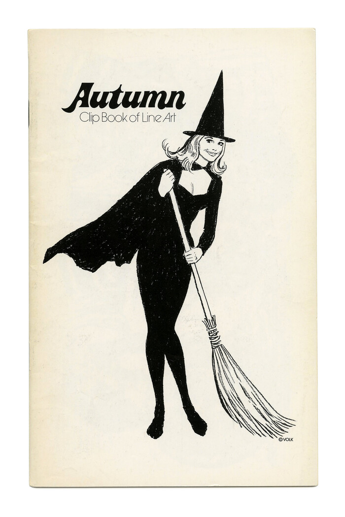

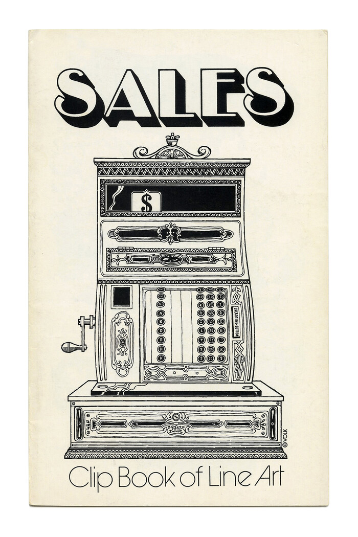
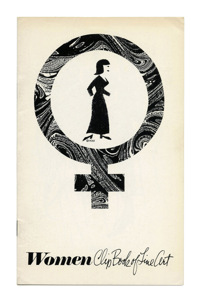
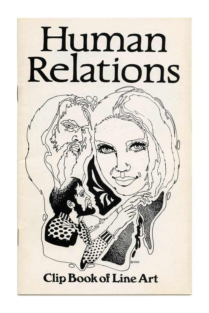

















5 Comments on “Clip Books of Line Art, Volk (1972)”
I can see Helvetica usage on the Occupations cover (the “Clip Book of Line Art” portion, to be exact).
Forget that comment about Helvetica… The “Clip Book of Line Art” portion of the Occupations cover is actually set in Akzidenz-Grotesk. Admittedly, both of those faces look very similar to each other when their key differences aren’t shown.
Right you are! Added.
Actually, I’m sorry if this seems a bit spammy, but upon further inspection, I noticed a few things that make it seem that Helvetica is being used instead of Akzidenz-Grotesk, such as the lowercase p and the lowercase k. The former has a shorter leg on the p than the latter. I suppose Akzidentz happen every now and then on this website. (Pun totally intended)
In principle, Akzidenz-Grotesk has diagonal terminals e.g. in c or e, whereas Helvetica features horizontal terminals. When you suggested AG, I checked for this detail and looked no further. What complicates things is that there isn’t just one AG, or one Helvetica. In the original foundry AG, differences across the sizes are huge.
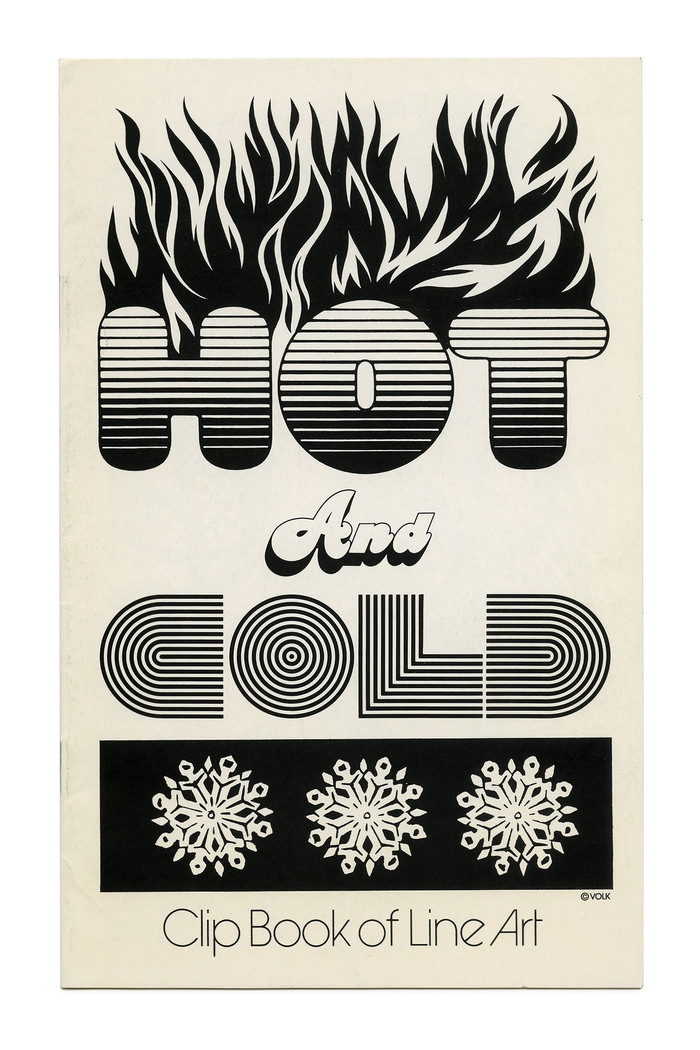
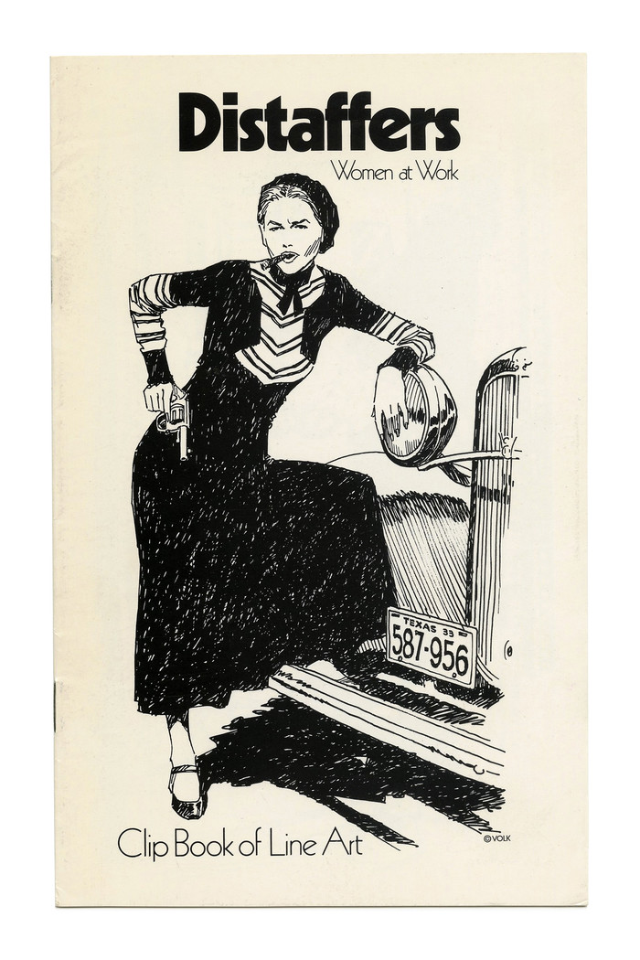
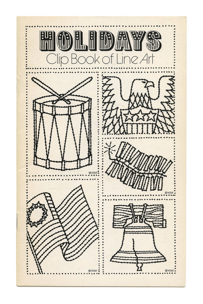
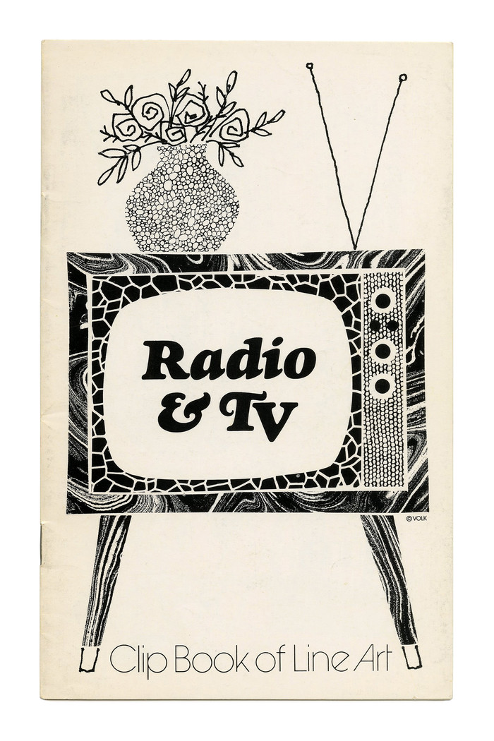
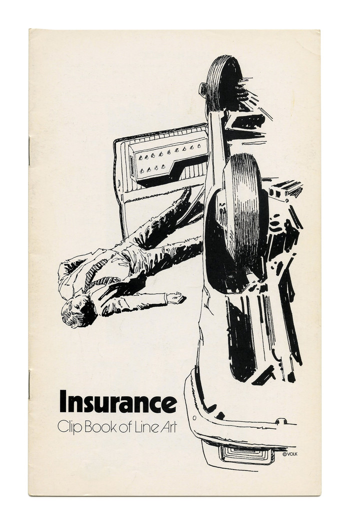
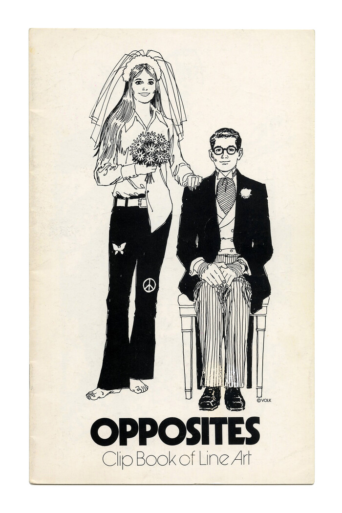
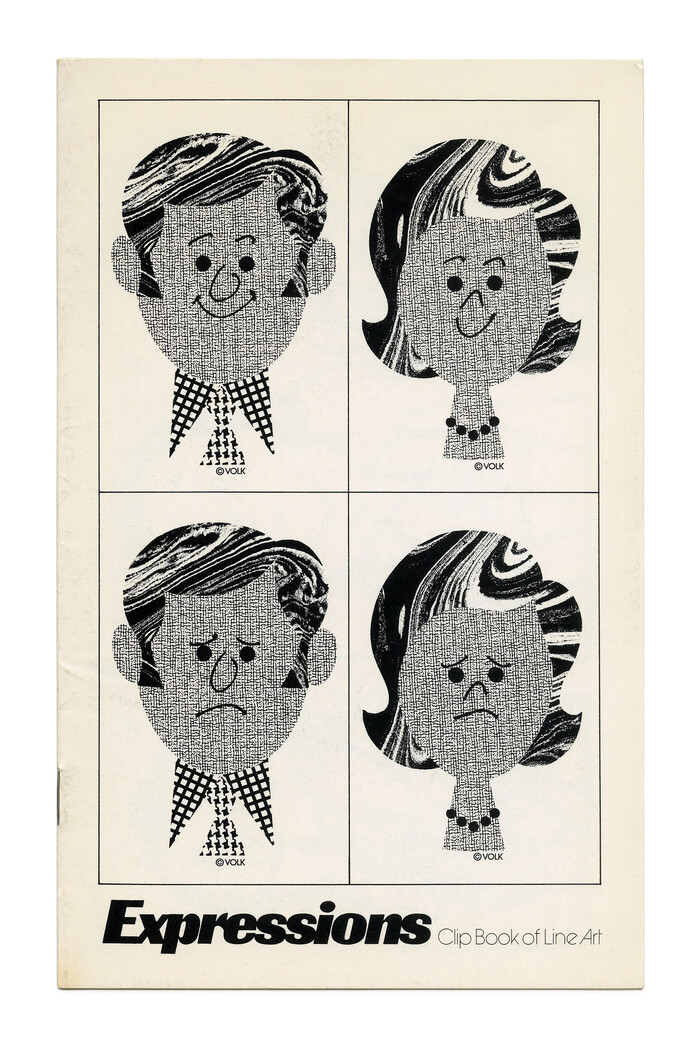
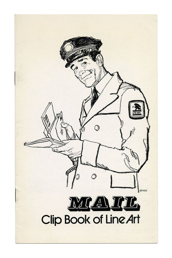
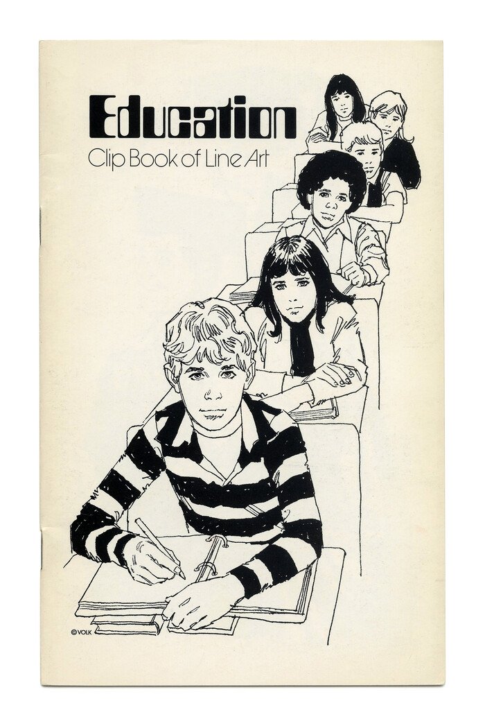
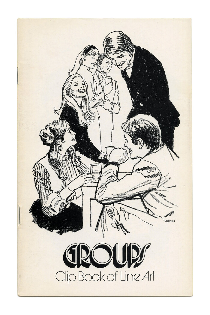
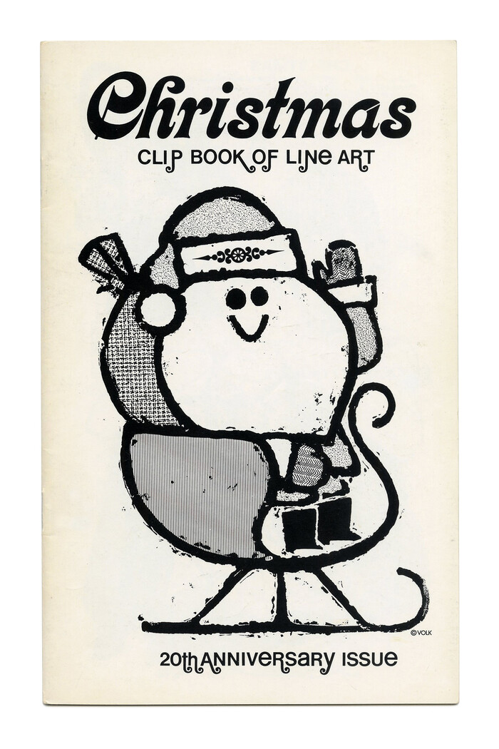
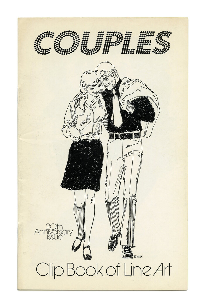
These booklets from the 1970s weren’t printed from metal type. Volk used some phototype adaptation. Filmotype is a likely candidate, as many of their originals were put to use on the clip book covers.
I checked a Filmomaster catalog, and lo and behold: Their adaptation of Helvetica (as HL) deviates from the original in exactly this detail, and exhibits an angled terminal. It also has the slight flaring present in the sample. Filmomaster’s AG (labeled SR after the American name, Standard) has an e that’s different, with a very small aperture. It also features round dots, unlike in Berthold’s original design.
Glad we could sort this out. Filmomaster’s Helvetica it is. Thanks, Bryson!