
Grace of Monaco movie poster
Contributed by Stephen Coles on May 24th, 2014. Artwork published in
.
Source: nz.rialtodistribution.com License: All Rights Reserved.
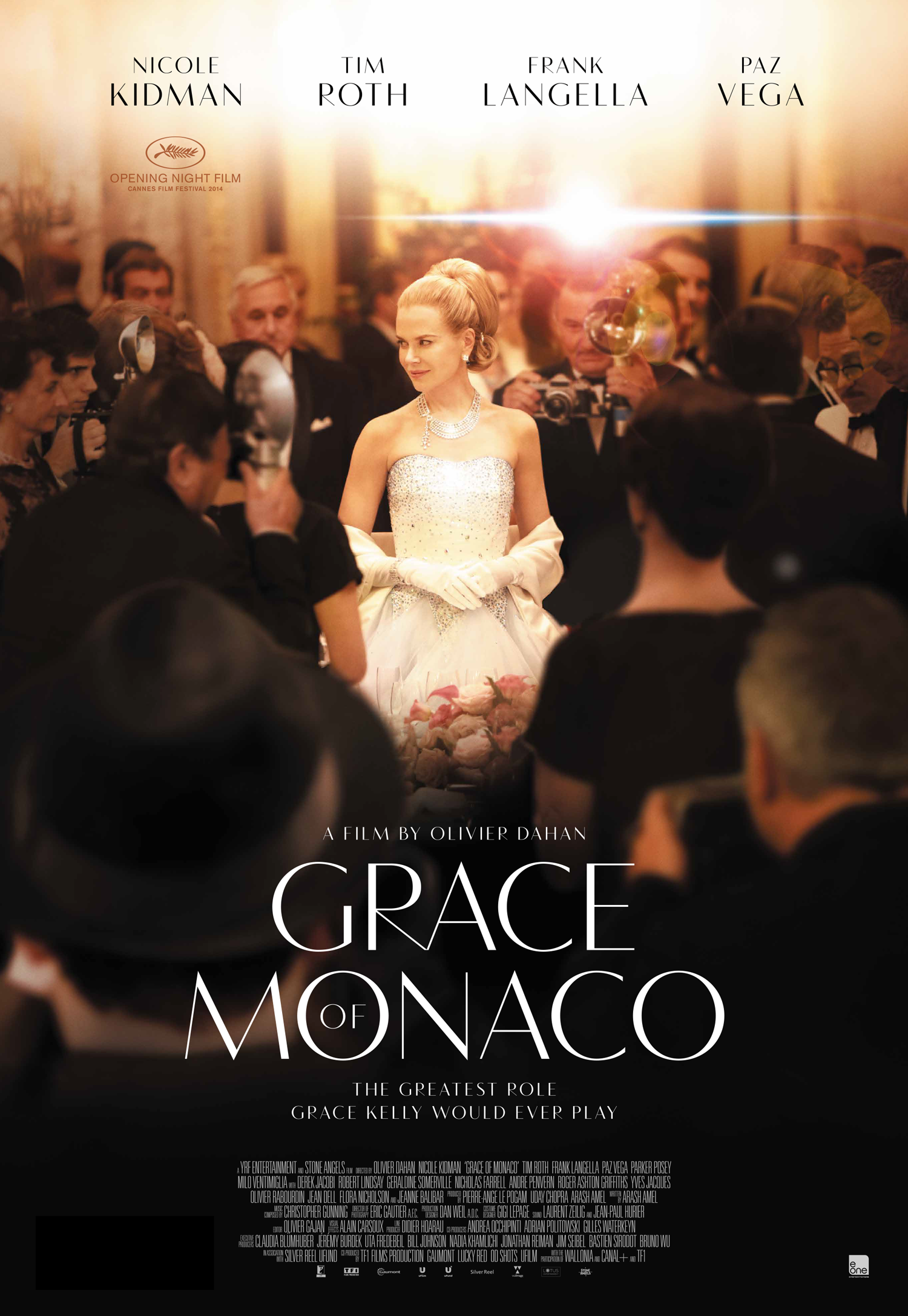
There are other Grace of Monaco posters set in a sloppy copperplate script and ITC Avant Garde Gothic, of all things. This (New Zealand?) design is by far the most graceful. Vanitas doesn’t hold up from a distance when small, however. Perhaps Optima, Condor or Timonium would have been a better choice for the little type. Or even better, a classical sans serif without stroke contrast.


")


 title sequence")


 U.S. movie poster")


2 Comments on “Grace of Monaco movie poster”
Do you know what font they used for the movie trailer? It was an art deco one, but different to the one here on this poster. Have been trying to find out online but without any luck!
Kay, this trailer uses ITC Avant Garde Gothic (with alternates), which is not so much Art Deco but more 1970s American modernism. To me, it seems quite out of step with European 1960s modernism of the film’s setting.
Maybe it’s the open-bowled ‘R’ that gives you that Art Deco feeling? Peignot has that shape and is more in line with an earlier French modernist aesthetic. The caps actually have a lot in common with the Vanitas used for the poster above.