
The Town That Dreaded Sundown (1976)

1976’s The Town That Dreaded Sundown was part of a wave of low-budget, regionally produced (and usually cast) slasher films made in the United States in the late 1970s. This particular film is somewhat unique because the film documents an actual event—“The Texarkana Moonlight Murders.” It was directed by Charlies B. Pierce, whose movies often get compared to the works of Ed Wood.
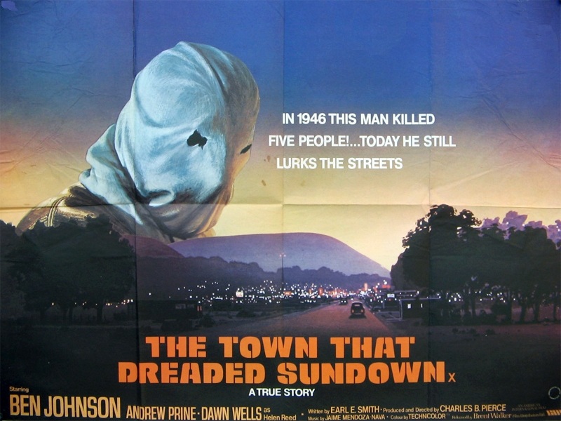
Two styles of Schaedler’s Alpha were used in the film’s promotional campaign, the solid Alpha Midnight and Alpha Sunrise (with perspective shadow). See an overview of all four styles at the end of a previous post.
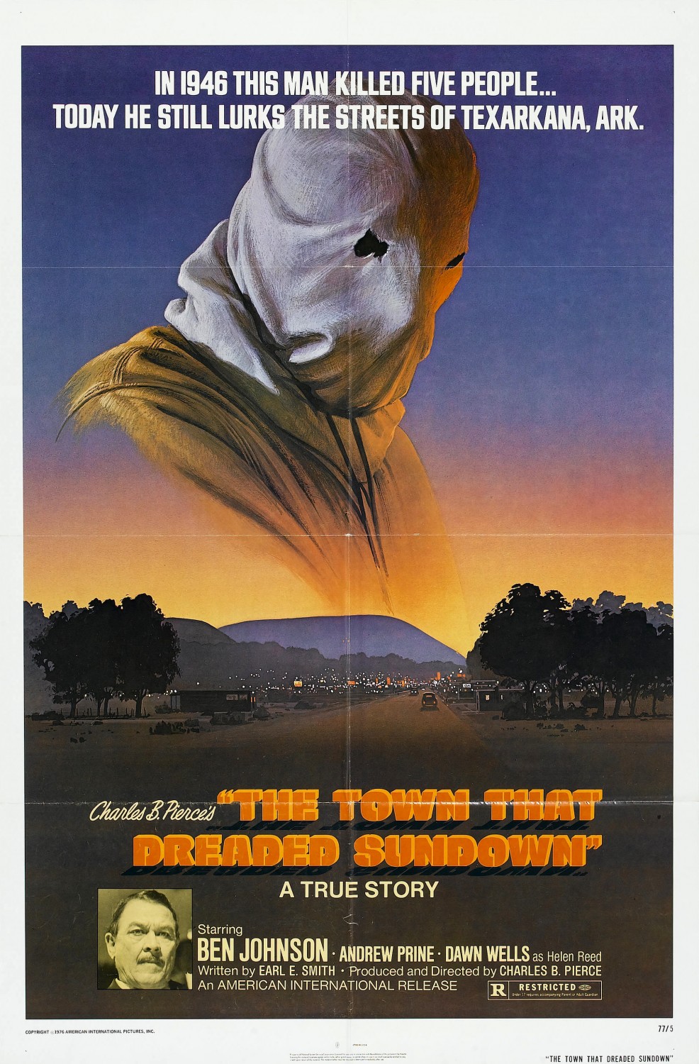
The typeface (?) used for the two lines at the top is unidentified. The letterforms are similar to Filmotype’s Glenlake and Ginger.
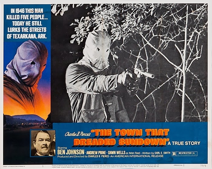
Lobby card
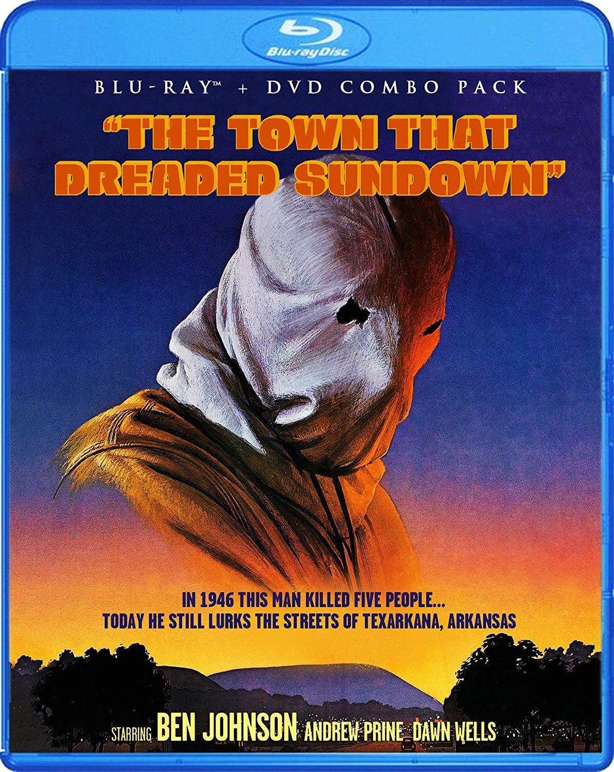
The Blu-Ray disk cover (2013) maintains the title in two-colored Alpha Sunrise (minus the drop shadow) and additionally uses Trajan and Garage Gothic.
")


</cite>")


 fashion film")


")


2 Comments on “The Town That Dreaded Sundown (1976)”
I grew up with the original poster in the family’s lake cabin. It used to scare all the kids! This is where my obsession with Alpha and its origin comes from. Before I could make out that Alpha Sunrise was an existing font, it looked shadow-y and noir-ish. A perfect fit for my hometown’s most famous unsolved mystery!
I know local people that were in the 1976 movie and I was actually present for a lot of the filming for the horrible 2014 remake.
I’m also probably going to digitize the unidentified.