
Photo: Paige XYL. License: All Rights Reserved.
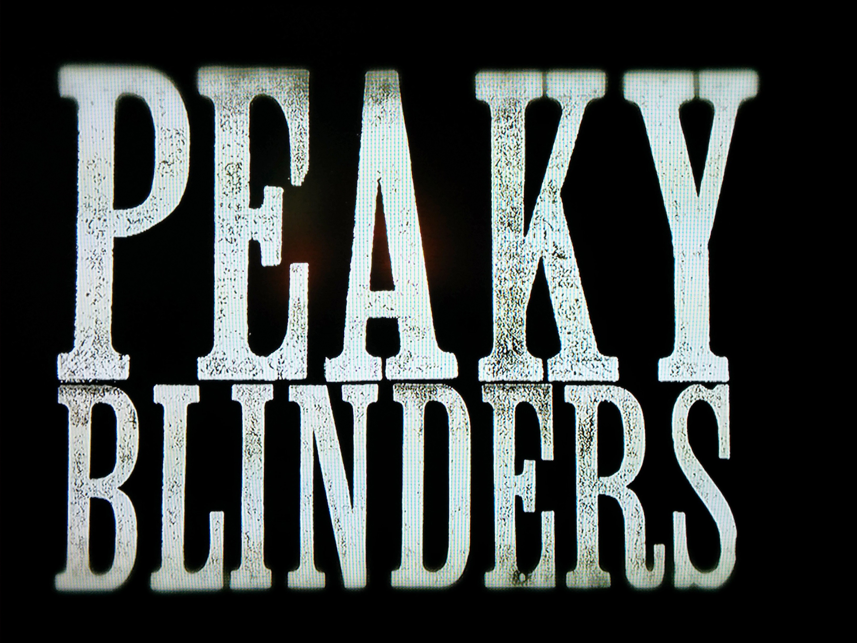
TV show logo and title type for a British historical crime drama, Peaky Blinders was produced by Momoco at London’s East End Letterpress Studio with wood letterpress type labeled as “Clarendon Condensed”. The foundry source for the type is unknown. It’s similar to William H. Page’s Clarendon XX Condensed, but slightly wider.
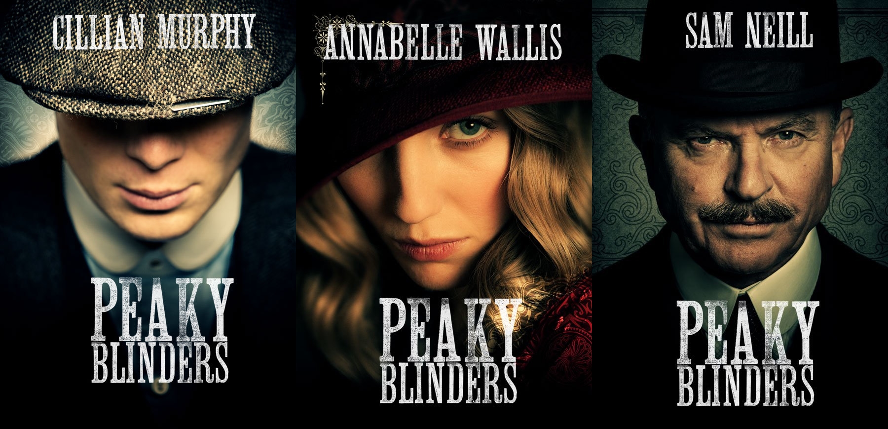
Source: flicksided.com License: All Rights Reserved.

Source: www.shostream.com License: All Rights Reserved.

")


")


1 Comment on “Peaky Blinders”
@stewf
The example shown is most similar to Clarendon X Condensed Light Face, by American Wood Type Co (Tubbs).
It is fairly close(ish) to William Page’s Clarendon X Condensed Light Face, but, as stated above, is wider than Page’s Clarendon XX Condensed Light Face.
It also has similarities to Hamilton’s No 35, though narrower.
It is heavier than Morgans &Wilcox Clarendon Lightface XX Condensed, but is much more similar to proportions of their Clarendon Lightface X Condensed, unfortunately the proportions of the counter form in the A and cross bar of the E do not match.
As this was produced by an English shop, I looked though examples of English manufacturers as well. Extra (or Double Extra) Condensed Clarendons by English manufacturers are harder to come by than with American manufacturers, and the styles that are condensed enough do not have the serifed crossbar of the E in your example. Miller & Richard gets closest with their Lean Clarendon, but does not seem quite condensed enough to match.
Matching wood type in notoriously tricky, and finding the exact provenance is often made trickier based on the availability of known specimen books for checking. An image of the actual type blocks and a direct proof of the type forms often helps see useful details a bit more clearly.
(Hope that in some way helps?)