
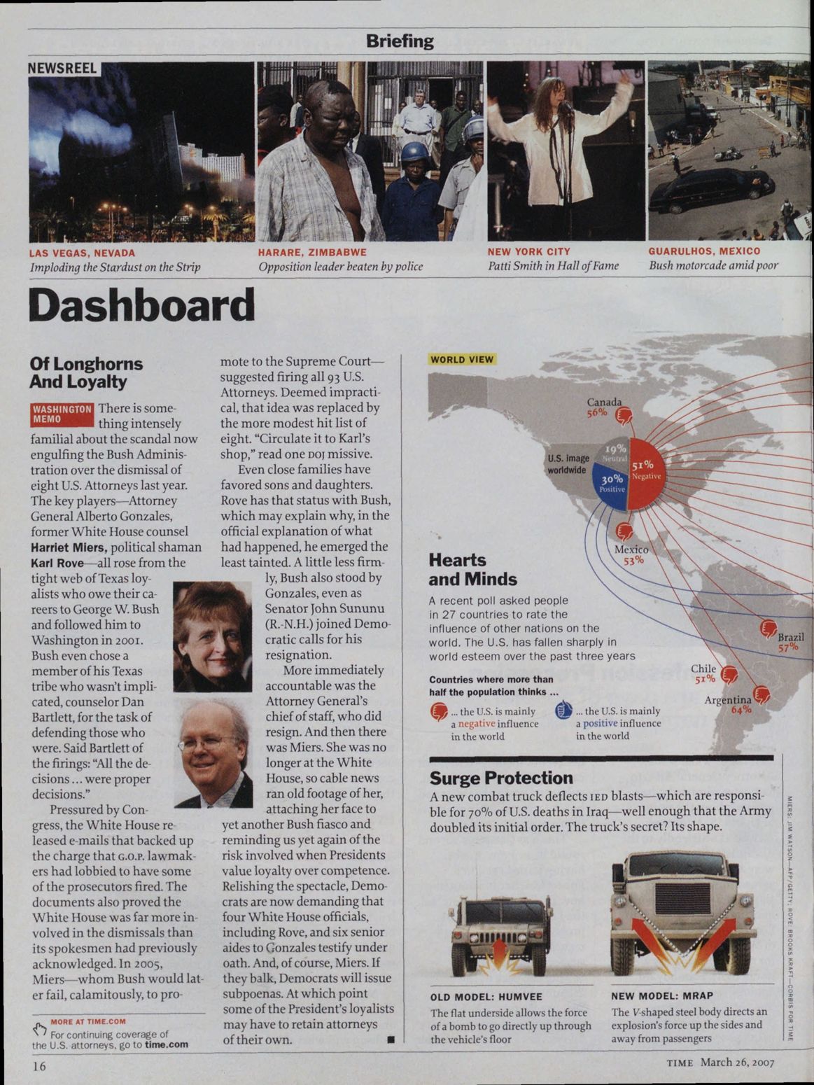
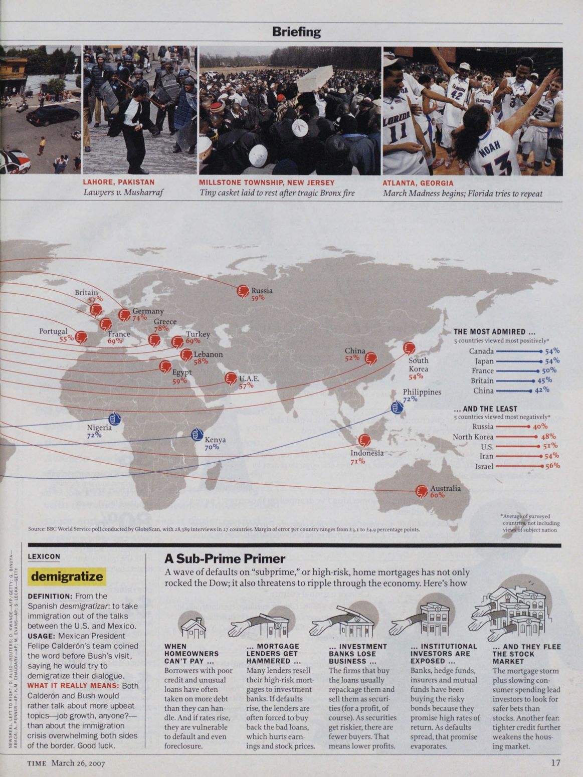
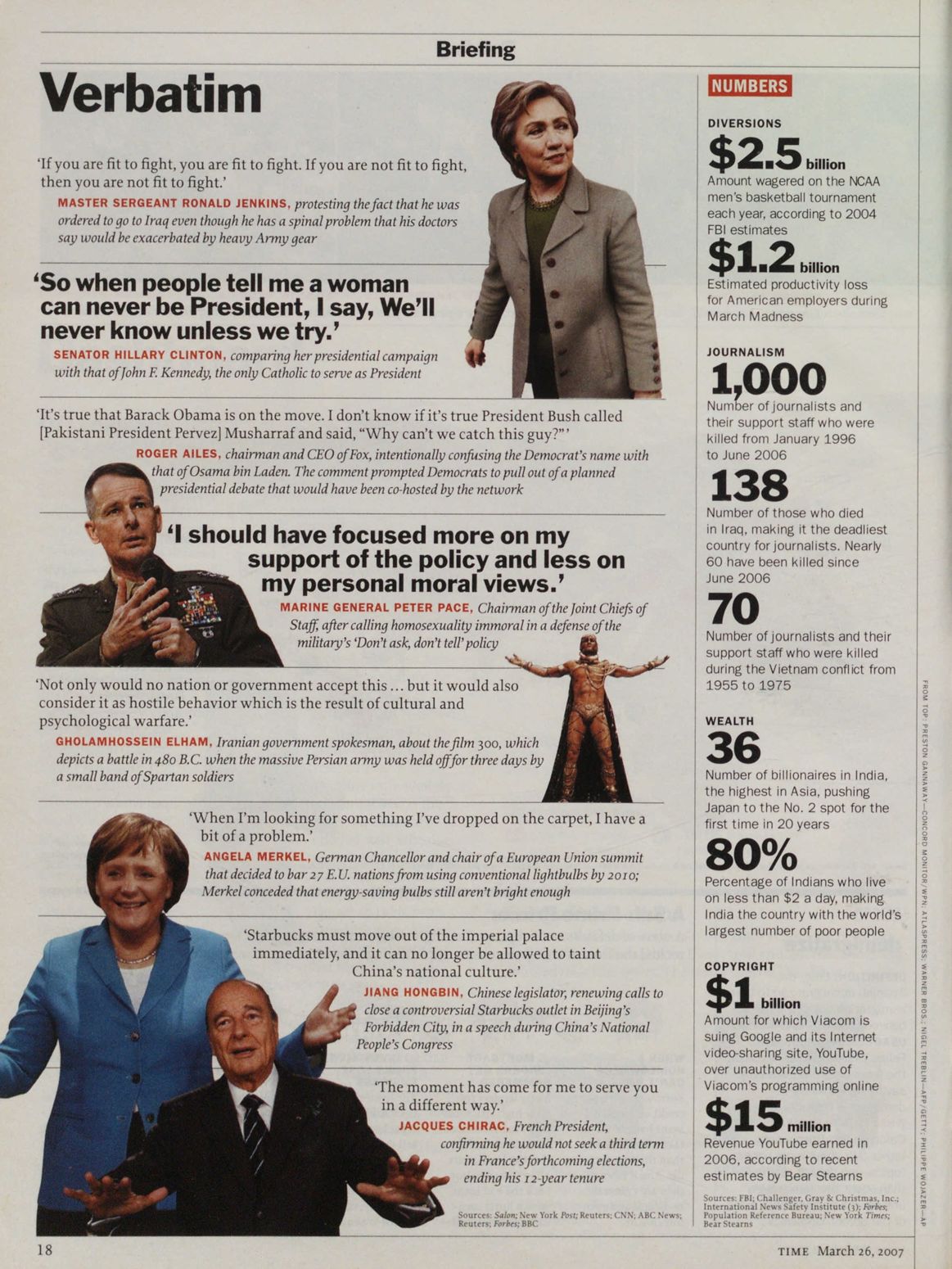
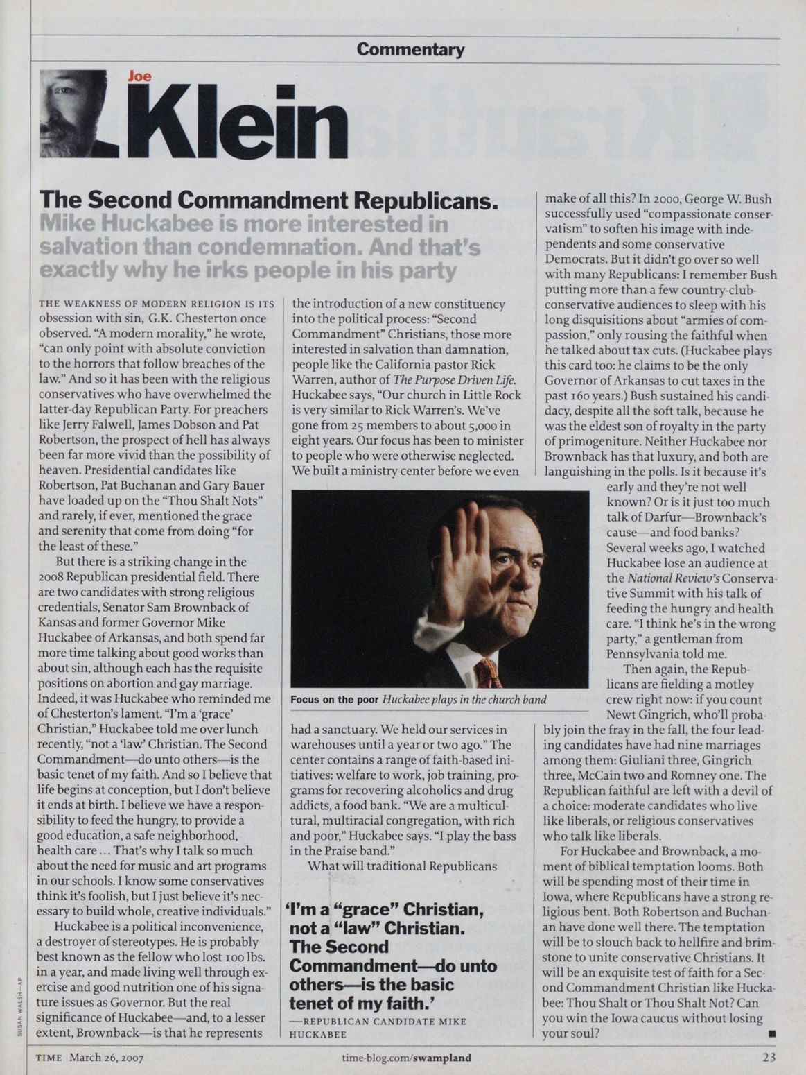
TIME magazine, Mar 26, 2007

This is the first issue of a TIME redesign which features Proforma alongside the long-running Franklin Gothic. Proforma served as the magazine’s main text face until June 2015.
The redesign was led by Paula Scher and Luke Hayman. In a DigitalArts interview, Art Director Arthur Hochstein, who was TIME’s AD from 1994 to the end of 2009, explains the choice of Franklin:
“When [Pentagram’s] Paula Scher and Luke Hayman began their typographic examinations, they looked at other faces, but rather quickly returned to Franklin Gothic as the primary display face.” Franklin was used by Walter Bernard in his 1977 redesign.
“We had Matthew Carter re-envision it as Benton Bold Condensed, which we used up until this redesign,” says Hochstein. “Pentagram felt that Franklin both signified news and reinforced our brand and heritage. They also felt it could be used in a fresh and modern way.”
And Proforma:
For the body face, the team picked Proforma, due to Hayman being strongly committed to a text face that imparted a sense of modernity, combined with ease of reading. “Proforma is a face without a lot of attitude,” says Hochstein. “It’s not derived from classical roman typefaces. It’s more matter-of-fact. My own feeling is that it makes the magazine feel a little more objective, and a bit smarter than its predecessor.”
“More important than any particular type choice, though, was its application in a crisp, disciplined format that de-emphasized type as illustration, that made type part of an overall framework for words and images. We abandoned tinted boxes and coloured type in headlines, which is a great relief. We had drifted much too far in the direction of decorative type, which is the wrong approach for a serious news magazine.”
Deputy Art Directors: Cynthia A. Hoffmann, D.W. Pine.


1 Comment on “TIME magazine, Mar 26, 2007”
OK, you told us what TIME used in articles til 2015. What do they use NOW? I searched “Time Magazine font” (and several variations) but all responses are about the cover title fonts or “New Times Roman”. Your site was 2 pages in and is only partly helpful. Thanks…