Run-DMC logo
From Greg Calvert’s 2016 article on Beats, Rhymes & Type:
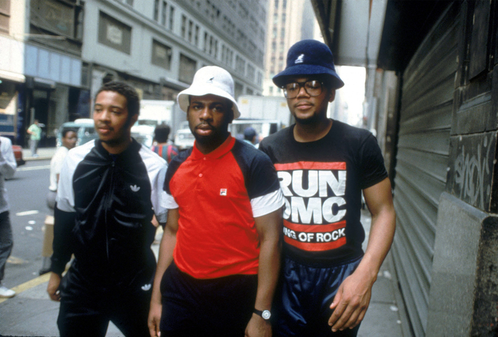
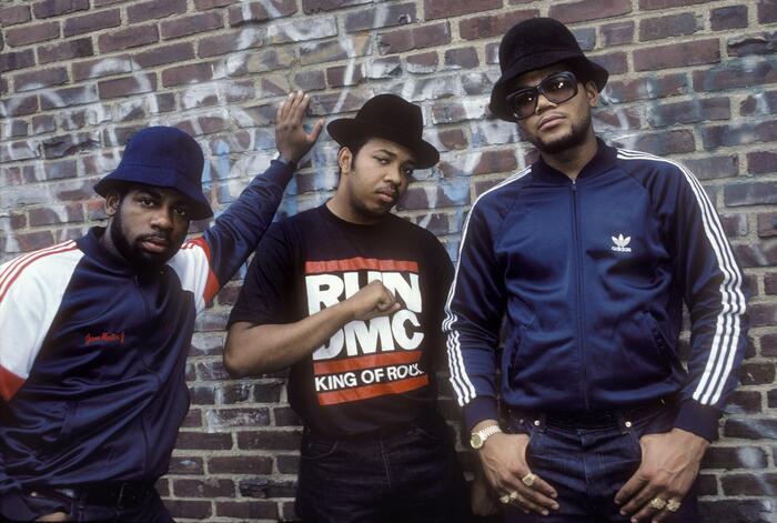
Hats, jackets, shell-toes, and chains. Run-DMC presented a striking and memorable image that resonated with America when they started releasing music in 1983. A group with such a focused identity clearly needed a logo to match. It took a few albums but they finally got one in the form of two thick red lines and six chunky letters set in Franklin Gothic Heavy — a simple visual shorthand for 80's hip-hop cool that’s been remixed and rehashed as much as Milton Glaser’s classic I ♥ NY campaign.
Strangely enough, the logo never appeared on a proper studio album—only singles and compilations. It did, however, appear in the background of the “Walk This Way” video, which dominated the airwaves in 1986 and successfully planted the image squarely in the public’s consciousness.
![Cover of the single “King of Rock”, Island Records (licensed from 4th & Broadway), UK, 1986
[More info on Discogs]](https://assets.fontsinuse.com/static/use-media-items/176/175117/upto-700xauto/635915f2/Run-DMC%20King%20of%20Rock.jpeg)
Cover of the single “King of Rock”, Island Records (licensed from 4th & Broadway), UK, 1986
[More info on Discogs]
Sue Apfelbaum managed to track down the logo’s designer, Stephanie Nash, and interviewed her in 2013 for an article about iconic New York music logos:
Finding out who designed it… that’s tricky. Graffiti artist turned designer Cey Adams, who did the hand-lettering on Run-DMC’s self-titled debut, is often given credit by mistake. When asked, Adams responded, “To this day, nobody really knows for sure exactly who did it. But it was done by a designer in England that did the King of Rock album and the ‘You Talk Too Much’ single [in 1985].” Now the truth is out: Ashley Newton, then the head of A&R at Island Records and now the CEO of Columbia, commissioned the logo from the label’s in-house team, specifically one Stephanie Nash.
Nash, now co-principal of Michael Nash Associates, a London design studio, did not expect any individual credit. “I remember listening [to the music] and thinking how visually typographic it was,” she says via email. “Rap was very inspirational for me at that time: large, meaningful, hard-hitting words used with such power that I had not heard before.” Her choice of the typeface came about simply: “At the time we had a limited number of fonts available, and Franklin Gothic was ‘tough’ and forthright without being old-fashioned or faddish. [It’s a] good, solid, no-nonsense font. Run-DMC’s name helped in having two sets of three letters.” The fact that it’s lasted so long she attributes to MF Benton, the typeface’s designer, and the strength of Run-DMC itself. “If the same graphic had been done for a pop band, it would not have acquired the same kudos.”
![Cover of the single “My Adidas” / “Peter Piper”, Profile Records (US) and London Records (UK), 1986
[More info on Discogs]](https://assets.fontsinuse.com/static/use-media-items/67/66874/upto-700xauto/6356e174/rundmccover-1000x1000.jpeg)
Cover of the single “My Adidas” / “Peter Piper”, Profile Records (US) and London Records (UK), 1986
The logo first appeared on a number of singles that, if the info on Discogs is correct, appeared in 1986. It’s also reproduced on the inner sleeve of some pressings of the King of Rock album from 1985, but it’s not clear when those were issued.
If Nash really used a typeface – as opposed to custom lettering based on Franklin Gothic – it must have been an apocryphal phototype version, and not Morris Fuller Benton’s original design. The letterforms are wider (but not as wide as Franklin Gothic Wide), bolder (compare the counter of C), and, most strikingly, the two stems in U are equally bold. Some later applications do use off-the-shelf Franklin Gothic.
Bruno Tilley, who was a member of the in-house design team at Island Records from 1980 to 1990, also claims (co-)credit. On his website, he writes:
We’d been working with RUN DMC on a campaign and a T shirt was needed. It was put together very quickly without a huge amount of thought. Again it worked so well that the band adopted it as their main logo and trademark.
![Cover of the single “Walk This Way”, Profile Records (US) and London Records (UK), 1986
[More info on Discogs]](https://assets.fontsinuse.com/static/use-media-items/176/175012/upto-700xauto/6356bfe5/115842637.jpeg)
Cover of the single “Walk This Way”, Profile Records (US) and London Records (UK), 1986
[More info on Discogs]

Still from the video for “Walk This Way”, with the logo painted on the wall. The letterforms in this version don’t match the logo, or Franklin Gothic, for that matter.

Another still from the video for “Walk This Way”: Steven Tyler of Aerosmith has broken through the wall that separates their rehearsal room from the neighboring studio by Run-DMC. Guitarist Joe Perry takes a peek through the hole where the U once was.
![Cover for Crown Royal (2001), the final album by Run-DMC before they disbanded in November 2002. This is again off-the-shelf Franklin Gothic. [More info on Discogs]](https://assets.fontsinuse.com/static/use-media-items/176/175010/upto-700xauto/6356c209/Crown%20Royal.jpeg)
Cover for Crown Royal (2001), the final album by Run-DMC before they disbanded in November 2002. This is again off-the-shelf Franklin Gothic. [More info on Discogs]
Formats
- Object/Product (790)
- Branding/Identity (5447)
- Album Art (2875)
Topics
- Fashion/Apparel (1097)
- Music (4355)
Designers/Agencies
- Stephanie Nash (1)
- Bruno Tilley (1)
Tagged with
- band/artist logos (149)
- hip-hop/rap (183)
- red and black (863)
- black and white (1598)
- stacked lines (202)
- over- and underlined (75)
- 1980s (473)
- one typeface (1479)
- Island Records (32)
- Adidas (7)
- Run DMC (1)
- lettering derived from typeface (539)
- 4th & Broadway Records (1)
- Profile Records (1)
- London Records (9)
- single records (718)
- album records (1747)
- iconic uses (104)
Artwork location
- United Kingdom (2381)
- United States (7135)
- London (1330)
- New York City (1965)


























2 Comments on “Run-DMC logo”
Thanks Florian and Matthijs for putting all this work into my old submission! Beautiful, a use for the ages!
You’re most welcome, Garrison! An iconic use – thanks for suggesting a post about it. Sorry that it took us so long. I’m happy we finally managed to flesh it out, just in time for Nick’s Franklin talk.