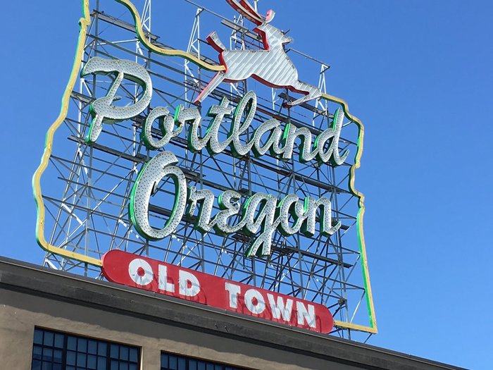
“Portland Oregon: Old Town” sign
Portland, Oregon’s “White Stag” sign represents a gradual erosion of lettering over its 60 years. What remains is mostly Brush Script.
The sign was originally erected in 1940 as an advertising sign for White Satin Sugar. It was repurposed in 1957 for White Stag Sportswear using a new style of lettering, and again in 1997 for Made In Oregon which introduced some Brush Script into the mix. The sign was acquired by the city in 2009 and it was soon redesigned to read “Portland Oregon”.

The White Stag sign, with its hand lettering as sprightly as the deer, stood this way for 40 years: 1957–97.
While some of the 1957 letterforms were preserved during the two recent transformations (e.g. ‘e’ and ‘g’), most of today’s sign uses Brush Script, which has only a passing resemblence to the energetic, angular forms of the White Stag original.
Personally, I wish they had hired a lettering artist to emulate the unique style of the White Stag original rather than resort to a font that has no special connection to the place, nor fit as well with the lines of the deer artwork — but not everyone is as picky: “In 2011, Ramsay Signs’ work on the redesigned sign won the company First Place in the Historic Reproduction category of an annual design competition held by the International Sign Association.”
Formats
- Signs (1392)
Topics
- Local (833)
- Governmental/Civic (451)
Designers/Agencies
- Ramsay Signs (1)
Tagged with
- restoration (4)
- redesign (369)
- Portland (7)
- type on an angle (782)
- critique of use (81)
- neon (116)
- type emulating lettering (19)
- award winners (145)
- modified typeface (1146)
- stags (4)
Artwork location
- United States (6378)
- Portland (71)





















3 Comments on ““Portland Oregon: Old Town” sign”
This Berlin sign, on the other hand, incorporates Brush Script more successfully. For one, the neon is in a center line (not the outline), which reduces the blobby effect of the face.
Brush Script really works better when it is solid color on whatever surface, and the outline isn’t emphasized.
Great piece, Stewf!
Yet… they didn’t completely ditch the original lettering for the “Portland Oregon” remake. They kept the original e and g, quite different from Brush Script. They also tweaked the n quite a bit.
Yes, I do mention the ‘e’ and ‘g’, but I missed the ‘n’. Thanks!