
Cabaret Musical
Contributed by Florian Hardwig on Apr 10th, 2012. Artwork published in
.

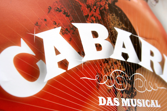
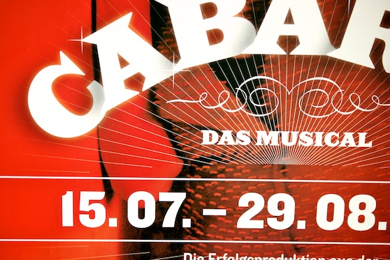
Type on an arc, with overlapping letters and drop shadows in-between – what sounds like a recipe for disaster actually makes for a strong word mark, and a striking poster. The guys from Berlin-based studio Upstruct know their craft. For Cabaret, a musical at Tipi/Bar jeder Vernunft, they mixed alluring photography with H&FJ’s bold Latin named Saracen. The letters are fanned out and enhanced with subtle shades and reflections, to evoke spatial depth. Season to taste with Knockout – a Grotesque from the same foundry – and you have a contemporary eye-catcher, with a reference to vintage circus and theater posters.


")


")


")


")


