
Source: www.flickr.com Uploaded to Flickr by ed and tagged with “nobel”. License: All Rights Reserved.
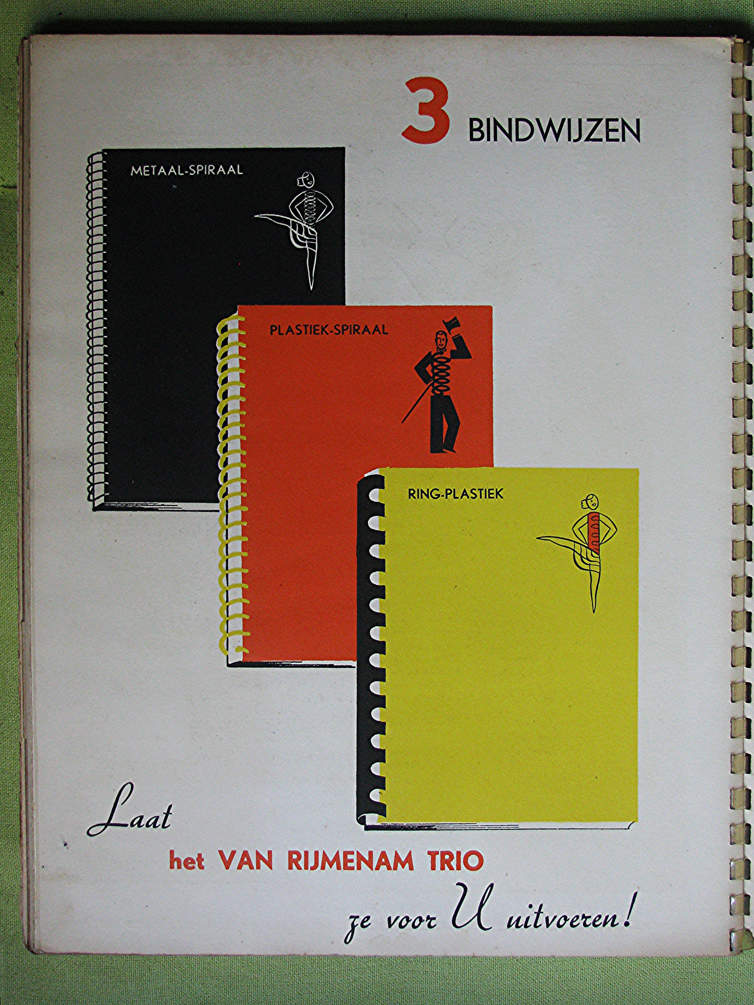
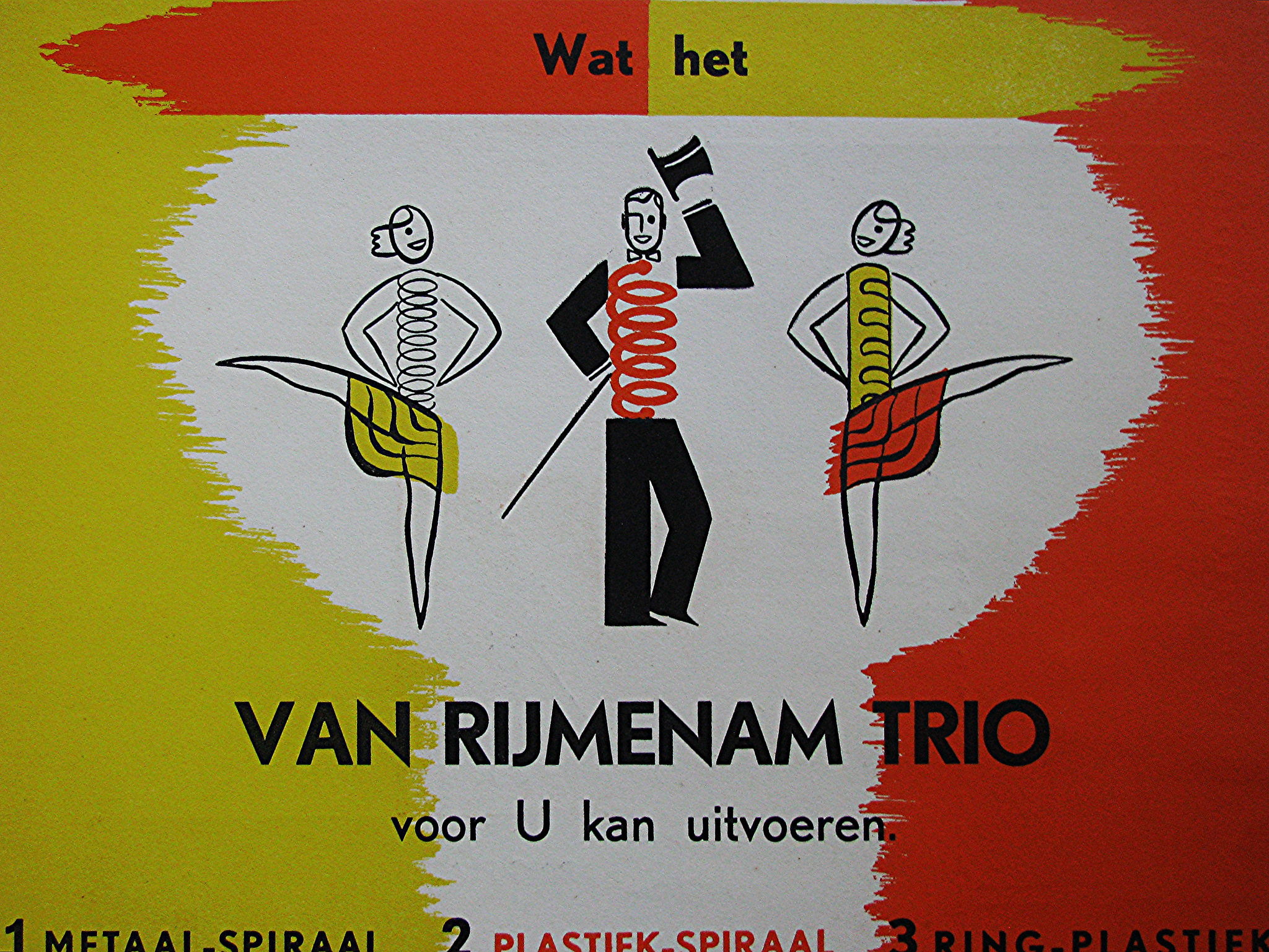
Ad in Drukkers Weekblad (Printers’ Weekly), Christmas edition 1938, presenting the three binding methods offered by H. van Rijmenam’s bookbindery, Oranjelaan 21, The Hague.

Source: www.flickr.com Uploaded to Flickr by ed and tagged with “nobel”. License: All Rights Reserved.
Source: www.flickr.com Uploaded to Flickr by ed and tagged with “nobel”. License: All Rights Reserved.


1 Comment on “Van Rijmenam Trio”
The messy alignment of the bold caps suggest that Amsterdam’s Vette Nobel came with several alternates — like ‘A’, ‘M’, ‘N’ both with pointy and blunt terminals — which were mixed unfavorably in this use. Can anyone confirm this?
Here’s a specimen of the double-lined Open Nobel-Kapitalen that shows an ‘M’ with splayed legs alongside one with parallel stems. At least these alternates were included in other styles, too.
While FB Nobel has blunt terminals, DTL Nobel is distinguished by pointed apexes in ‘AMNVW’ across all styles.
P.S.: On their Nobel page, DTL shows a scan of a specimen by Lettergieterij Amsterdam. It lists alternate “spitse kapitalen” (pointy capitals) for ‘AMNVW’ which were available on request only. Furthermore, Andrea Fuchs and Fred Smeijers note that Nobel’s letterforms differ considerably across the various sizes.