D-Day leaflets

General Dwight D. Eisenhower’s D-Day message, Order of the Day: 6 June 1944.
This day marks the 74th anniversary of the landing operations of the Allied invasion of Normandy in Operation Overlord during World War II, commonly referred to as D-Day. From Sue Walker White:
My dad Robert William Bishop took part in the D Day landings, he landed on Gold Beach near Arromanches. Here is a copy of the leaflet he was given just before he set sail in a landing craft. He was in France for around 2 weeks before he was blown up by a mortar bomb, and was taken back on a hospital ship.
The leaflet shown above was produced by His Majesty’s Stationery Office (HMSO) and is set in some Caslon version (Imprint? see comments), with Gill Sans used for the heading.
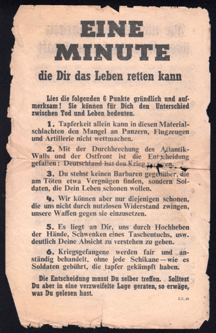
Z.G.45 — “Eine Minute die Dir das Leben retten kann” (One minute that can save your life). The typography combines Welt-Antiqua fett (Ludwig & Mayer, 1934) for headline and numbers with Rockwell 359 Bold Condensed (Monotype, 1935) and Times Bold (can you spot the odd g out?). The earlier Z.G.23 shows basically the same typographic setup. The text has been reset, though. The personal pronouns (“Du”, “Dir”, “Dich”) now are capitalized. The later Z.G.73K changes to Pabst Extra Bold with Cheltenham, Memphis and Gill Sans.
This leaflet was dropped on the German troops telling them how to surrender and that they will be treated well as prisoners of war. It was picked up by my Dad as he took part in the D Day landings 6th June 1944.
The “One Minute” leaflet is part of the ZG series produced by the Psychological Warfare Division (PWD) of the Supreme Headquarters Allied Expeditionary Force (SHAEF),
… a joint Anglo-American organization set-up in World War II tasked with conducting principally “white” tactical psychological warfare against German troops in Northwest Europe during and after D-Day. […] The bulk of the aerial propaganda leaflets were printed in the United Kingdom and a dedicated Special Leaflet Squadron of the US 8th Air Force disseminated the leaflets from its base in Cheddington in south-east England.
PsyWar.org states that this Z.G.45 is a reprint of Z.G.23, again reprinted as Z.G.73K in Paris:
This is probably the most successful single PWD combat leaflet of the Western campaign, judging from the returns of prisoners. It is a “battle-type” leaflet, designed for hard defensive fighting (from the German point-of-view). Its lack of any political appeal, and its short-term soldier-to-soldier language may have been responsible for its success.
A copy of this leaflet is also preserved in the Deutsches Historisches Museum.
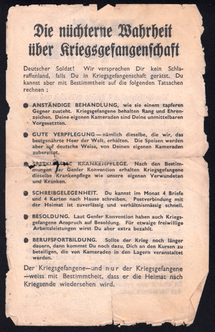
Z.G.45 — “Die nüchterne Wahrheit über Kriegsgefangenschaft” (The sober truth about being POW).
The blackletter is Schmalfette (Frankfurter) Fraktur, Monotype series 187, from c. 1930. It is somewhat similar to the schmalfett cut of Bernhard-Fraktur (1912). Note that the heading makes correct use of the long ſ and round s as well as of the ch ligature. The text in Gill Sans doesn’t use the eszett (ß) in “verhältnismäßig”, “weiß”, “daß”. The last paragraph features letterspacing for emphasis (“nur”).
In memory of all allied service members who fought and sacrificed their lives against the perils of Nazi Germany, on D-Day and beyond.
Formats
- Posters/Flyers (3507)
Topics
- Governmental/Civic (452)
- Other (190)
Tagged with
- D-Day (2)
- World War II (35)
- Allied Expeditionary Force (1)
- Dwight D. Eisenhower (1)
- leaflets (30)
- war (36)
- 1940s (73)
- propaganda (20)
- psychological warfare (1)
- German (language) (1320)
- lists (165)
- bullets (51)
- letterspacing for emphasis (21)
- blackletter (182)
- uncertain typeface ID (160)
- history (293)
Artwork location
- France (1521)
- United Kingdom (2142)



















3 Comments on “D-Day leaflets”
Several sources show a different version of Eisenhower’s D-Day message, with the heading set in ATF Spartan instead of Gill Sans, and a slightly different text typeface distinguished by oldstyle numerals and a narrower f and s, among other details.
This comparison shows another copy of the leaflet depicted above (left; courtesy of Stephanie W., Clarington Community) and a copy of this other version (right; U.S. National Archives and Records Administration, via Wikimedia Commons). Curiously, the linebreaks as well as the large gaps after some sentences are the same. Due to the different typefaces, the line lengths don’t match, though. What is this — a later resetting, emulating the quirks of the original?
This close-up shows some of the differences between the two text typefaces. The top version might be in Imprint (series 101) by the English Monotype Corporation — can anyone confirm this? The bottom version appears to be Caslon by the American Mergenthaler Linotype Company.
I had assumed that the first image must be Imprint (it was recommended the following year as a standard face for government publications)–almost all the characters seem right but a numeral is wrong; Imprint’s lining 9 has no bulb at bottom left. Monotype’s Caslon 128 is the same, and (I was wondering if this was borrowed from another font now) their Baskerville has the right 9 but the wrong 4 (flick upwards at the end of the horizontal), so I’m a bit stumped. I’m not sure of any other likely candidates. (Except Intertype’s Imprint release Period Old Style? I don’t have a specimen with numerals handy but it seems to be a near-exact copy, so close I can only assume Intertype licensed the drawings.)
Wow, thanks for digging, Blythwood! I had hoped you would chime in. Much appreciated.
Looks like we can rule out Period Old Style. Here’s a snippet from the Some Type Personalities specimen by Intertype Ltd. in Slough (scan courtesy of Hans Reichardt):