An independent archive of typography.
Made possible by sponsors like Mark Simonson.
Sign in to participate.
Topics▼ |
Formats▼ |
Typefaces▼ |

















9 Comments on ““Prym’s neuester Schlager!” ad”
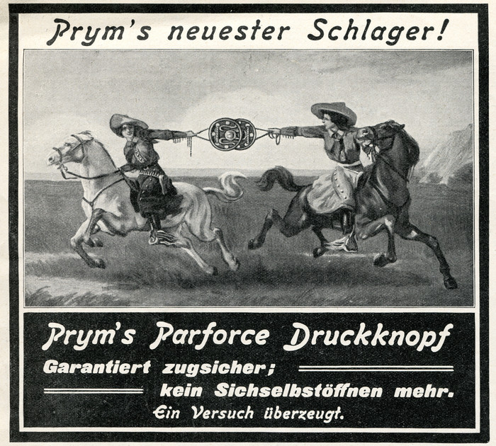
An italic grotesque face at the bottom is nearly identical to Old Gothic Bold Italic.
I agree; it is some version or relative of the face that was also known in Germany as Fette Kursiv Grotesk. Albert-Jan Pool has gathered some of its history. I’ve added the typeface credit, even if it’s not a perfect match. Thanks!
If you look at the Old Gothic Bold Italic /r in this sample, its terminal ends in a flat, horizontal line. In a lot of specimens of the Old Gothic Bold Italic design – at least as it originated in Germany – the /r is different. The terminal ends is a diagonal. I can’t prove it, but I think that both versions of the /r existed from the very beginning: I think that J. John Söhne’s Fette Kursiv Grotesk may have had two different /r sorts available in most (or all?) sizes.
My design for Flight Center Gothic focuses mostly on streamlined forms of letters like the ‘r’ – based partially on drawings from the Saarinen papers at Yale – but the font does also include some stylistic alternate glyphs sticking closer to the more complex grotesque forms that seem more typical in earlier predecessors. I would be very curious to know if/what alternates existed for the original Söhne fonts in the late 1800s!
Nick, I have terrible quality, not-straight, low-light iPhone photos of Fette Kursiv-Grotesque in pre-WWI German specimens, probably one each from each of the foundries that carried it. I will look through them again, and can send them to you, but IIRC I only ran across the /R, /a, and /G from your lower line. As well as both of the /r versions (but not ever on the same page, I think). /y does not come up in specimens a ton, generally, because it is used in German so seldomly.
I’ll look for specimens of Fette Kursiv-Grotesk at Letterform Archive this week, but here’s what I’ve been able to gather from the online specimens so far:
While the angle-terminal ‘r’ is the most commonly seen form in Fette Kursiv-Grotesk, the flat-terminal ‘r’ is found in Nebiolo’s Etrusco, and isolated in specific size showings of other versions (e.g. 24pt Washington), which is what leads to confusion in identification.
The curve-leg ‘R’ is in all versions of Fette Kursiv-Grotesk (and Doric and Washington), while the straight-leg ‘R’ was introduced only by Amsterdam in their Vette Antieke Cursief (Old Gothic Bold Italic). Due to this consistent and visible difference I’ve split Amsterdam’s type from the John original.
The version used in Depero-Futurista has a flat-terminal r, but Nebiolo’s Etrusco corsivo nerissimo as shown in mid-20th century specimens has an r with diagonal terminal. Here’s a glyph set from an undated (post 1961) edition of Collana Nebiolo (courtesy Hans Reichardt):
Thanks for that, Florian. It does seem that later versions of the type do have a consistent ‘r’ form. Here’s a 1911 specimen from AG für Schriftgießerei which shows the flat ‘r’ on the 6pt only.
I should have checked all the sizes. In the Nebiolo specimen mentioned above, Etrusco corsivo nerissimo is shown in 6, 8, 10, 12, 16, 20, 28, 36pt. The sizes exhibit small differences for some glyphs (e.g. a), and indeed the 6pt (and only this cut) here has a flat r, too.