Heinrich Bernhardt invoice, 1940

Now that we’ve seen some invoices in Erbar-Grotesk and its inline precursor Phosphor, it’s time for one where the two related faces were paired, right? Wrong — this is Reflexschrift Helios, a Phosphor follower released in 1928 by the Ludwig Wagner foundry in Leipzig.
Helios is an all-caps face with geometric sans serif letterforms, too, and similar in weight to Jakob Erbar’s design. However, it takes the idea one step further, and ingeniously doubles the inline effect. The naming tops it, too: Helios is not just licht (bright) or phosphorescent, but the sun itself.
Less popular than Phosphor, Helios didn’t make it to the phototype era, and — to my knowledge — has not been digitized yet either. CastleType’s Zamenhof Inverse is probably as close as one gets.

Zamenhof Inverse is much lighter, with a less compact C. The lines in ‘A’ or ‘B’ reveal that it was not designed to be used separately, but in combination with other styles of the series, for chromatic effect.
Typewriter buffs may note that a special script form has been used for the ‘M’ in the currency: Rℳ for Reichsmark.
The main products of this factory were leather driving belts. This is directly reflected in the logo, which shows the letters ‘HBE’ (Heinrich Bernhardt, Erfurt) tied together with a driving belt.
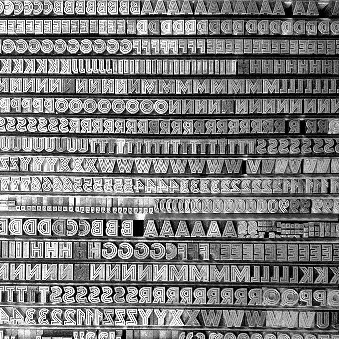
The real Helios can be found in the collection of the p98a letterpress workshop in Berlin. This snapshot of a case with metal sorts in two sizes reveals that the fonts have more to offer than only caps: there are numerals, punctuation marks, and even section signs (§).
Typefaces
Formats
- Branding/Identity (4771)
- Ephemera (789)
Topics
- Product (996)
- Technology (898)
Tagged with
- invoices (42)
- letterheads (258)
- 1940s (73)
- typewriters (69)
- metal type (108)
- borders and rules (667)
- German (language) (1321)
- job work (177)
- Nazi Germany (32)






















4 Comments on “Heinrich Bernhardt invoice, 1940”
Great post. What makes Helios so appealing to me is that the white inline is thinner than the black strokes, giving it an “illuminating” effect. It’s appropriately named.
RMU has recently released a digitization of Helios, under the name Reflex Pro. It appears to be largely faithful to the original, with some exceptions, most notably in ‘Q’ — now with descending stroke, a detail that was unfeasible in metal —, the streamlined ‘U’, and also in letterforms like ‘P’: In the original, the bowl has a more continuous curvature, without horizontal segments in any of the three lines.
Revivalist Ralph M. Unger credits the original design of Reflexschrift Helios (1928) to Hans Möhring, but doesn’t state any source for this information. In the 1920s, Möhring was a freelance type designer in Leipzig, so it is quite possible that he provided this design to Ludwig Wagner. His credited typefaces were made for various foundries — Genzsch & Heyse, Stempel, Woellmer, Schriftguss — but a connection to Wagner is not known. Möhring had designed the related Elegant-Grotesk licht for Stempel in 1929.
I note two things:
1) This Erbar does have a square i-dot – it seems most other versions I have seen have a round i-dot.
2) The lowercase t is somewhat squat. I read there were two versions of Erbar-Grotesk with different heights. Beside the i-dots, this one looks much closer to a font I have seen in a 1962 book (“How to be brief” by Rudolf Flesch).
Hi Klapaucius,
mmh … it’s true that Erbar-Grotesk came in various forms, including a second set with a lower x-height and several alternate forms, and later more alternates/revised forms that brought the design closer to Futura. However, as far as I can tell, the only version with round dots is Erbar’s original sketch, before it was worked into a typeface. You can read more about the history and see the mentioned sketch in Indra Kupferschmid’s article for CJ Type. Both the square dots and the t as seen on this invoice match the showings of Erbar-Grotesk (fett) in original specimens. URW’s digitization follows these shapes as well.