
Tazo identity and packaging
Contributed by Barry Parker on Dec 3rd, 2016. Artwork published in
.
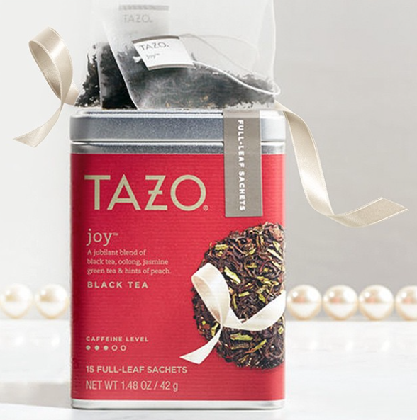
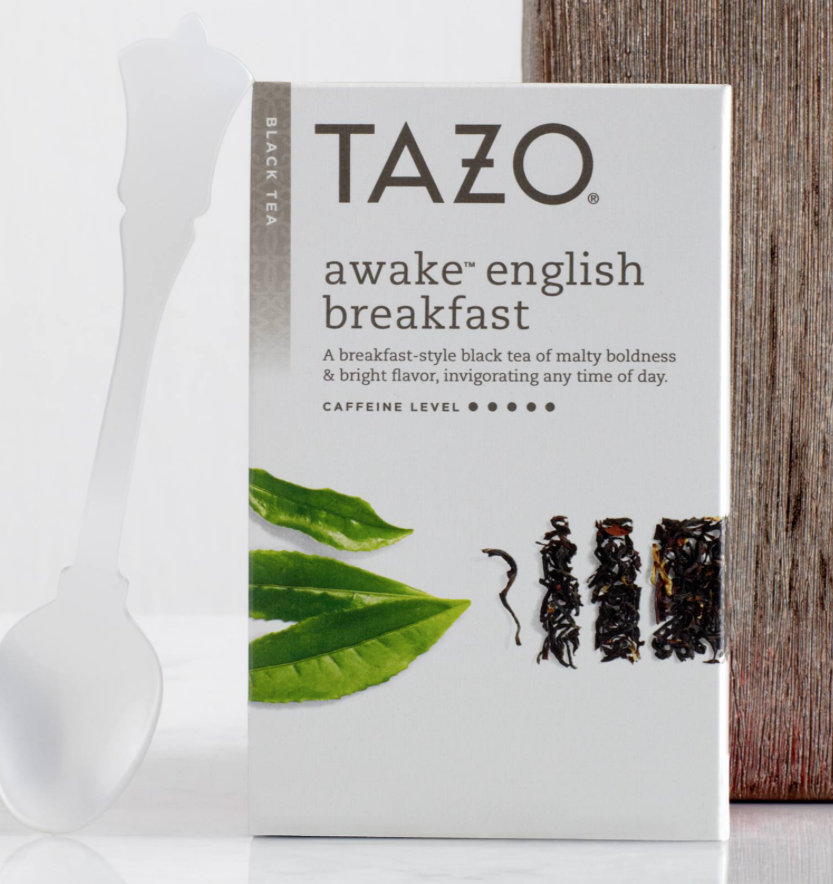
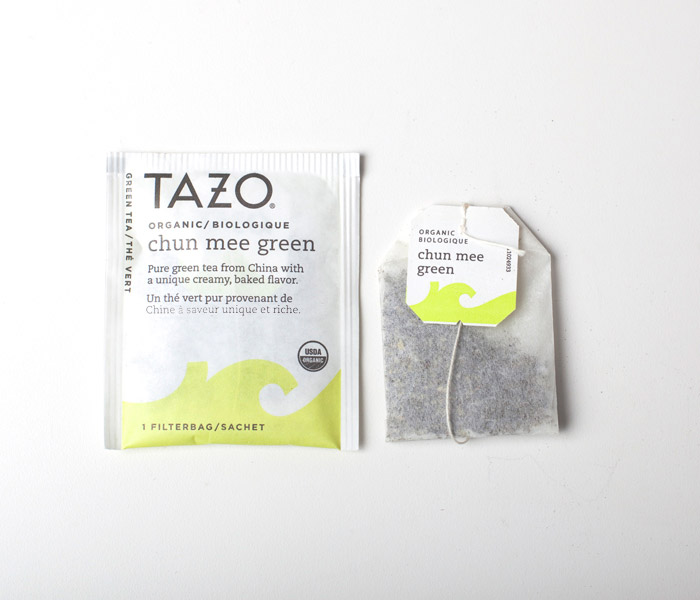
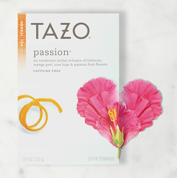
One of my favorite brand identities ever was the original Tazo line, designed in 1994 by Sandstrom Partners. Starbucks purchased Tazo in 1999 and did a full, in-house rebrand that was launched in 2013.
The newer look is minimal and modern, optimized for shelf visibility. The crossbar through the Z nods to the original design, though most of the mystical quality of the original Tazo design is gone. Still, a lovely and enduring approach that still feels more poetic than generic.
The Dieline has additional information.
Starbucks Corporation. License: All Rights Reserved.


")


")


