
On Type & Lettering by Vladimir Favorsky
Contributed by Rustam Gabbassov on Dec 5th, 2016. Artwork published in
September 2016
.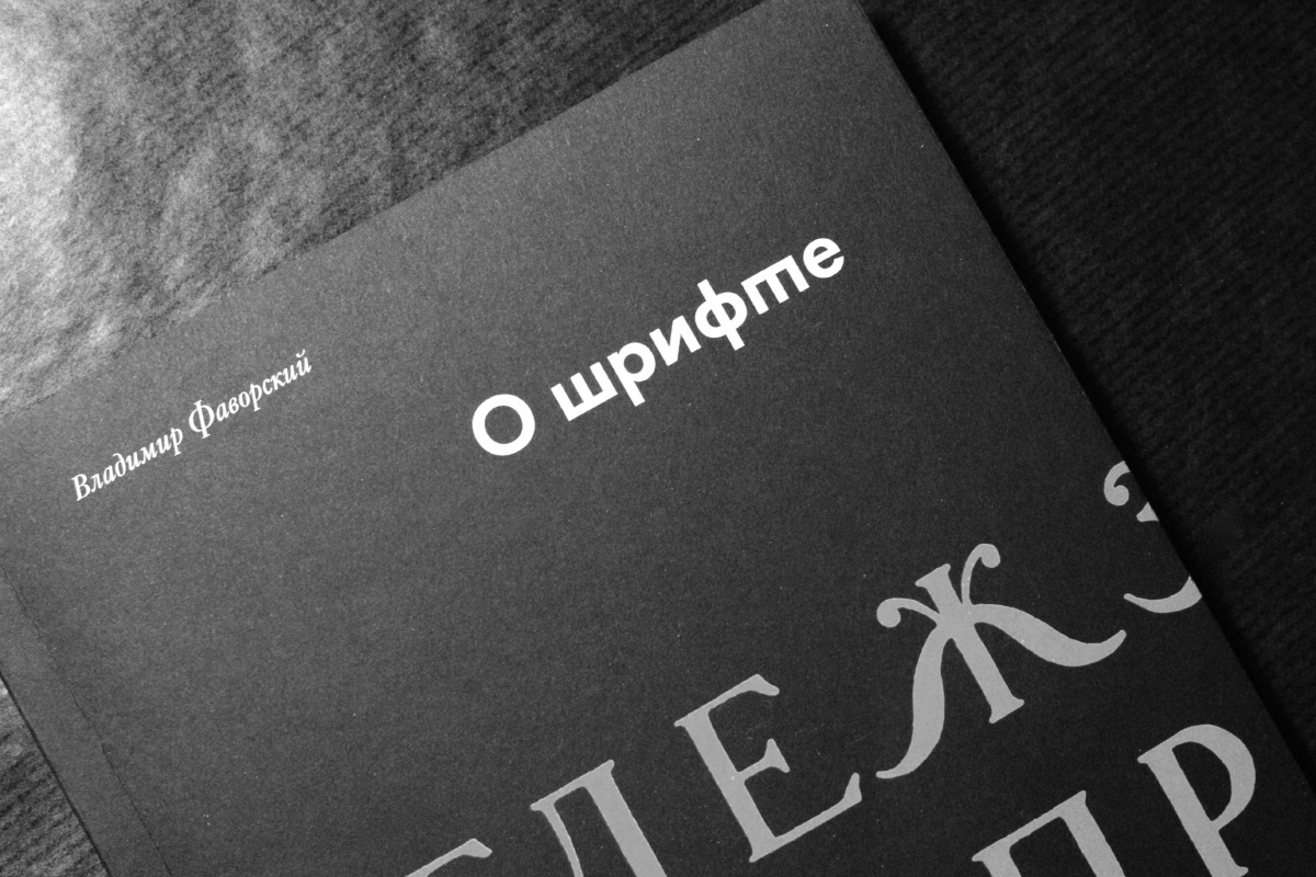
Photo: Rustam Gabbassov. Schrift Publishing. License: All Rights Reserved. Artwork by Rustam Gabbassov.
Futura Cyrillic with alternates. The typeface was designed by Vladimir Efimov and extended by Eugene Yukechev. The Cyrillic alternate glyphs as well as the oldstyle figures are inspired by Paul Renner’s work.
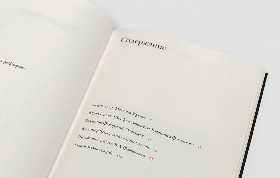
From Vladimir Favorsky’s On Type & Lettering (Владимир Фаворский: О шрифте). Second edition. Schrift Publishers, Moscow, 2016.
Watch Rustam and Eugene talk about Rediscovering Russian Typographic Heritage at Typographics 2021. Fonts In Use is proud to be a media partner of the conference. See more work by speakers of the 2021 edition.
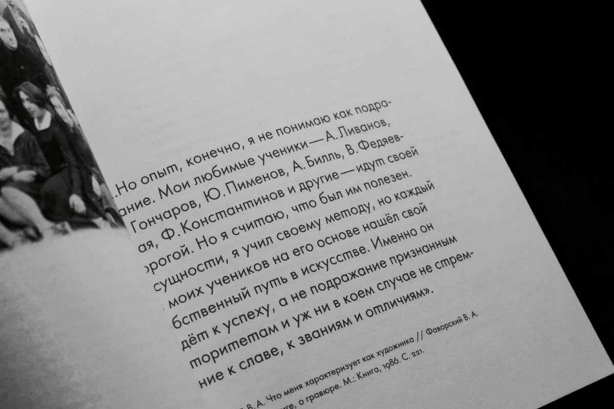
Photo: Rustam Gabbassov. Schrift Publishing. License: All Rights Reserved. Artwork by Rustam Gabbassov.
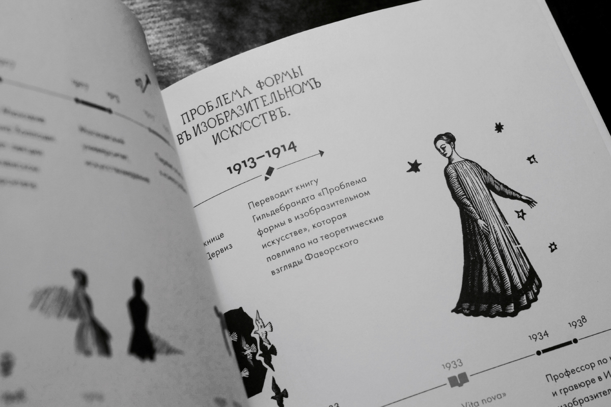
Photo: Rustam Gabbassov. Schrift Publishing. License: All Rights Reserved. Artwork by Rustam Gabbassov.

Source: typejournal.ru Photo: Rustam Gabbassov. Schrift Publishing. License: All Rights Reserved. Artwork by Rustam Gabbassov.

Source: shop.typejournal.ru Photo: Rustam Gabbassov. Schrift Publishing. License: All Rights Reserved. Artwork by Rustam Gabbassov.
Source: shop.typejournal.ru Photo: Rustam Gabbassov. Schrift Publishing. License: All Rights Reserved. Artwork by Rustam Gabbassov.


")


")


, 27 April 2013")


")


5 Comments on “On Type & Lettering by Vladimir Favorsky”
Rustam, which version of Futura has been used here — is it a customized one? I see that there are various versions of Futura with Cyrillics on the market: ParaType has Futura PT and Futura Futuris, and some styles of Tilde’s Futura (based on Bitstream’s) have been equipped with Cyrillics, too. Are there more options? Can you comment on the differences? Which Futura Cyrillic is the best one, in your opinion?
According to ParaType, Futura Futuris was designed in 1991 by Vladimir Yefimov, with condensed styles added in 1993 by Vladimir Yefimov and Alexander Tarbeev. The family spans 12 styles, including Cameo and Shadow versions.
The first 8 styles of Futura PT were developed in 1995 by Vladimir Yefimov. Additional styles were made in 2007 by Isabella Chaeva, and the previous styles were partly revised to match the whole family, now spanning 22 styles (7 weights plus 4 condensed weights, all with obliques).
Florian, you’re right, we use customized Futura PT made for the Type Journal web-site (and publishing house Schrift later). We added the old style figures (designed by Eugene Yuckechev) to the text version and some eccentric glyphs to display version for the chapters. Also some technical review (hinting, metrics) was made for the web version.
It’s kind of complicated but the last one cyrillic Futura from ParaType library is the best one. Originally Cyrillic version of eight styles (Futura, under contract to BauerTypes) was developed at ParaType (ParaGraph) in 1995 by Vladimir Yefimov. That was redesigned version of Futura Futuris developed in 1991 by Vladimir Efimov (condensed styles were added by in 1993 by Vladimir Yefimov and Alexander Tarbeev). And then at 2007 Isabella Chaeva redesigned this version for ParaType with additional 5 bold and 8 condensed styles. According to ParaType “now the new Futura is an uniform type system consisted of seven weights with corresponding obliques plus eight condensed styles. All these fonts are coordinated in letterforms, metrics, and weights to better working together.” So in my opinion this Futura is the best one.
I never use Tilda’s Futura and can’t comment it.
Rustam, большое спасибо!
It is interesting to see that you incorporated a glyph similar to Renner’s initial ‘m’ for ‘т’. There is a current thread on the Typedrawers forum about mixing and matching italic and roman shapes in Cyrillic fonts.
Florian,
The shape of lowercase letter “т” that reminds latin “m” or cyrillic italic “т” rather eccentric and never uses actually in cyrillic text composing now, if it is not historical stylization. But we did it because of Favorsky’s prose style — it is quite eccentric too. So when we designed the book layout, we wanted to add to the layout a bit of glitch.
Interestingly enough, that “t=m” variation was familiar to the Russian reader from the beginning of the XVIII (from the Petrine reform of the Civil type) to the XIX.
Image from the Maxim Zhukov’s essay “The Peculiarities of Cyrillic letterforms”
As for mixing and matching italic and roman shapes in cyrillic fonts or display typography, there are good experiments on upright italics, see for example Ilya Ruderman’s Vander, but in most cases it looks rather confused than being a meaningful choice.
Very nice, thank you for the detailed explanation!