Madonna – Like A Virgin album art
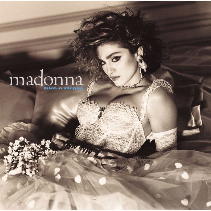
Madonna* on the album cover photography:
I have always loved to play cat and mouse with the conventional stereotypes. […] People were thinking who was I pretending to be—the Virgin Mary or the whore? These were the two extreme images of women I had known vividly, and remembered from childhood, and I wanted to play with them. I wanted to see if I can merge them together, Virgin Mary and the whore as one and all. The photo was a statement of independence, if you wanna be a virgin, you are welcome. But if you wanna be a whore, it’s your fucking right to be so.”
*) in Debbi Voller: Madonna: The Style Book, via Wikipedia
I wonder whether the font pairing was meant to subtly echo this dichotomy on a typographic level, too — here the graceful Centaur, there the debauched Primus. The former has been advertised as “The Noblest Roman of Them All”, and praised as “unequaled” (Max Caflisch). For its first fifteen years, Centaur was exclusive to the Metropolitan Museum of Art, and unavailable to ordinary printers. Primus, on the contrary, is characterized in the specimen as “rank, weighty, captivating” (kraftvoll, gewichtig, fesselnd), exhibiting the skills of the “commercial artist” (Merkantil-Lithograph). It is pitched to customers in bright red as being serviceable “for jobbing work, magazines, ads, posters, jackets, packaging, labels, records, calendars”.
Art direction: Jeffrey Kent Ayeroff, Paula Greif
Art direction, design: Jeri McManus [Heiden]
Photography: Steven Meisel (Source: Discogs)
Designed by Friedrich Berthold in a single style and first cast in 1962, Primus was available from Berthold Fototypes in the 1980s. To my knowledge, it hasn’t been digitized yet. Priamos (Brendel, 1974–1978, available from SoftMaker and TypeShop) expands the design into 7 weights. Its boldest weight is not as heavy and wide as the original Primus, though.
Formats
- Album Art (2587)
Topics
- Music (3861)
Designers/Agencies
- Jeri Heiden (3)
- Jeffrey Kent Ayeroff (2)
- Paula Greif (1)
Tagged with
- Madonna (4)
- all lowercase (592)
- Sire Records (4)
- contrasting sizes (352)
- 1980s (428)
- pop music (263)
- high profile (511)
- contrasting typefaces (286)
- vinyl records (2227)
- 1980s albums (35)
Artwork location
- United States (6341)


