
“Learn German” posters, Webster University
Contributed by Kat Gilbert on Jan 17th, 2017. Artwork published in
.

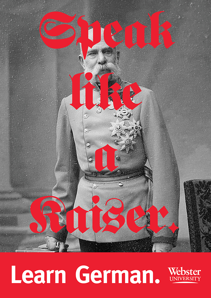
Photo: Kat Gilbert. PD-US Photo cred: Ferdinand Schmutzer. License: All Rights Reserved. Artwork by Kat Gilbert.
To emphasize the German-ness, only German fonts were used: Fette UNZ Fraktur (Peter Wiegel’s version of the classic Fette Fraktur) and Erik Spiekermann’s FF Meta.
Webster University’s Vienna branch has mostly American and International students. Though classes and everything within the campus is held in English, students are encouraged to integrate themselves into Vienna’s social and cultural life by learning the indigenous language.
The copy for these posters was intended to be cheeky and successfully pushed more of Webster’s students to participate in German classes.
License: All Rights Reserved. Artwork by Kat Gilbert.

License: All Rights Reserved. Artwork by Kat Gilbert.

License: All Rights Reserved. Artwork by Kat Gilbert.
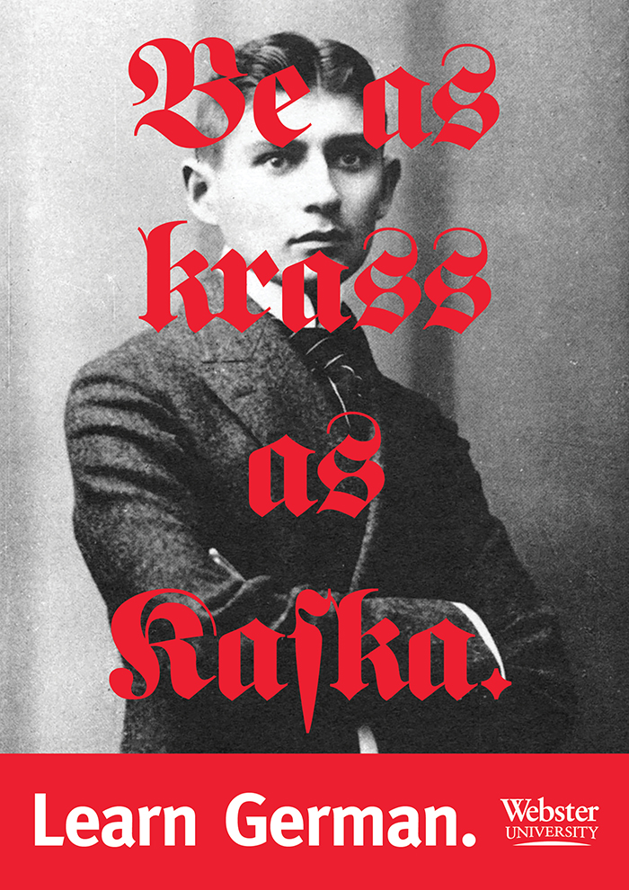
“Krass as Kaſka” — that’s not an ‘f’.


 and <cite>Tote schlafen fest</cite> (1972) movie posters")


2 Comments on ““Learn German” posters, Webster University”
It’s actually sort of jaw-dropping to see German language education posters promoting the subject in a way connected with ideas of German tradition – this has been, for understandable reasons, unthinkable in the UK. Maybe more possible to contemplate now. (Many teachers of German in the UK until very recently were children of refugees - my favourite German teacher was the daughter of a Viennese Jewish dentist, for instance.)
The typographic code of blackletter in general and often Fette Fraktur in particular for Old Germany incl. Nazi Germany has enjoyed great popularity especially in the UK. What’s new here is the affirmative self-ironic use, no?
That’s pretty much the same path Sigmund Freud had to take, the first character in this diverse line-up of German speakers.