
Fuhrgeschäft Arno Heinrich invoice, 1939
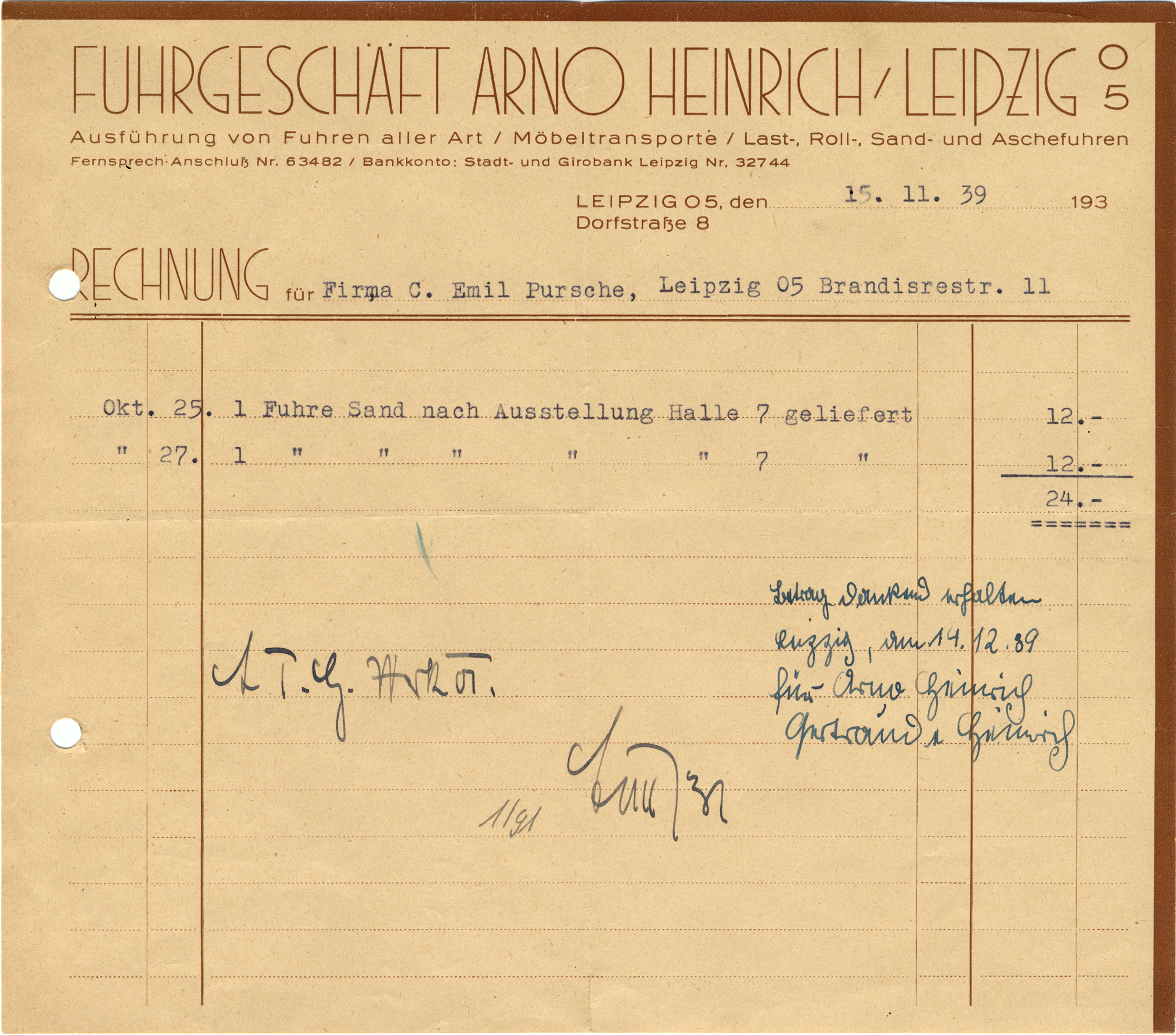
The letterhead of Arno Heinrich’s haulage company in Leipzig is simple and functional, and yet it has style. The compact format (11.8×10.4 cm) is accentuated by borders that bleed off the top and right edges. Printed in a single brown color, the typography is limited to two typefaces. While the smaller items are in nondescript Industria (1910), the company’s name and “Rechnung” feature Grotesk-Pfeiler. These “sans serif pillars” comprise monolinear caps of narrow proportions, adding some metropolitan flair. The strict geometric construction and the low waist reveal their Art Deco origin. Designed by F. Schultze, the Grotesk-Pfeiler (or Groteskpfeiler) typeface was first cast in 1927 by Norddeutsche Schriftgießerei, and later by Johannes Wagner.
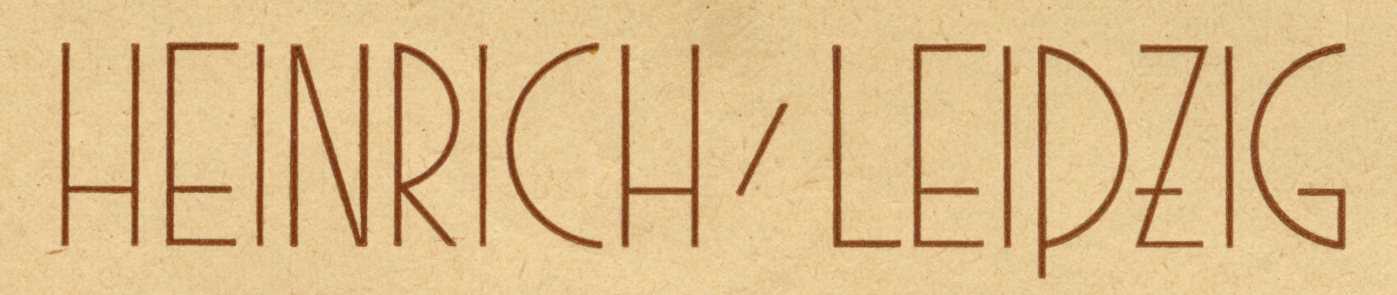
Grotesk-Pfeiler’s ‘Z’ has a crossbar. This feature can often be found in German lettering. It occasionally appears in type, too (see e.g. Tiemann-Mediäval, Liturgisch), but typically not in sans serifs. Here it further emphasizes the low waistline. The ‘P’ is the only capital with a descender. This can be seen as a blackletter influence.
Grotesk-Pfeiler has an unusual character set. In addition to a full set of caps, it includes a few lowercase characters with enlongated ascenders (‘bdfhklſßt’), to be combined with the lowercase of Edel-Grotesk or Wotan-Grotesk (i.e. Norddeutsche’s and J. Wagner’s versions of Neue Moderne Grotesk / Aurora-Grotesk I–IV).

")


")
