
Festival Dag in de Branding

Dag in de Branding organizes four one-day programmes a year, where concerts are put on at various locations in The Hague. The festival reflects current developments in classical and improvised music, in music theatre, in jazz and pop music, as well as in opera and electronic music.
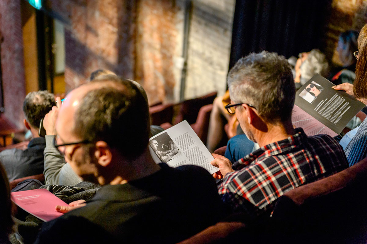
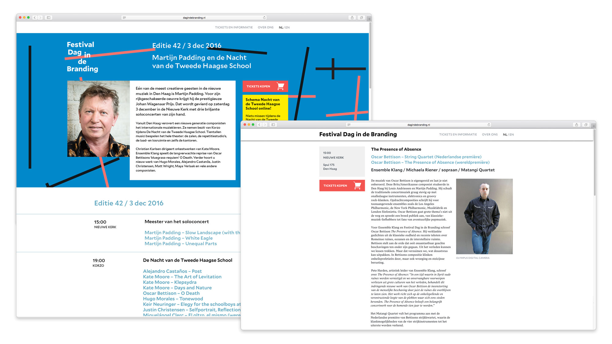
The organisation wished to communicate in a very clear and simple language. At the same time the audience is interested in concise information and background stories. We proposed to communicate in a ‘dynamic’ way: ideally very compact and clear (logo, banners on location, posters, the website’s homepage), but always with elaborate information close at hand: backgrounds on every concert can be found on the website, and the programme was redesigned as a magazine with interviews and other interesting stories.
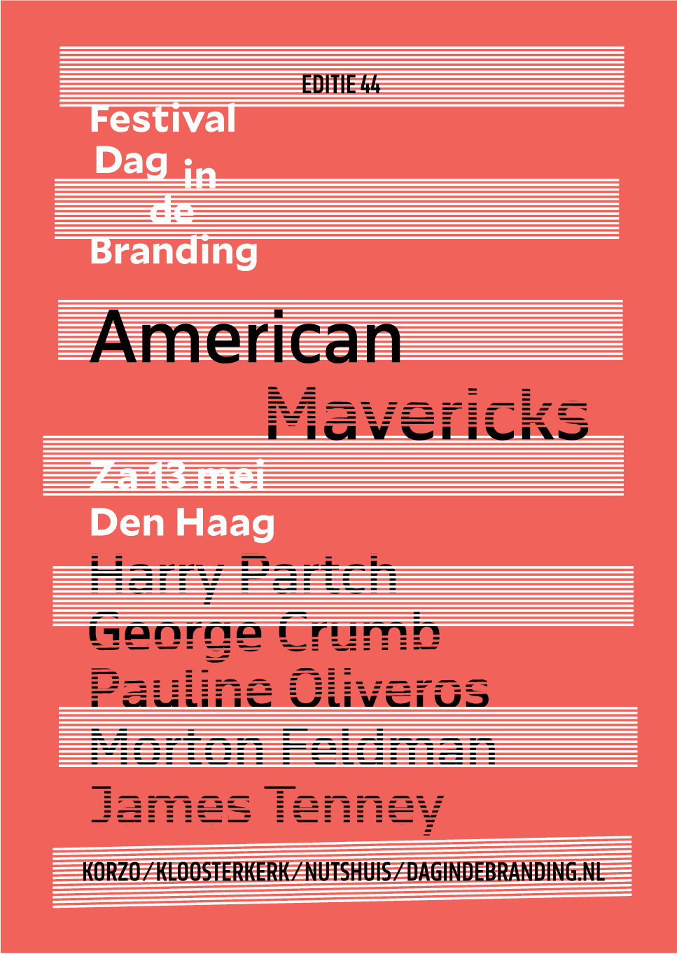
To distinguish between the different types of information, we gave different typefaces different roles: Mallory is the main typeface, bold, enthusiastic, precise and warm. On posters, Mallory is paired with November for edition-specific information in different sizes and widths. The different widths come in very handy, as we decided to communicate the composer’s names in big sizes, and at the same time breaking down any name on a poster was a definite no-go. Running text in both print and website is set in Lava, warm and classic enough to pair with Mallory, and formal enough to tone down Mallory’s details, which can sometimes appear a bit too enthusiastic or mannered for the context.
In autumn 2018, the type palette was updated. On the posters, November was replaced by Mallory Microplus in various weights; in the program booklets, Nocturno was chosen as the new serif companion to Mallory.


Poster for edition 53, October 2019.

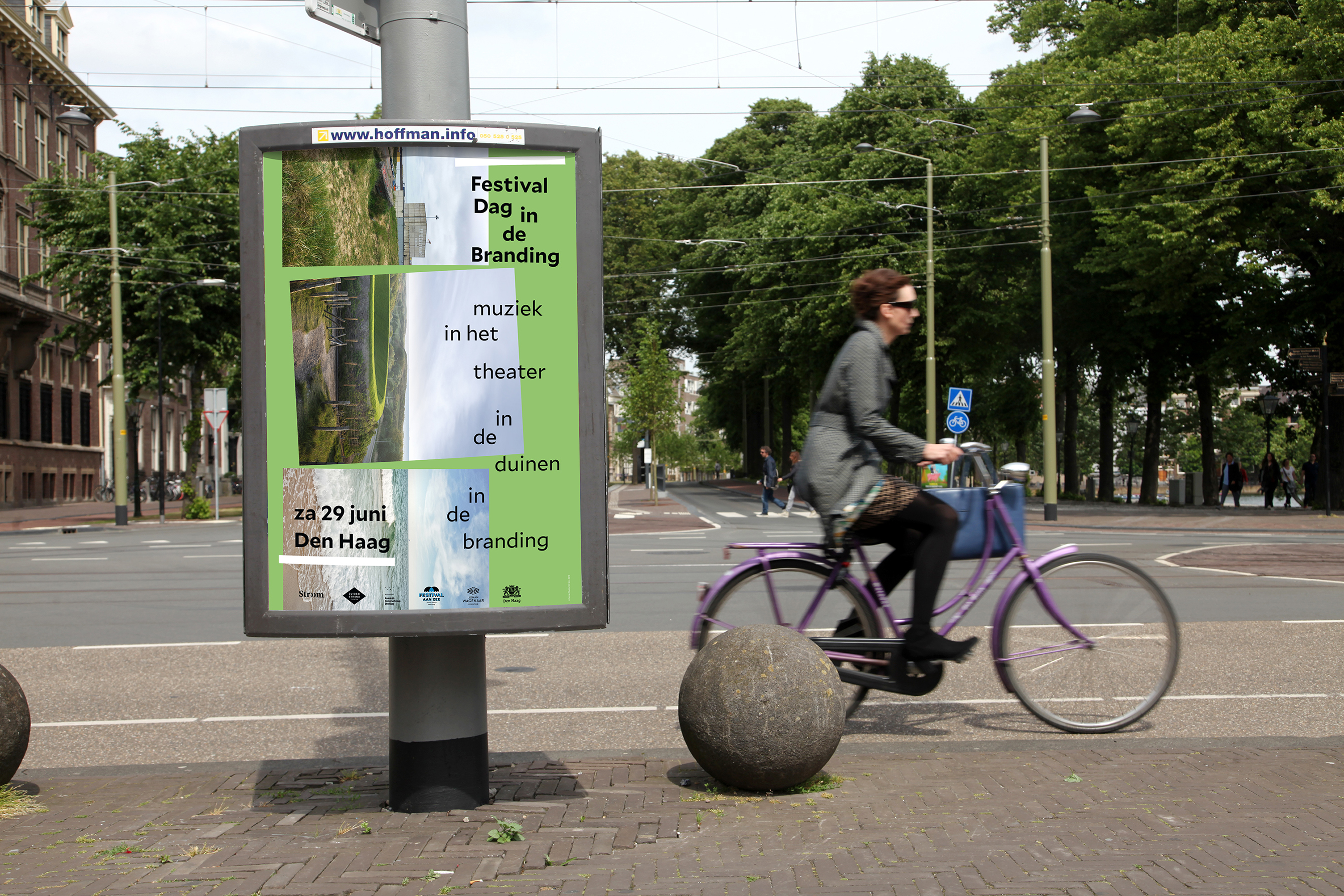
Poster for edition 52, playing at various locations along The Hague’s beach, summer 2019.
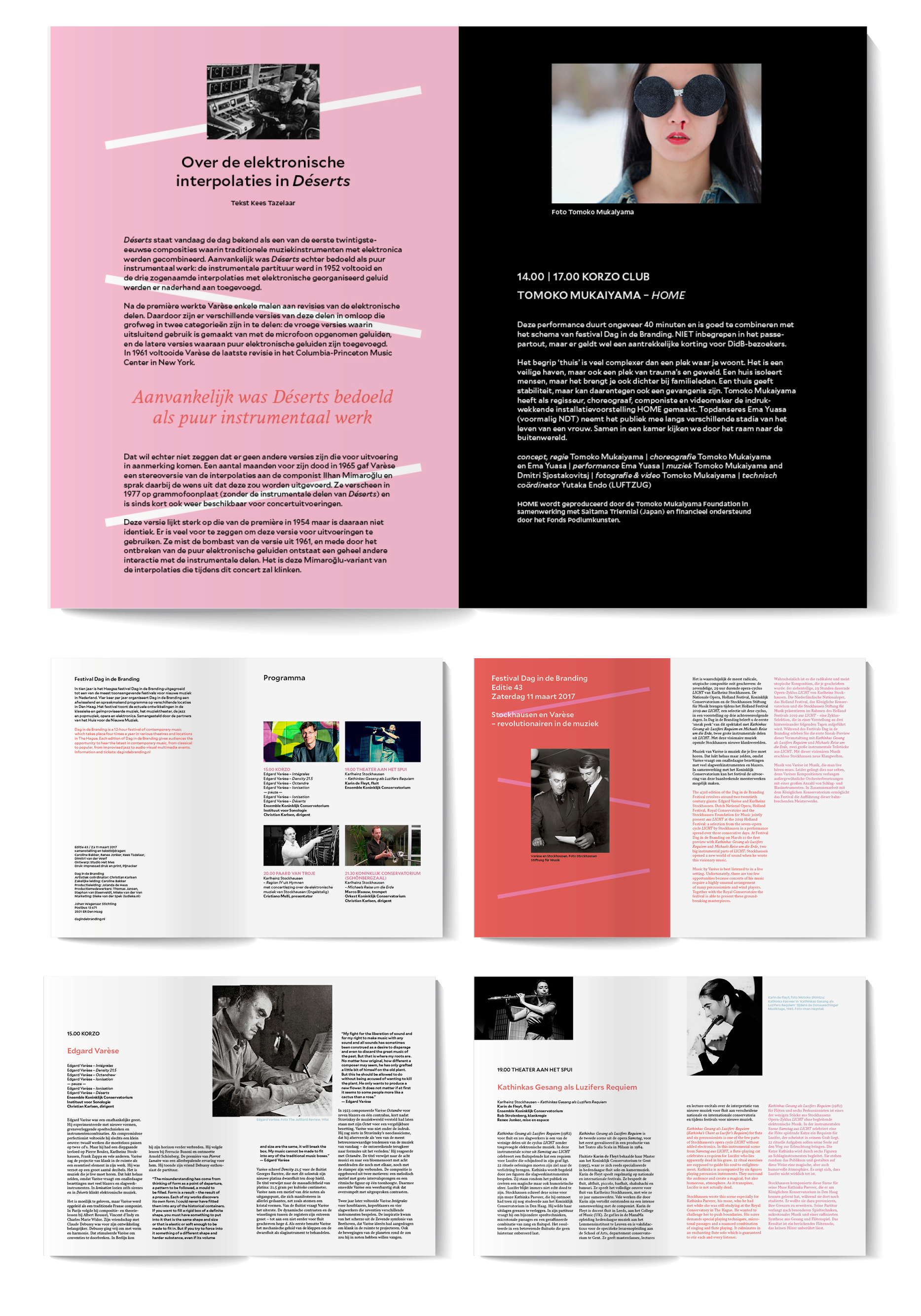
Spreads from the program for edition 43, spring 2017. The program for this edition focussed on two giants in contemporary music: Edgard Varèse and Karl-Heinz Stockhausen.


")


")


")

