An independent archive of typography.
to participate.
Topics
Formats
Typefaces

Emigre #15: Do You Read Me? (opening spread)

Contributed by Florence Fu on Oct 24th, 2017. Artwork published in .
    Emigre #15: Do You Read Me? (opening spread)
    Source: letterformarchive.org © Emigre Graphics. Digital capture by Letterform Archive. License: All Rights Reserved.

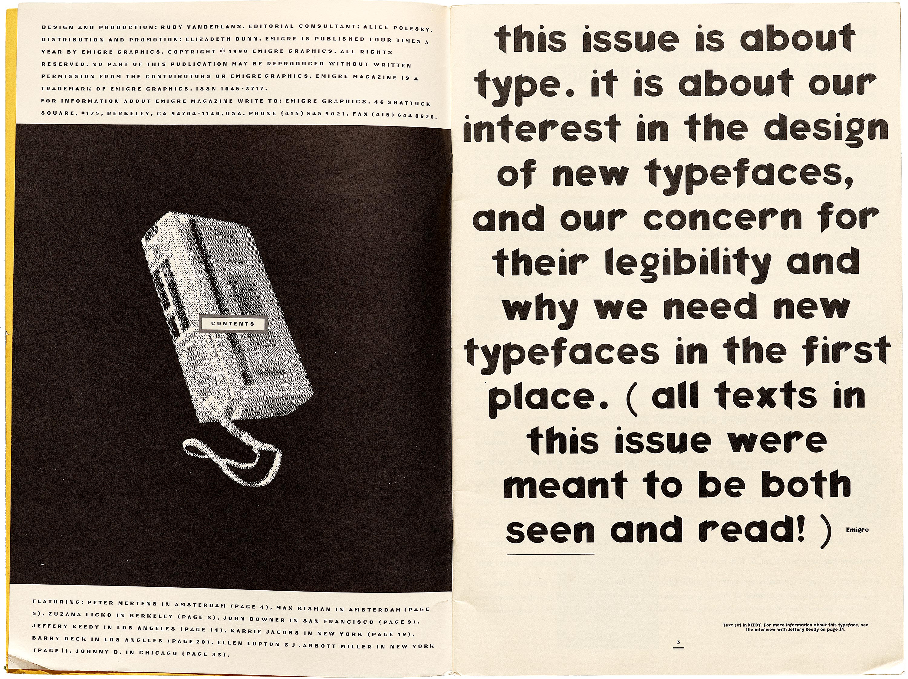
    Though initially considered “ugly” and hard to read, a beta version of Keedy Sans, initially designed in 1989, was featured in the opening pages of Emigre's issue #15: Do You Read Me?, which tackled age-old questions about why we need new typefaces – but in the new context of digital design.

    Keedy Sans’ unconventional proportions, simultaneously sliced and rounded stems pushed against ideas about legibility and rationality in modern typeface design. The eclectic sans was later picked up and sold through Emigre Fonts, setting an example for experimental typefaces that would follow.

    The small type used for this issue’s colophon and contents is Oakland 6 (1985), one of Zuzana Licko’s many bitmap fonts that were later compiled as Lo-Res.

    Letterform Archive holds Emigre’s complete paper archive, including font catalogs and development files, and a complete run of Emigre magazine.

    Typefaces

    • Keedy Sans
    • Lo-Res

    Formats

    Topics

    Designers/Agencies

    Artwork location

    2 Comments on “Emigre #15: Do You Read Me? (opening spread)”

    1. Was this the first use of Keedy Sans?

    2. From Mr. Keedy via email:

      It depends on which Keedy Sans you mean.

      I designed a typeface for my own use in 1988 called Bondage Bold that I used until 1991 for LACE and CalArts.

      That is where Rudy first saw it.

      It was Bondage Bold that was used in Emigre Issue #15, the first time it was used in Emigre was Issue #13. And I also used Bondage Bold as guest editor in issue #17.

      After I agreed to let Emigre release it as Keedy Sans (Ed Fella told me to change the name) I was “schooled” by Zuzana in how to draw bézier’s correctly in Fontographer. Zuzana did some of the drawing (mostly because I was taking too long) as well as offer suggestions to make it less wonky and told me to add a regular weight because Emigre did not sell single weight fonts at that time.

      I think the first time Keedy Sans, the commercial Emigre version, was in print was the last page of Emigre #20 (1991) that announced it as the newest release.

      Then I used it as guest editor for Emigre #21.

      I think of Bondage Bold as the early (feral) version of Keedy Sans and it was first printed and used in 1988.

    Post a comment