Akira by Katsuhiro Otomo
A brief typographic history of the influential Japanese comic.
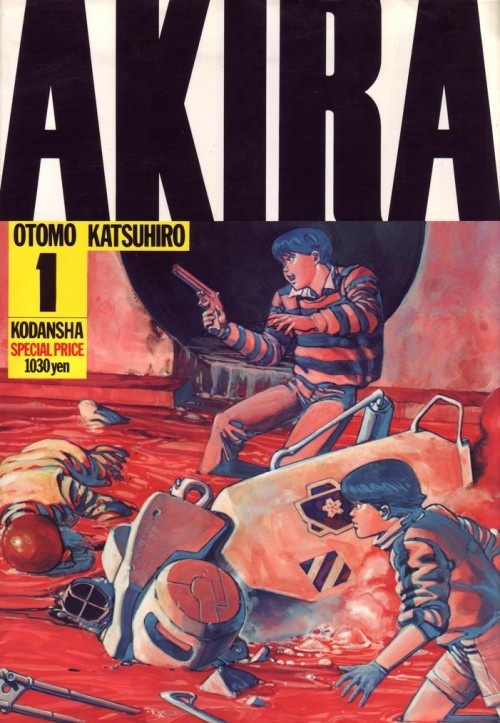
Cover of the paperback collection vol. 1, displaying the famous Akira logotype. First printing: Sep. 21, 1984.
Akira (Japanese: アキラ), often stylized as AKIRA, is a Japanese manga series written and illustrated by Katsuhiro Otomo. Set in a post-apocalyptic Neo-Tokyo, the work uses conventions of the cyberpunk genre to detail a saga of turmoil. Initially serialized in the pages of Young Magazine from 1982 until 1990, the work was collected into six volumes by its publisher Kodansha. The work was first published in an English-language version by the Marvel Comics imprint Epic Comics, one of the first manga works to be translated in its entirety. [Wikipedia]
It is now widely recognized that Akira had a huge impact on kids and readers from all around the world in the 1980s and ’90s – and I’m no exception! I’ve always been fascinated not only by the story and Otomo’s incredible drawings but also by all the graphic material surrounding the project and contributing to the Neo-Tokyo universe. One mystery remained unsolved, though: to identify the Akira typeface.
What most of us know as the Akira logo is actually the title on the cover of the paperback collection published by Kodansha from 1984. At the time, the design was astounding. The B5 format with yellow page edges (a color rarely used at the time), and a cover entirely in English, turned the book into a sensational subject that was considered groundbreaking.
I didn’t use the English and Chinese and whatever else on the cover because I was thinking about global distribution. I did it because I had this incredible enthusiasm to just try to make something new. [Otomo in Akira Club]

Several cover attempts by Otomo and his team. Note the futuristic typefaces used for the title.
Otomo and his design office, Pencil Studio, did a lot of research regarding the cover design and also tried out futuristic typefaces such as Checkmate and Earth.
It took me a lot of time before I was finally able to settle the design. I wanted it to be really packed with stuff and make it feel like you couldn’t really tell what country it came from. Due to repeated trial and error, it finally ended up going on sale behind schedule. [Otomo in Akira Club]
Otomo eventually settled on condensed sans-serif capitals to give the title a majestic, yet simple and slightly coarse image and “an air of American comics”. It is unclear if Otomo used a trimmed Impact, or something close, like Schmalfette Grotesk. In the Akira Club book (see below), the caption stated that it’s “Impact with the top and bottom cut.” (translation was double-checked by Akira Yoshino) but it doesn’t seem to fit, especially the K and R. Impact Condensed is a bit closer but is still not a perfect match. Geoffrey Lee, the designer of Impact, had recognized that Impact was inspired by Schmalfette:
I remember that period well, when many of us admired the vitality and colour of what we knew only as Schmalfette, and used it by old-fashioned cut and paste. Use was limited as it was never made in metal as far as I know, and existed then in capitals and numerals only.
Later someone added (or found) a lowercase for its new existence. I personally find the style lacks the attractive feel of the caps. [Geoffrey Lee on Typophile]
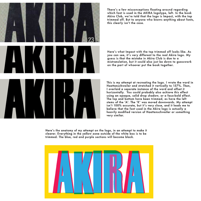
In 2013, James Harvey, the creator of Bartkira, an Akira spoof with The Simpsons characters, made a post about what he thought was the right typeface used for the logo: Haettenschweiler which is also derived from Schmalfette Grotesk.
The most likely answer is that the logo is hand-drawn, based on Schmalfette. (On the Web, some folks have stated that it’s a condensed weight of Rhode, which is close, but that typeface was released years after the manga).
Other typefaces on the cover are Franklin Gothic Extra Condensed (author’s name, publisher, and price) and Dynamo for the number of the volume. The text on the cover flaps is set in Helvetica Inserat.
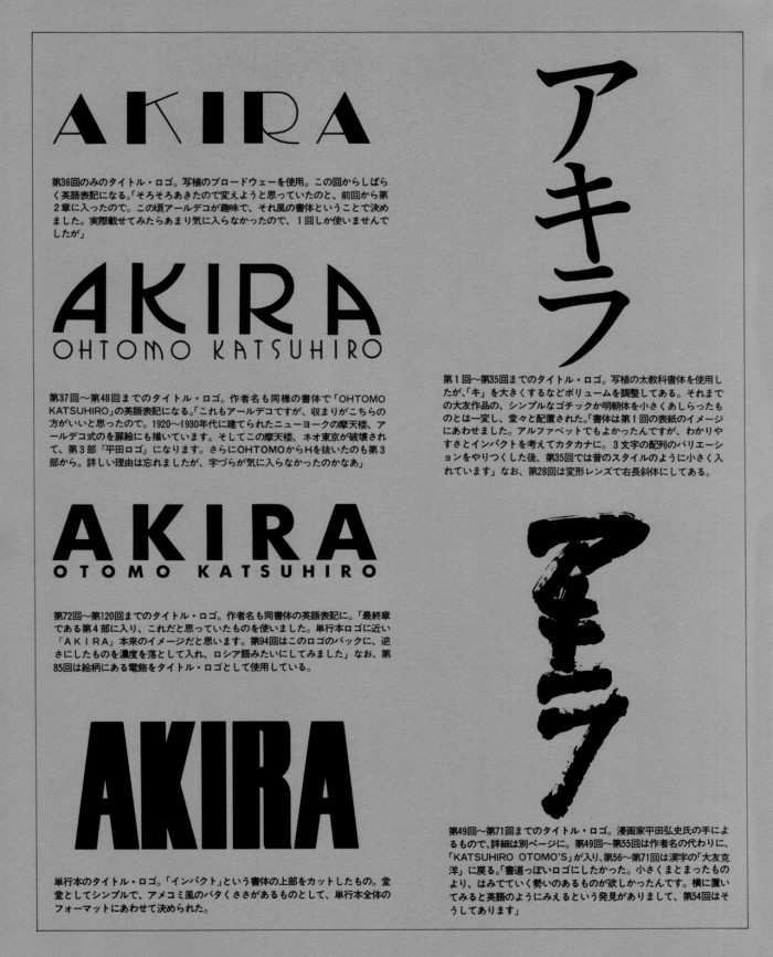
But before the paperback collection, during the course of AKIRA serialization in Young Magazine, Otomo already experimented with a number of different typefaces for the title logo, including both Latin letters and Japanese katakana.
The first one, going from issue 1 to 35, used “a bold textbook typeface for photo-typesetting. The キ was made larger so that there is a balance between the three letters.” Akira Yoshino identified it as 石井太教科書体 BTA (Ishii Futo Kyokashotai) from the Shaken (写研) foundry, which was specialized in phototypesetting.
Then, on the cover of issue 36, the title is set in Latin letters from Broadway. Broadway was immediately replaced by ITC Busorama (issues 37 to 48), “which is reminiscent of the New York skyscrapers built in the 20s and 30s”. From issue 49 to 71, the title is again rendered in Japanese katakana. The calligraphic lettering has been done by Hiroshi Hirata, another manga artist. For the last batch of issues, going from 72 to 120, Otomo eventually chose a bold weight of Futura:
We had finally found the title style that suited Akira’s story. [Otomo caption in Akira Club]
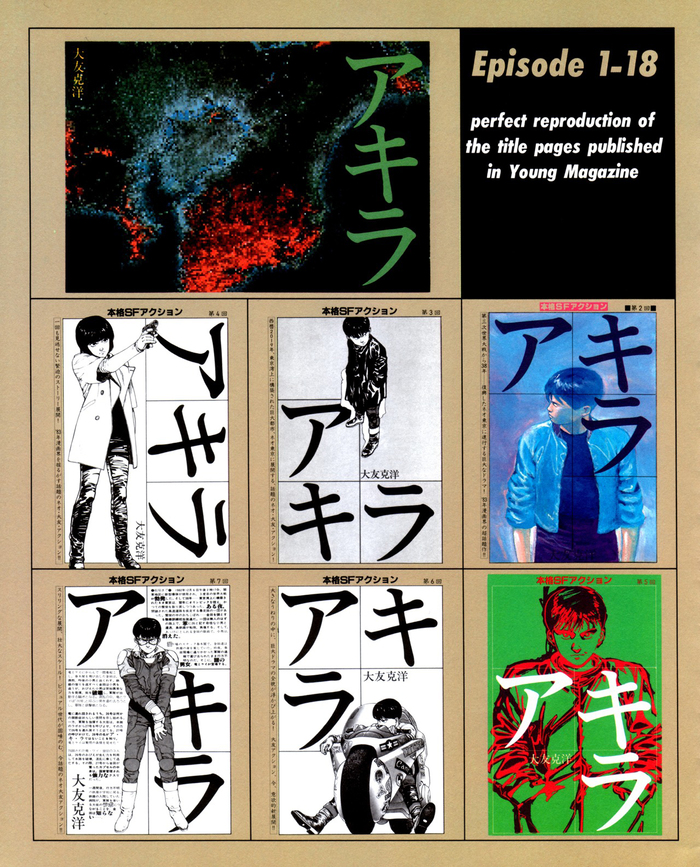
The titles of the first issues were set in 石井太教科書体 BTA which can be seen on page 5 of that document.
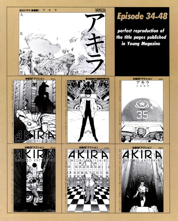
Switching to ITC Busorama, Otomo also included his name in the title because it seemed more convenient. Note issue 36, the only one set with Broadway.
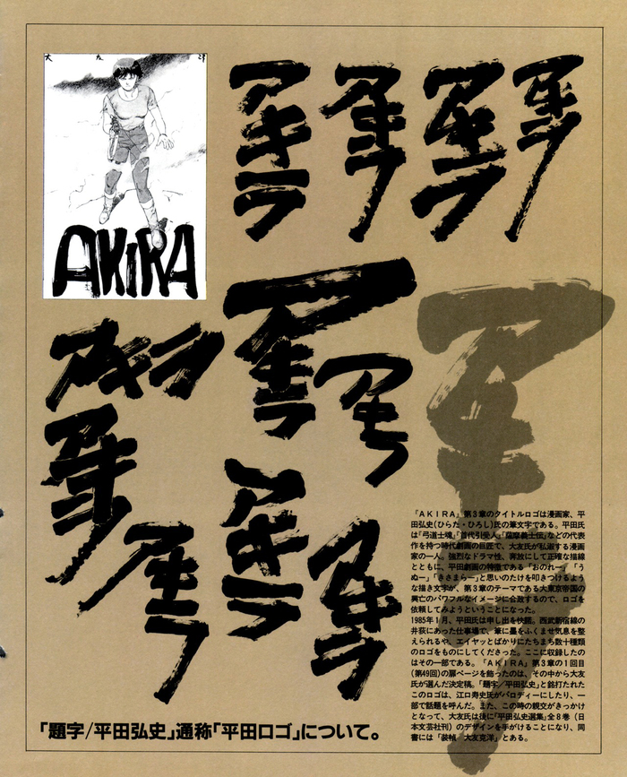
All the tests on this page have been done by Hiroshi Hirata, but it was Otomo who decided on the final form of the calligraphic title that fit the spirit of Akira better.
![“I wanted the title to be written with a brush because I wanted to have a more dynamic logo. I also realized that turning the title to put it horizontally gave the impression of it being written in Roman letters. The title of number 54 has this form for that reason. [Otomo in Akira Club]”](https://assets.fontsinuse.com/static/use-media-items/65/64003/upto-700xauto/5ab16eed/Akira_Art_Book_-_Akira_Cl%20copie3.jpeg)
“I wanted the title to be written with a brush because I wanted to have a more dynamic logo. I also realized that turning the title to put it horizontally gave the impression of it being written in Roman letters. The title of number 54 has this form for that reason. [Otomo in Akira Club]”
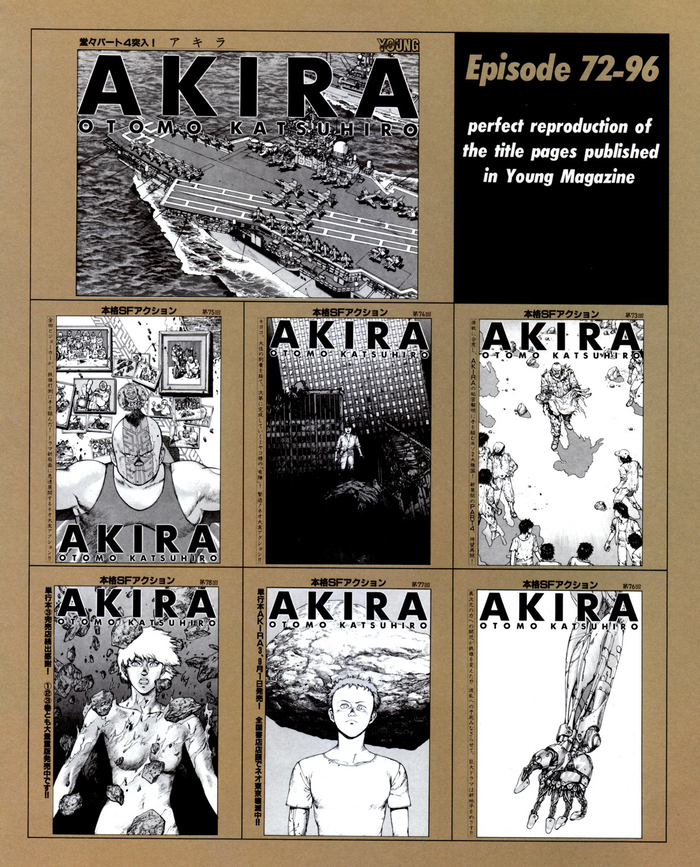
When switching to Futura, Otomo decided to remove the H from his surname because he did not like it.
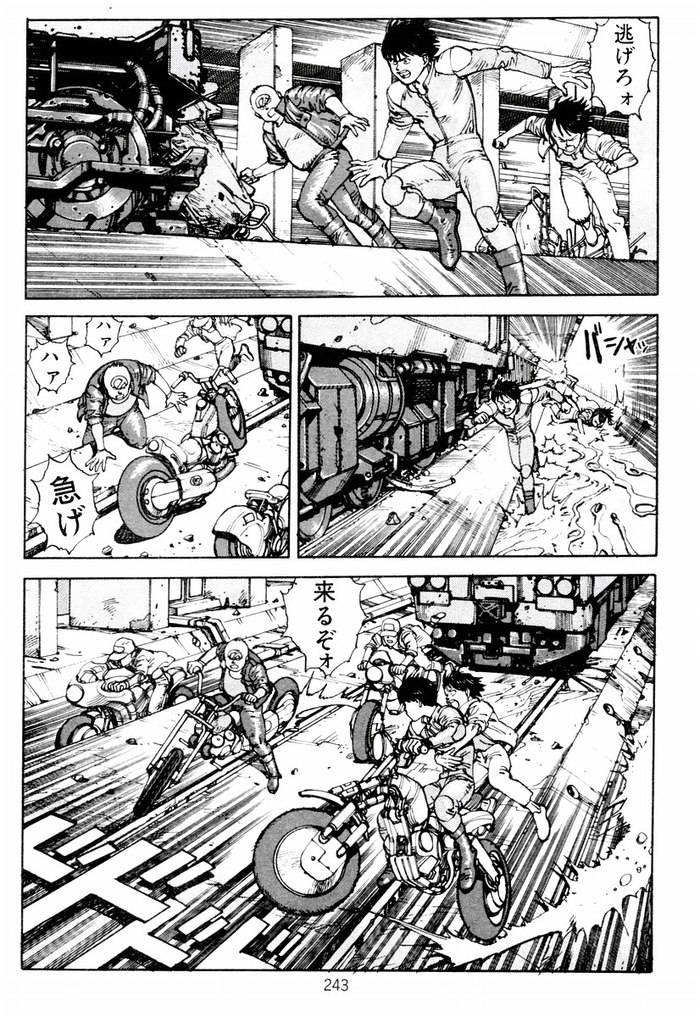
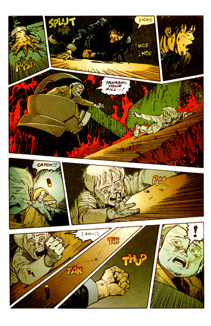
The speech balloons were initially mostly hand-lettered, but recent translations have used digital typefaces to achieve the job (see below).
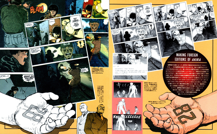
The first foreign edition was the US one, made by Epic Comics from 1988. In addition to the translation, panels were mirrored and it was colorized by Steve Oliff (through his company Olyoptics) and hand-lettered by Michael Higgins, to match American comics standards of that time. Read more about the process and workflow of the translation in The Task of Manga Translation: Akira in the West by M. de la Iglesia.
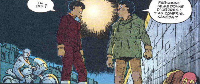
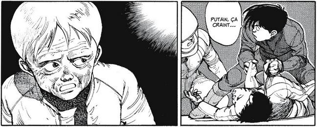
Subsequent foreign editions (German, French, Italian, and Spanish ones) were published from 1991, based on Epic Comics’ work. Here’s a panel from the French edition, obviously hand-lettered.
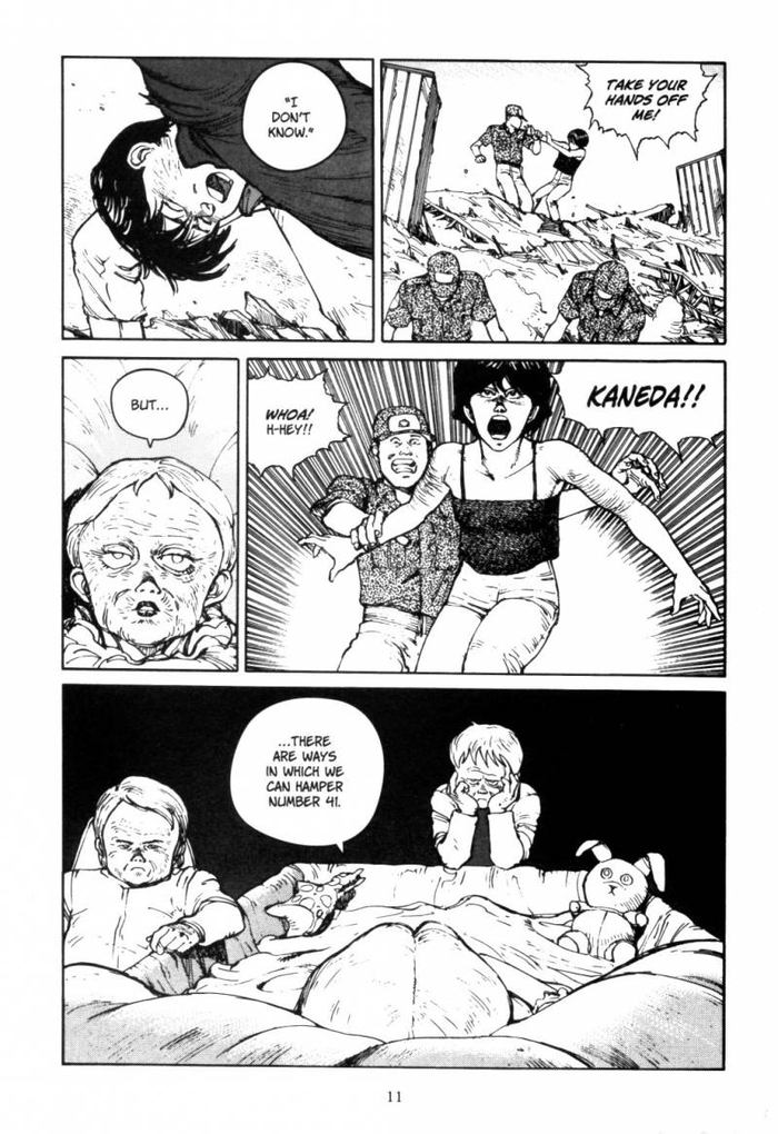
The English Dark Horse edition published in 2001 went back to the original reading order and black and white drawings. It uses Jim Lee by Comicraft (released in 1998) as the dialogue typeface.
The recent French “perfect edition” by Glénat uses Alter Ego from Blambot for dialogues.
There’s a lot more that could be said regarding typefaces and Akira, but I’ll save the movie for the next article. Feel free to comment and add pieces of information that I didn’t find. I’d like to thank Akira Yoshino for his help with this contribution.
Formats
- Books (4004)
- Branding/Identity (4771)
Topics
- Entertainment (1006)
- Literature (1917)
Designers/Agencies
- Katsuhiro Otomo (1)
- Pencil Studio (1)
- Hiroshi Hirata (1)
Tagged with
- uncertain typeface ID (160)
- lettering derived from typeface (483)
- Japanese (language/script) (83)
- manga (13)
- Akira (1)
- process (68)
- book covers (3493)
- logo evolution (52)
- logos (2700)
- lettering (376)
- calligraphy (19)
- loose letterspacing (265)
- retro-futuristic (24)
- all caps (4068)
- speech balloons (105)
- dystopian (28)
- 1980s (432)
- fiction books (172)
- cropped type (271)
- high profile (515)
Artwork location
- Japan (100)
In Sets
- type1 (Waleed Masoud) (32)
- recent favorites (aug 2018) (Conor McKiernan) (4)
- sim (HUMBERTO CUNHA) (15)
- Genial (Leonel Demetrio) (53)
- website (orlando gillam) (7)
- visions (orlando gillam) (18)
- Good simple fonts (Edward Tyler) (14)
- Fonts to Get? (Nic Harp) (120)
- Moodboard (Charles) (29)
- a (Bagus Purwoko) (64)
- Japanese Pop Culture (Quentin Schmerber) (10)
- MHM (Ronni Bourgeois) (79)
- Rankin (Corrie Gerard) (10)














3 Comments on “Akira by Katsuhiro Otomo”
In an interview in the Japanese design magazine MDN Akira Saito, the graphic designer who worked on the Akira books in 1984, mentions that he used a Gothic typeface which he cut the top of for the Akira Logo. He could just have meant a San-serif, but I think it is more probable he was talking about one of the Japanese Gothic typefaces.
I think the title typeface is an altered version of Druk Condensed Super. Some versions of the masthead are different however as the bowl of the R is more curved than Druk.
Hi Paul, there are certainly a number of contemporary fonts that come close, including your suggestion. What rules out Druk Condensed, though, is the fact that it was released in 2014, several decades after the Akira logotype first appeared.