
How To Stop Time by Matt Haig
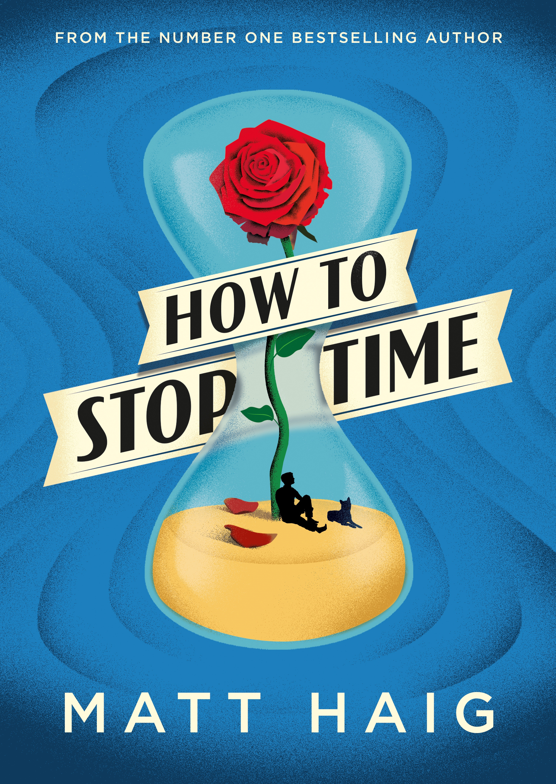
The title on the cover of the latest novel by Matt Haig is in Sonrisa Bold, set on an angle and slanted so that the stems appear vertical again. Designer Pete Adlington comments on the font choice:
I needed something that gave a historical nod without feeling like it was defined by a period and this seemed to fit nicely.
Sonrisa has an interesting background: Its design “evolved from [Jason Castle’s] sketches of the skeletal structure of Jakob Erbar’s Koloss, trying to discover its underlying essence without all the contrast and bulkiness of the original design.” Koloss, originally released by Ludwig & Mayer in 1923, was advertised as the extrabold companion to Feder-Grotesk, also by Jakob Erbar. First cast in 1909, the latter is a very early example of a contrasted sans serif. One could say that Castle reverse-engineered Feder-Grotesk. The result has narrower proportions, but especially the capitals come quite close, see this comparison. Sonrisa was released by CastleType in 2011, around the time when the renewed interest in the stressed sans serif started to gain momentum, see e.g. Condor (2010) or Timonium (2012). This is the first time I’ve seen it in use. Hat tip to Ben Anslow!


")


")


")


")


