
Das Stue
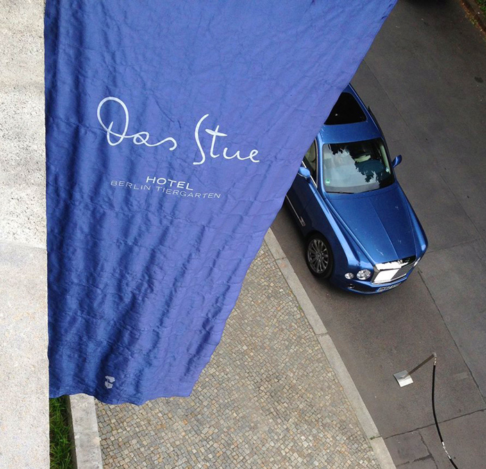
Located in Western Berlin in quiet surroundings with the Tiergarten park on one side and the Berlin Zoo on the other is a five-star design hotel with a Danish name: Das Stue – The Living Room.
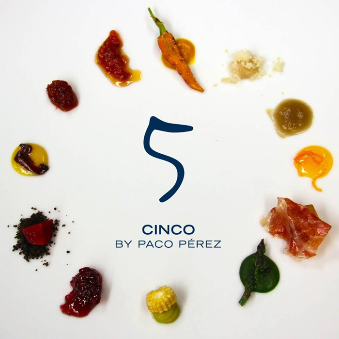
Why Danish, why living room? It’s simple – the building was constructed in the 1930s as Denmark’s embassy and later became its Berlin consulate. Several years ago it was architecturally extended and upgraded as a hotel – an urban retreat combining luxury and homeliness. Quite a potpourri of prominent names is connected with the locality: Johann Schaudt, architect of the historical building; the Axthelm architectural practice responsible for its contemporary annex; celebrated Spanish designer Patricia Urquiola responsible for the interiors; Catalan chef Paco Pérez heading Das Stue’s Michelin-starred restaurant Cinco, and last but not least: FF Mister K – the Kafka handwriting font responsible for the hotel and restaurant logos.

Since it first opended its doors in late 2012 Das Stue has been a singular success story. The melange of Third Reich classicism, the new minimalist building wing, sleek but cosy guestrooms, 20-course Mediterranean meals, ostriches parading in front of the windows and Franz Kafka’s very unsleek handwriting – seems to fit perfectly to the zeitgeist of today’s Berlin. – A long list of enthusiastic reviews and awards confirms it.

Trade Gothic Extended, stylishly set in all caps, and Georgia support Mister K on Cinco’s menus …

Julieta Ulanovsky’s sans serif Montserrat and system font Times New Roman on Das Stue’s virtual presence are a surprisingly modest choice for “Berlin’s first luxury boutique hotel”. See them in combination here.
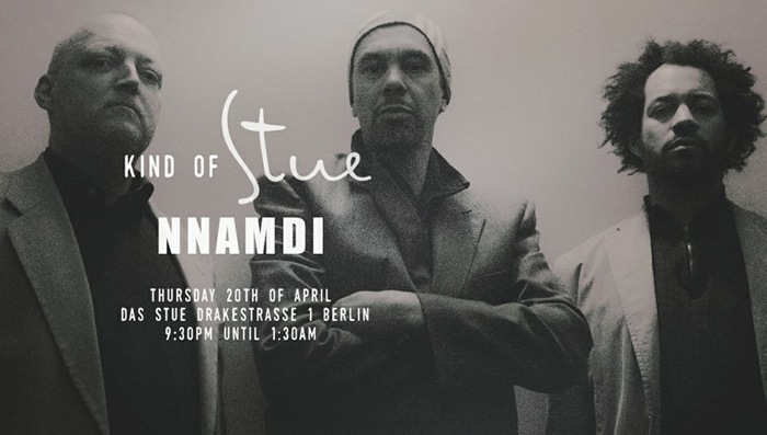
For music events Mister K is joined by Impact and a condensed DIN-like grotesque.
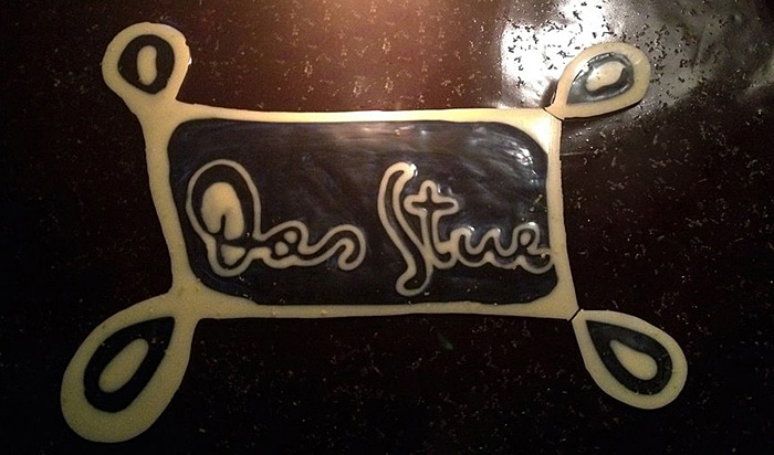
FF Mister K Icing (still to be approved by the FontFont Type Board)
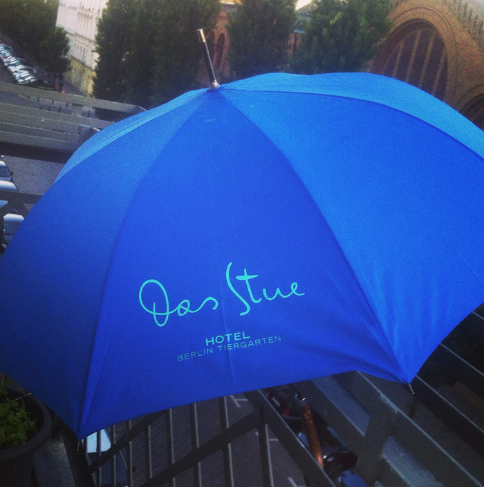
A bit of Stue made it to K-designer Julia Sysmäläinen’s balcony.


")


")

")

