
Frost/Nixon (2008)
Frost/Nixon is a drama film, retelling the post-Watergate television interviews between British talk-show host David Frost and former president Richard Nixon — conducted and recorded 3 years after Nixon, facing impeachment, resigned as a president. The movie is based on a play of the same name by Peter Morgan, who also adapted the screenplay.
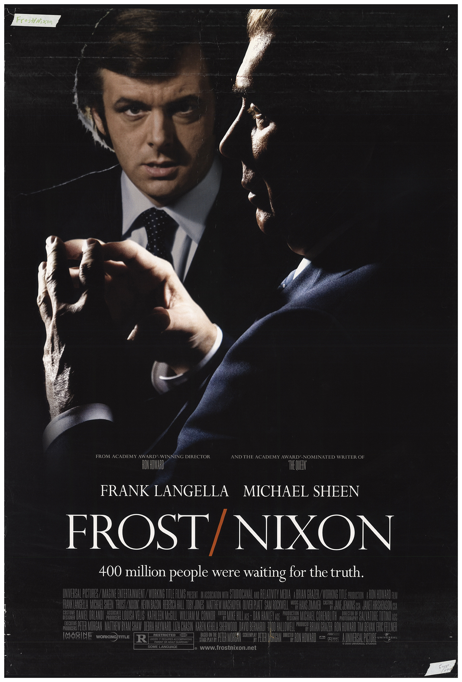
The poster by InSync + uses Perpetua for all big type. Eric Gill’s design (1928) is obviously not chosen because for being period-correct. More likely, it was chosen to add a sense of timeless drama to the photo-montage of a contemplative Nixon (played by Frank Langella), faced with an intense look of TV presenter David Frost (Michael Sheen). The tight and narrow type used for the credits is probably Bee.


")


 movie logo and opening credits")


2 Comments on “Frost/Nixon (2008)”
“FROST/NIXON” is set in the light cut of Perpetua’s titling caps. In this style, the S is oddly low-waisted. The image shows Monotype’s digital Perpetua Roman (top) compared to Perpetua Titling Light (bottom).
Thanks for solving that one, Florian. I figured the difference between the type used for names of the actors and the movie title could be caused by stretching, but optical sizes it is. Plus stretching: below three lines showing the type on the poster (top), Perpetua Roman (bottom) and the middle line shows Perpetua Roman stretched 89% (Frank) and 85% (Sheen).