
Dinner to the American Press Humorists (1906)
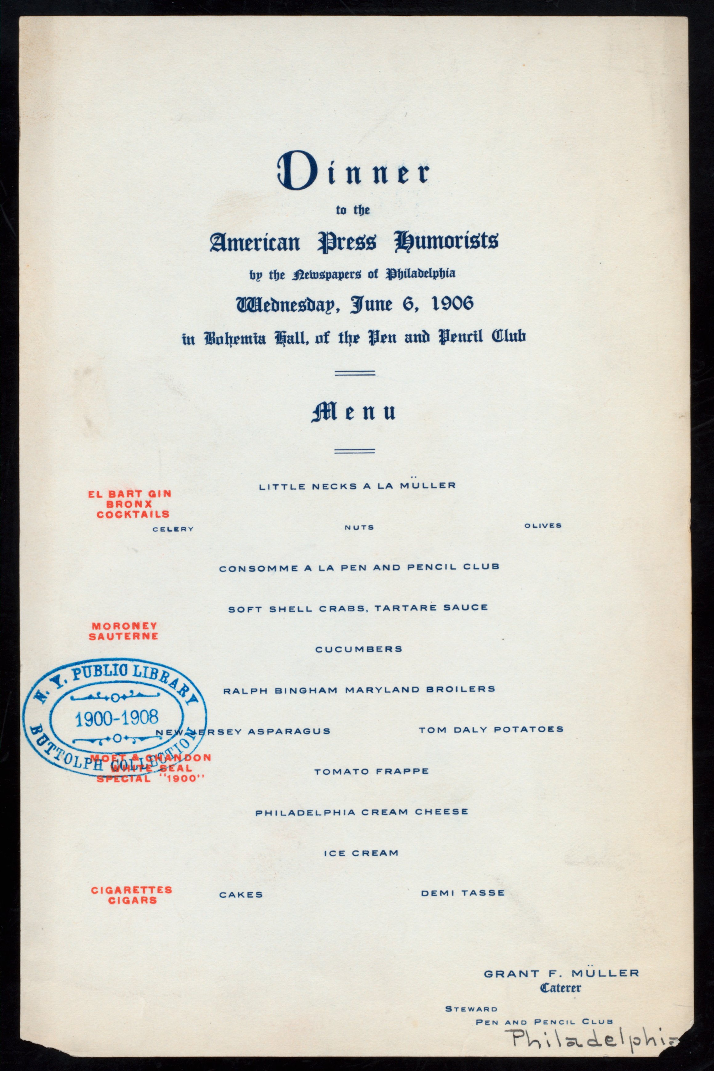
Dinner to the American Press Humorists by the Newspapers of Philadelphia, Wednesday, June 6, 1906, in Bohemia Hall, of the Pen and Pencil Club. Broadside; 5.5 × 8.5 inch. From the New York Public Library’s collection of historical restaurant menus, call number 1906–511.
The menu typography combines two of the most popular members of the Old English subgenre of Blackletter, Cloister Black and Engravers Old English. Both typefaces were issued by ATF a few years earlier, the former in 1904 and the latter in 1901 [Mac McGrew: American Metal Typefaces of the Twentieth Century]. The center-aligned sans serif caps stem from a contemporary typeface, too: It is either Inland’s Blair (1900) or its slightly heavier companion Mitchell (1906). The umlauts for “Müller” had to be added manually.
The enlarged ‘D’ in ‘Dinner’ is from Missal Initials, a set of squarish caps designed by Will Bradley based on 15th-century sources (compare e.g. the Spiegelberger Missal). It was issued by ATF in 1904 and patented 28 February 1905. When A. V. Hershey developed his collection of early vector fonts in the 1960s, Missal Initials provided the inspiration for the Italian Gothic caps. By extension, it influenced the recently released Minotaur Lombardic by Production Type.


")


2 Comments on “Dinner to the American Press Humorists (1906)”
Missal Initials also appear in other menus from this period. Here’s a red ‘C’ from the menu for a Complimentary Dinner given in honor of Alfred J. Boulton and William A. Prendergast by the Brooklyn League on 16 December 1907 [NYPL]. The text face is Plate Text No. 4 (BB&S):
From top to bottom:
Missal Initials (1904), Hershey Italian Gothic (c. 1967), Minotaur Lombardic (Production Type, 2014/2017).
Although the technical limitation takes its toll here and there, A.V. Hershey’s interpretation stays relatively close to Bradley’s design. Production Type took more liberties for their Lombardic caps. Most importantly, the spacing is now proportional, see especially ‘W’. Several characters like ‘F’, ‘G’ or ‘T’ got a less ambiguous form, some were “romanized” (‘Z’). The ‘O’ became more fancy, so that this cap is different from the standard Minotaur, too.