

Quake specimen posters

Poster #1: The story begins with everything peaceful and stable. Old scars are there.
School project: Design a series of three posters that showcase the characteristics of a chosen typeface. I picked Quake, designed by Fryda Berd at Adobe after the 1989 San Francisco earthquake to show that something constructive can come from something destructive.
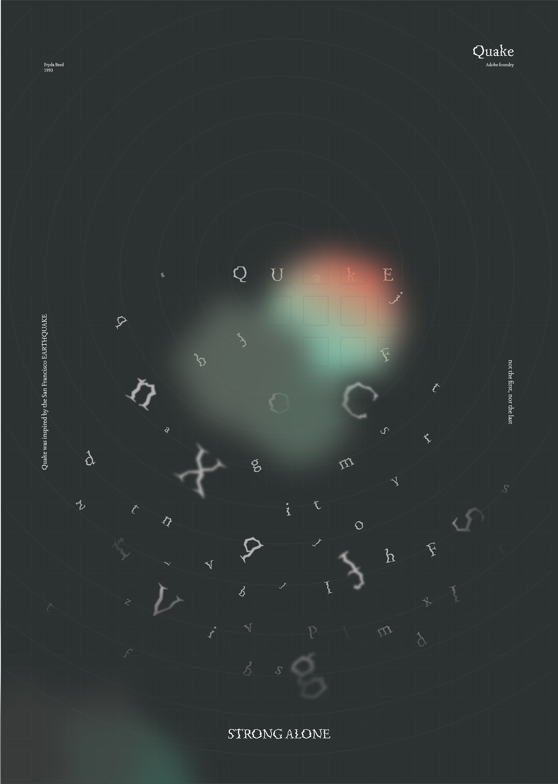
Poster #2: Then the quake happens and everything falls down. You can see the grid in this poster to show that when destruction happen, the bases are brought to light. New scar appears.
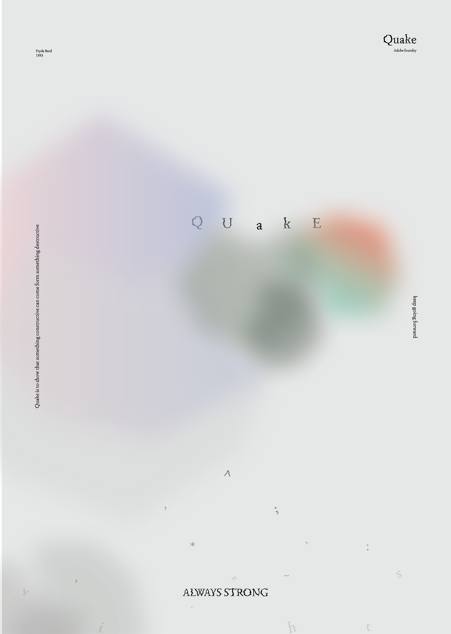
Poster #3: After everything is over, it's time to re-construct. You can notice that before it was only letters but now there is punctuations as something new as well as they are important in structuring. Both scars are there, but it does not mean it's the end of the world.


")


 movie logo and posters")


")


 by Hermann Hesse, Suhrkamp 1948 Edition")


