An independent archive of typography.
Made possible by sponsors like Mark Simonson.
Sign in to participate.
Topics▼ |
Formats▼ |
Typefaces▼ |



















1 Comment on “Roberta Flack – First Take album art”
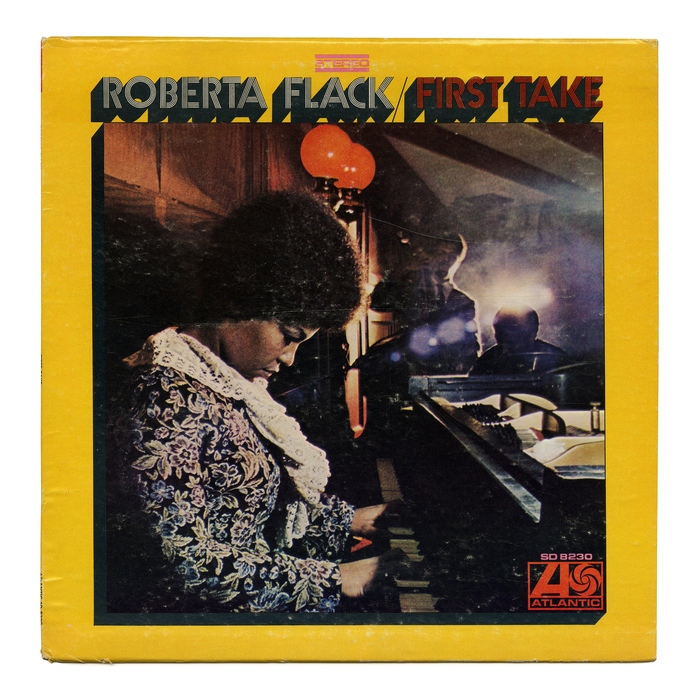
There are several phototypefaces that combine the multiline treatment with a long shadow, including PLINC’s Bauhaus Prisma Shadow and Futura Prisma Shadow, Churchward Design 70 Lines Deep Shadow, Headliners’ Prismania Fourteen, Lettergraphics’ Prink Shaded, and Prisma Shaded (shown in Solotype).
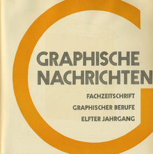
None of them is a match, though. It looks like this is “plain” Prisma with a custom shadow effect. The godfather of this subgenre might be Arno Drescher’s Onyx (Schelter & Giesecke, 1936). There are surprisingly little pre-made options among digital fonts, if any. The shadow in RMU’s Prisma Pro Shadow is not very pronounced.