
De Witte Raaf (2006–)
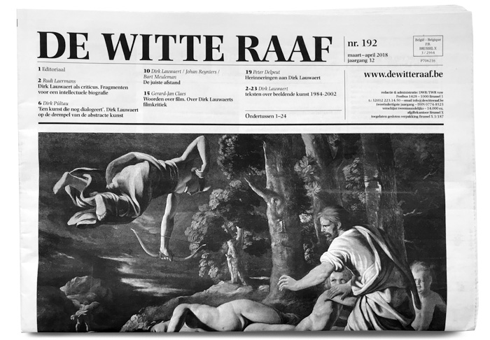
Nr. 192, March–April 2018
De Witte Raaf (“The White Raven”) is a bimonthly art journal published in Brussels since 1986. Printed in an edition of more than 15,000 copies, it may be picked up for free from over thousand distribution points in Belgium and the Netherlands.
The journal “wants to revive the public debate about the arts. To this end De Witte Raaf analyzes the art news in the Netherlands, Flanders and the rest of Europe. […] It is aimed at people who occasionally (or more often) visit an art institution, people who work in such an institution, or who make art themselves.”
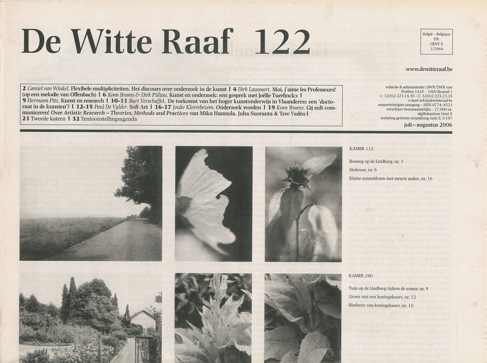
Nr. 122, July–August 2006 was one the first issues designed by Inge Ketelers using Photina.
Inge Ketelers is responsible for the graphic design since 2006 (nr. 119). Her redesign introduced Photina as the journal’s typographic identity. José Mendoza y Almeida’s typeface family is used throughout the paper, for all elements, and in a number of styles.
The question here was to restyle an art journal which is notorious for its extensive texts but also for its thoroughness and keen arthistorical information and research. Attention was focused on the headlines, typeface and readability. [Photina is] characterised by an economical use of space combined with a good readability. The text face shows an even colored grey tone. In contrast with a daily newspaper in which all headlines, texts and pictures fight for the attention of the reader, the pages in De Witte Raaf look rather comfortable and quiet, the eye isn’t aggressed and has the full space to read undisturbed.
In May 2007 (nr. 127), Ketelers adjusted her design when the journal’s size was slightly decreased (from 29×44 cm to 28.5×40.5 cm) for production reasons and the second section was abandonded in favor of an insert. The nameplate that had previously been set in mixed-case letters from Photina Semibold now was rendered in caps from the bold weight. The issue number was toned down, the contents got more room and were organized in three columns.
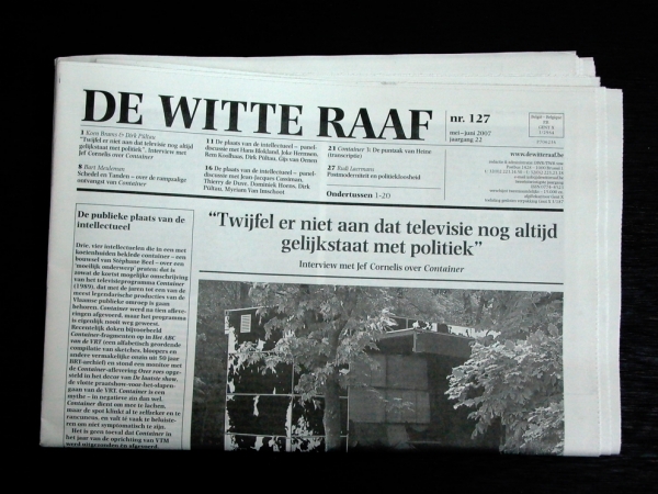
Nr. 127, May–June 2007 was the first issue to feature the adjusted design, with the nameplate in all caps. Main headlines are set centered above the cover image.
Johan Velter praises the design as “that silent, significant newspaper that we have lost”:
With each new episode the idealists of De Witte Raaf show how design and content relate to each other. The newspaper is still printed on newsprint, black and white—including the illustrations and the publicity by third parties. The text is divided into four columns, the ideal ratio for reading a tightly linespaced text. […] Inge Ketelers has tightened the rigor: here a bit more bold, there a bit less. The severity of intellect, gravity and aloofness are reflected in the material newspaper.
Now in its thirteenth year, the design still looks strong and convincing, and anything but dated. This has also to do with Photina, which is “a brilliant and underused design” (John D. Berry). It was originally intended to become the go-to text face for the second half of the 20th century, just like Times had been for the first. In retrospect, one could state that Photina was a little ahead of its time. In any case, it doesn’t feel like it’s half a century old, and “almost nails the mixed metaphors style that’s popular in text faces now” (James Puckett).
Detail from nr. 155, January–February 2012. The table of contents combines ultrabold page numbers with italic author names and semibold titles for a clear and quick to grasp hierarchy.
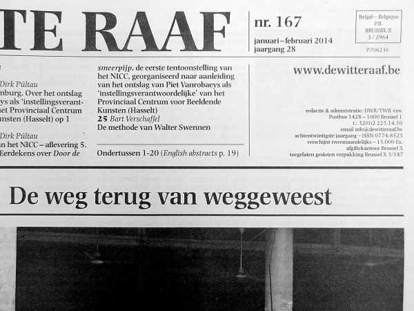
Detail from nr. 167, January–February 2014
Detail from the interior (2015), showing the 4-column layout.
Detail from the interior (2017), featuring a text with numerous footnotes.


 movie artwork")


")


")


")


1 Comment on “De Witte Raaf (2006–)”
José Mendoza has told the story of how Photina came to life in an article titled “Le photina : un nouveau caractère de photocomposition”, published in Communication et Langages, n°21, 1974. Persée made a digital version available under a Creative Commons license (CC-BY-NC-SA). Here are two snippets showing the very first sketch of a test word from 1966 and some outline drawings for the italics, plus several quotes by Mendoza about his creation.