
SPAR Netherlands

“Zin in Zomer” magazine, table of contents. Art direction and design by De Ontwerpers.
Omnes is the corporate font used by some regional branches of global retailer SPAR. This post documents its use in the Netherlands, the country where SPAR has its origins.
The sans serif from Darden Studio is employed throughout the visual identity, from the website to ads, customer magazines, and in-store signage. SPAR’s designers adroitly use it in a range of contrasting sizes and in playful arrangements. Together with the bright colors and well-curated photography, Omnes helps to build a brand language that signals both good value and high quality.
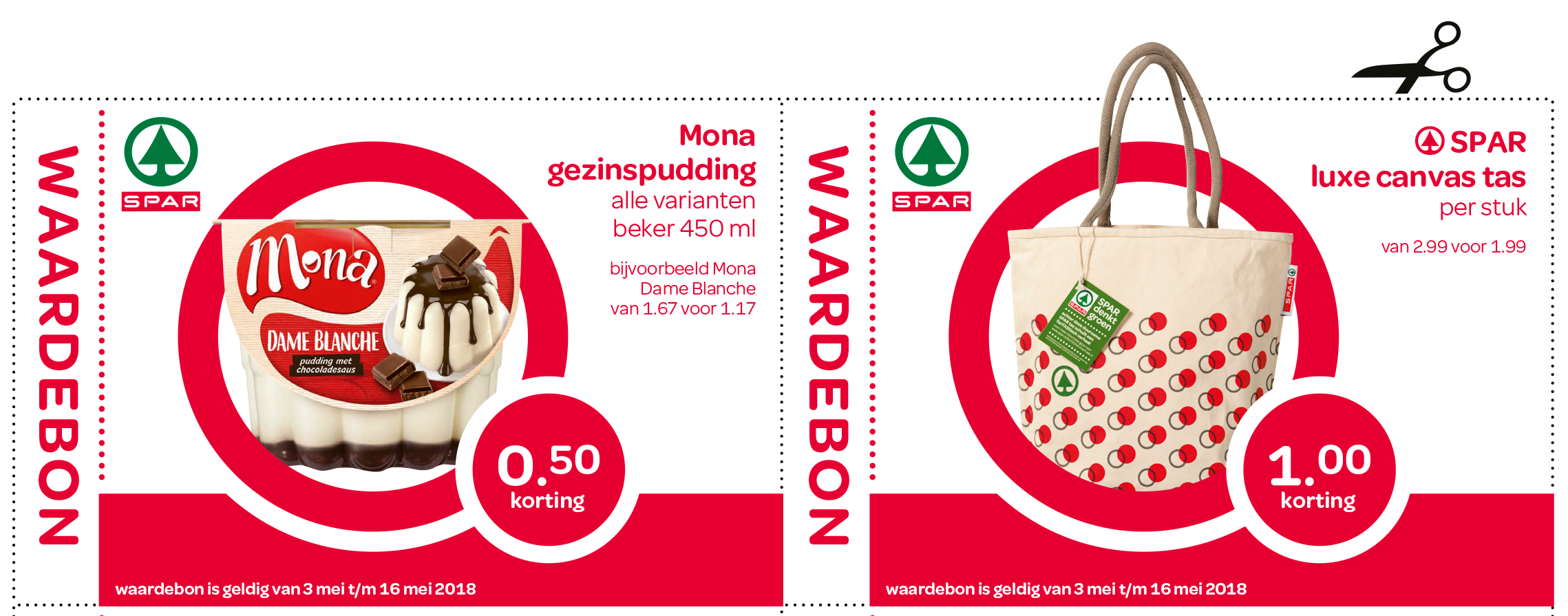
Discount coupons

Detail of a page in a leaflet advertising special offers. SPAR uses a customized version of Omnes where the alternate “long-nosed” figure 1 has been made the default.
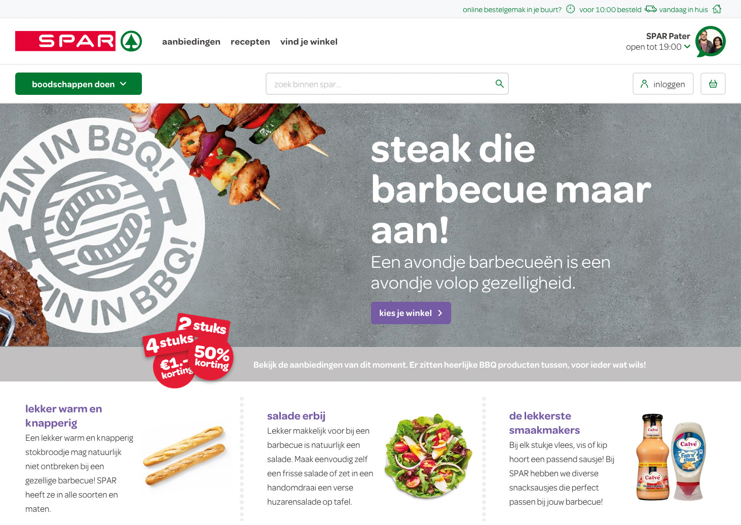
The website uses Omnes for all text — from headlines and teasers to menus, buttons, body copy, and small print. It does so with three weights; Regular, Medium, and SemiBold.

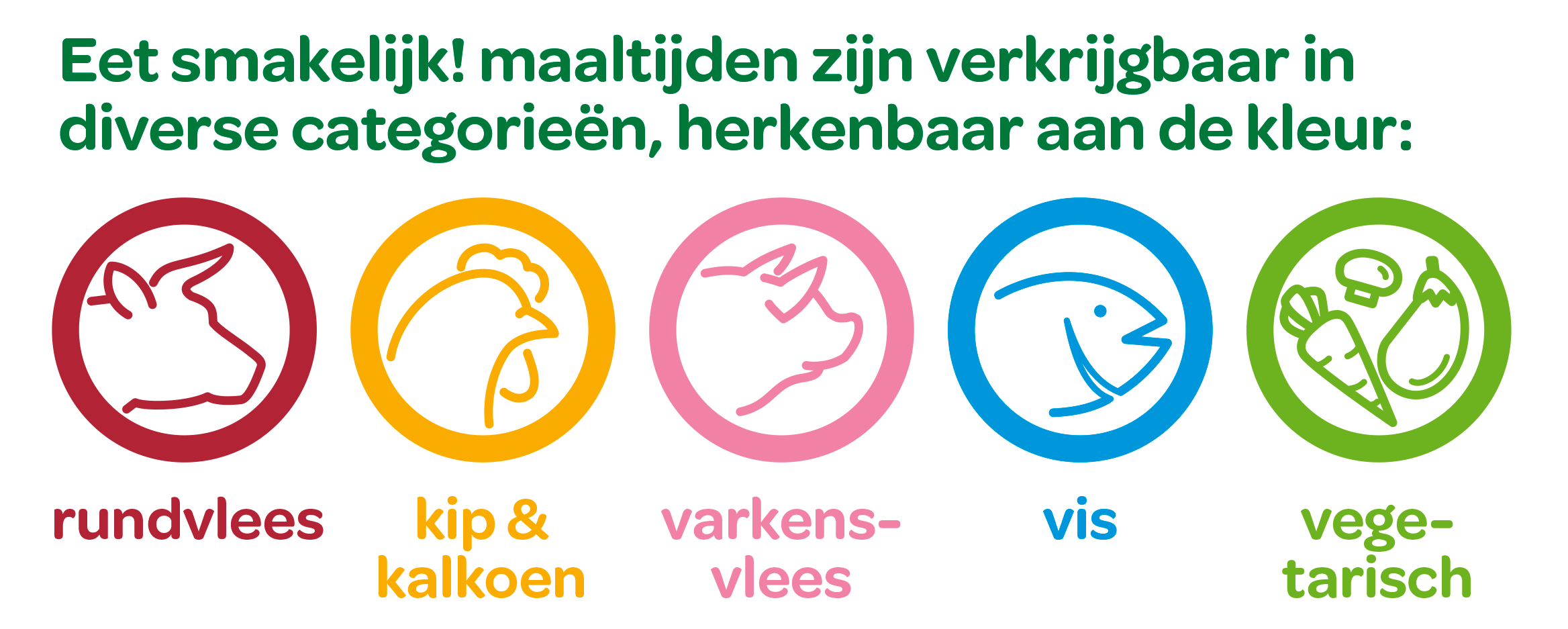
“Eet smakelijk!” (Enjoy your meal!) – cover of a magazine with recipes.
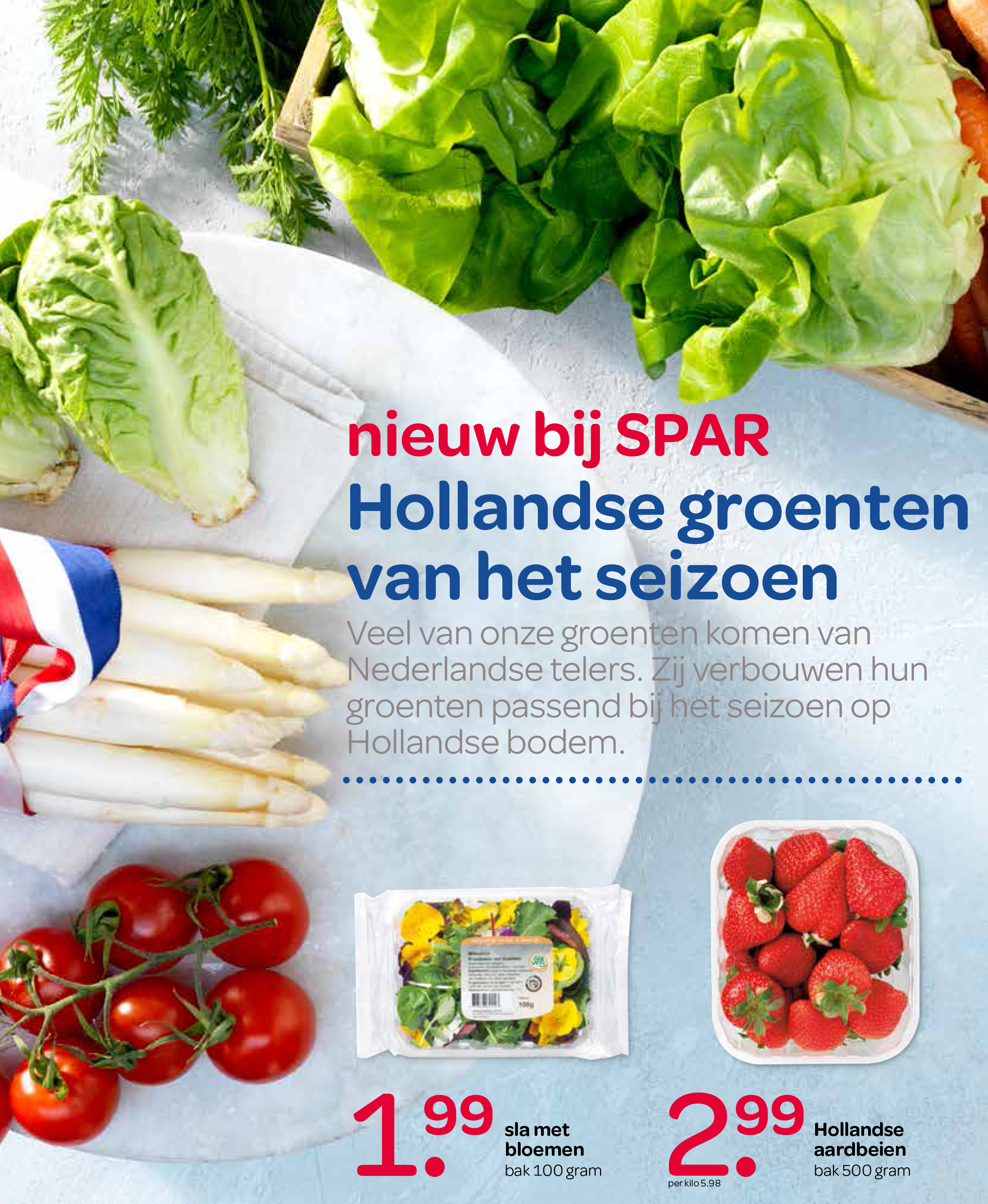
Ad for regional produce, with the headline referencing the Dutch national colors.


")


