
Politico’s European edition launched in print picking up — nearly wholesale — templates from the U.S. print edition, which is a very different beast. Not only is it geared toward an American audience with different sensibilities, but it also comes out daily when Congress is in session. The European edition publishes once a week and is thus straddling that space between newspaper and magazine.
My first task when I arrived five months after launch was to revamp it in such a way that it made sense for our audience, which is chiefly in Brussels, but also spreads to political influencers in London, Paris and Berlin. I made structural changes, introducing a grid that created nice pockets of white space throughout the book, changing the pacing of interior pages and introducing the option to have single- (or no-) story front pages that would showcase magazine-style pieces inside.
But by far the most significant change came with the typography. After working up prototypes with a handful of families, we settled on Publico (Banner and Text) for display serifs and body type, which, to me, has an instant European flair — and Guardian Sans (Headline and Text) for display sans serifs, and smaller bits like cutlines, graphics and infoboxes. I’ve found it to be versatile in the way it recedes a bit — and plays well with — Publico.
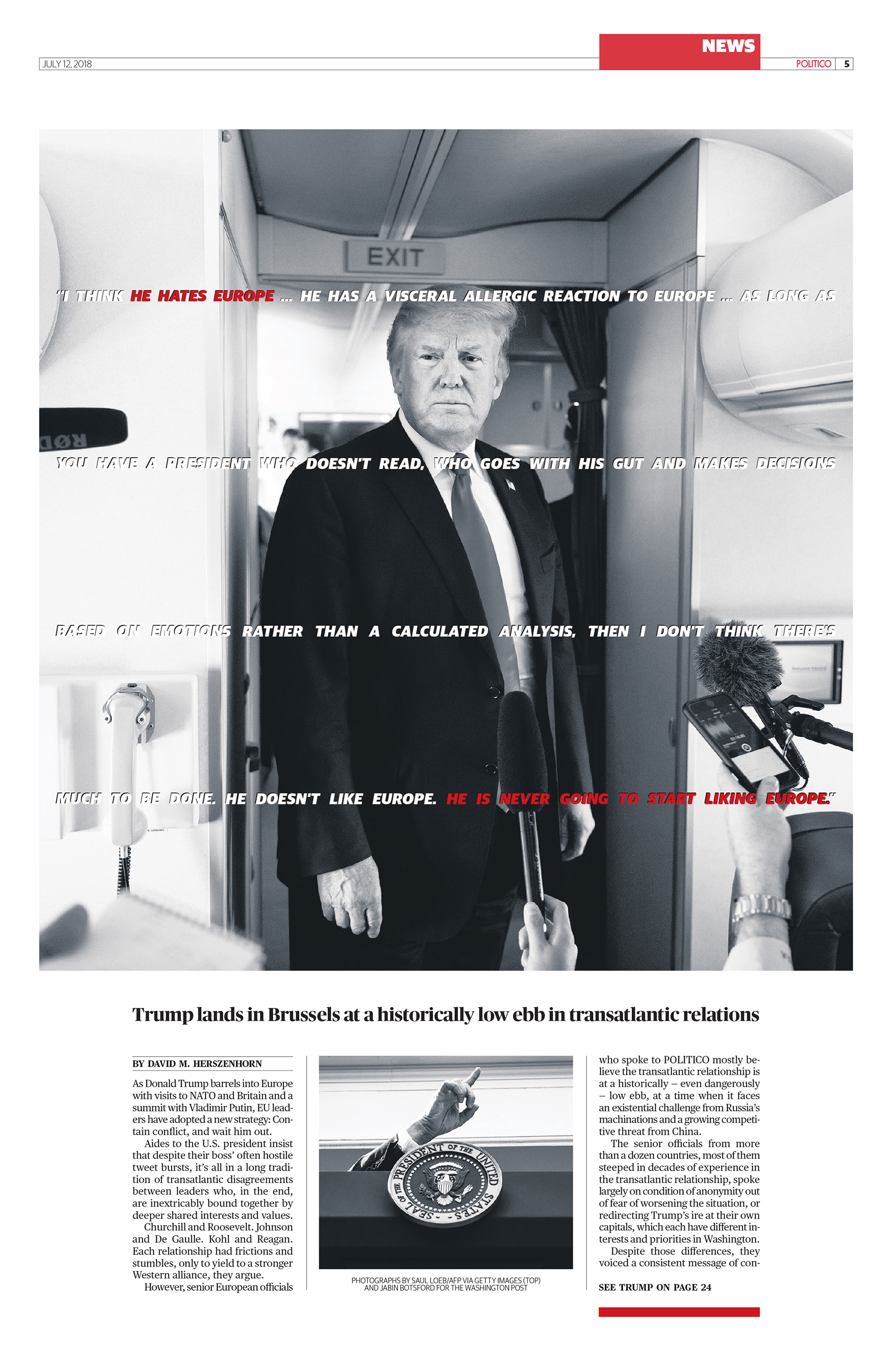
What I didn’t plan initially, but quickly found the need for, was a heavy, compressed display font that we could use sparingly on big news stories and harder-edged features. I’ve found Matt Willey’s wonderful Timmons to work perfectly for us in these situations. (We’re perhaps going to that well a bit too often of late, but it really filled a gap in our typographic arsenal.)


")


 Logo")


2 Comments on “Politico Europe”
Thanks for your contribution, Tim, and especially for sharing some info about the project and the reasoning behind the typeface selection!
Politico Europe was named one of 12 finalists as World’s Best Designed Newspaper by the Society for News Design:
This past year it was again a finalist, this time one of seven.
I am a South African and also a Layout Designer for my local free to the public newspapers… I might say, Tim Ball’s work is AWESOME! I am very impressed. How can I get hold of the POLITICO editions here in this part of the world?
Regards