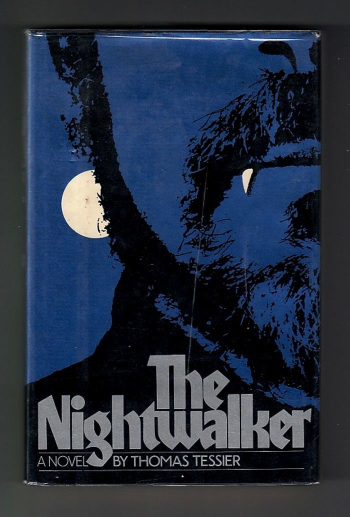
The Nightwalker – Atheneum book jacket
Contributed by Stephen Coles on Nov 25th, 2019. Artwork published in
.
20
Prolific book jacket designer Lawrence Ratzkin was fond of blackletter type, as well as ITC Honda, Ronné Bonder and Tom Carnase’s 1970 “grayletter” with equal parts fraktur and roman sans serif.
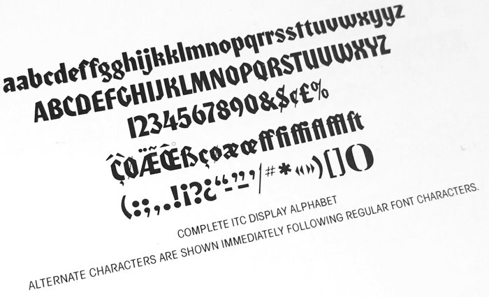
Source: www.flickr.com Photo: Stephen Coles. Sample from The ITC Typeface Collection, 1980. License: All Rights Reserved.
Ratzkin used a couple alternates for this tight lockup, including a t that I would argue is much better than ITC Honda’s default version, and which tucks neatly into the adjacent w. The standard looped k is replaced with the alternate roman form.
Unfortunately, the current digital version of ITC Honda is missing all eight of the alternates available in the original phototype version. The sample below shows what this headline would look like in the digital font. You can see why the alt t really came in handy.

Photo: Stephen Coles. License: Public Domain.
Formats
- Books (3974)
Topics
- Literature (1904)
Designers/Agencies
- Lawrence Ratzkin (7)
Tagged with
- stacked and interlocked (87)
- werewolves (4)
- book jackets (521)
- book covers (3467)
- blue (604)
- tight letterspacing (529)
- Atheneum Books (4)
- alternate glyphs (746)
- borders and rules (660)
- Thomas Tessier (1)
- teeth (15)
- moon (72)
- beards (9)
- overlap (216)
Artwork location
- United States (6342)
- New York City (1703)
In Sets
- ITC (Florian Hardwig) (338)









1 Comment on “The Nightwalker – Atheneum book jacket”
Seeing this makes me wonder whether this uncredited cover for a Kafka compilation published in NYC in 1983 was designed by Ratzkin, too. It uses the alternate a, r, and t.