Learn to Dream by John Baldessari
RIP John Baldessari. The conceptual artist passed away this week at the age of 88. Read the obituaries by the Los Angeles Times and the New York Times, or watch A Brief History of John Baldessari.
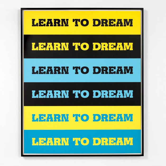
The screen print shown in this post was made in 2011. From Chartwell:
This work repeats a directive Baldessari has used throughout his career: “Learn to Dream.” These words are placed across horizontal bands of yellow, black, cyan, and light blue, and rendered in the typeface ‘Churchward Montezuma 96 Extra Bold’ designed by New Zealand typographer Joseph Churchward. Baldessari has come back to this phrase multiple times in different formats: most recently on a billboard in New Zealand for ARTSPACE, and on T-shirts for the Trespass Parade in downtown Los Angeles. In contrast to the common characterization of dreaming as something that happens unconsciously, or when we lose focus (daydreaming), Baldessari encourages us to actively dream, to deliberately engage with the creative, the irrational, and the hopeful.
The mentioned billboard was created together with Churchward. It was shown at the Langham Hotel Carpark in Auckland, New Zealand in summer 2008.

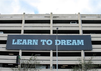
Local art writer, artist and curator John Hurrell comments:
The composition has a peculiar symmetry, two five lettered words separated by two letters (TO) in the centre, with EAR balanced by REA. The O is unusual because it is not unusual. It has no indentations or swellings like the other letters.
Churchward’s font is the real star of this image, its strange bulging curves giving the letters distended protruding stomachs so that with the chunky serifs, there is an unexpected folksy humour in the appearance of the language.
Montezuma was originally designed for the phototype library of Churchward International Typefaces. You can see the drawings at Te Papa Tongarewa Museum of New Zealand. While they exhibit some noticeable ink traps, especially in the Extra Bold, this feature has been cranked up to eleven in the version used for Baldessari’s works. Its name, Churchward Montezuma 96 Extra Bold, might indicate that Churchward revised the typeface already in 1996 (several of his other releases include the year in the name). In 2012, BluHead Studio released a digital version in four weights. Churchward Montezuma Black largely follows the design of 96 Extra Bold, albeit with looser and not always even spacing.

Comparison of the letters DREAM, composed from the original drawings for Churchward Montezuma Extra Bold (undated, Te Papa Tongarewa Museum of New Zealand, top) and the digital Churchward Montezuma Black (BluHead Studio, 2012, bottom).
Formats
- Art/Illustration (394)
- Exhibition/Installation (645)
Topics
- Art (2737)
Designers/Agencies
- John Baldessari (1)
- Joseph Churchward (1)
Tagged with
- John Baldessari (1)
- dreams (13)
- stripes (145)
- repetition (515)
- all caps (4033)
- one typeface, one size (304)
- screen printed (208)
- billboards (92)
- type in a band (190)
- public art / street art (83)
- big type (1080)
- contemporary art (256)
- ink traps (41)
- only type (884)
- 2000s (52)
Artwork location
- New Zealand (131)
- United States (6341)
- Auckland (36)
- California (152)
- Santa Monica (11)


