
East-West/West-East thesis project
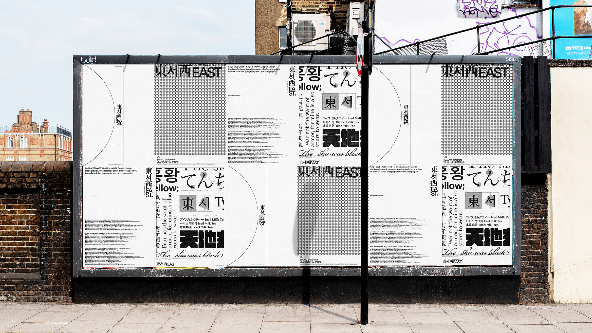
East-West/West-East thesis posters
East-West/West-East is an MFA graphic design thesis project. After knowing the situation that there is a lack of accessibility and clarity on East-Asian typography knowledge for a broader range of audience, the thesis project aims to research and design a series of references on how to use East-Asian typography and Latin typography.
While at a macro level, notions of globalization and nationalism are shifting between the two over time. Cross-culture communications in our daily life scenario are still unstoppable. Among those communications, the dialogue between East-Asia and the west is one of the driven forces. To raise the accessibility, clarity, and appropriate uses of East-Asian typography and Latin typography is needed. The resources and references shall be decentralized. It should not only limit to certain practitioners and scholars but also open to a broader and even younger audience.
The results are executed through items that can often be seen daily. Those deliverables include a book, a series of informational posters, a teaser motion, a typographical ruler, an online reference website, a series of conceptual packaging designs.
To visually execute this thesis project, one of the core strategies is to create an identity system to maintain the visual consistency of the thesis. As this thesis is creating a series of references, “neutral”, “black & white”, “typographical”, and “educational” become the keywords that lead the design and typographical choices.
For the core identity system, Lausanne, Source Han Sans and Source Han Serif are the three typographical choices. Lausanne, designed by Nizar Kazan, has a neutral appearance and high legibility. Source Han Sans, developed collaboratively by Adobe and Google, has a complete set of types that can apply to Chinese, Japanese, and Korean languages. This type family also includes seven weights and supports Traditional Chinese, Simplified Chinese, Japanese, and Korean. It also includes Latin, Greek, and Cyrillic characters from the Source Sans Pro family. Source Han Serif is the serif version of the Source Han type family, being a counterpart.
Specifically, in the thesis book, Dutch 801 (Bitstream’s version of Times) is used to enhance the feeling of being educational and informational. The appropriate character height-width ratio makes itself a typeface fitted for both large and small scales. Its softness and roundness from the serifs, bowls, teardrops, and terminals create its high readability for audiences. Lyon Text is used to display Latin languages along with Source Han Serif in captions and other small descriptions. For demonstrating type terminology and characteristics in the book, Nanum Myeongjo is sometimes applied to replace the Korean fontset from Source Han Serif. The Korean characters within Source Han Serif family have more roundness and edginess, creating more brushstrokes-like features. The sharpness and cleanness from Nanum Myeongjo seem to fit more with Chinese and Japanese types from Source Han Serif.
As one of the critical parts of this thesis project, East-Asian typefaces pairing with Latin typefaces are addressed. These pairing examples (not shown in this post) include the following:
Hiragino Mincho and Monotype Baskerville
Luckytype Juzhen and Self Modern
Sandoll GothicNeo and Garnett
Hiragino Kaku Gothic and Sentinel
AR Yuanti and Gotham Rounded
MF Jinhei and Bickham Script
Disclaimer: The end of an MFA thesis project is certainly not the end of its practice. The next steps would include researching deeper on East-Asian typography and sharing my results with other designers/students who might be interested in such a topic. Due to the variety and quantity of existing East-Asian typography realm, this thesis project is open-ended and willing to contribute to any ongoing studies, conversations, projects, and digital platforms which explores such topic.
Find more images on my website, or browse through the process documentation.

East-West/West-East poster details

The thesis book consists of two parts. Part I is East-Asian Typography Atlas while Part II is Thesis Process. The final book will be crafted with a do-si-do binding technique. The form is a representation of the coexisting relationship between these two parts.

The thesis book spread example
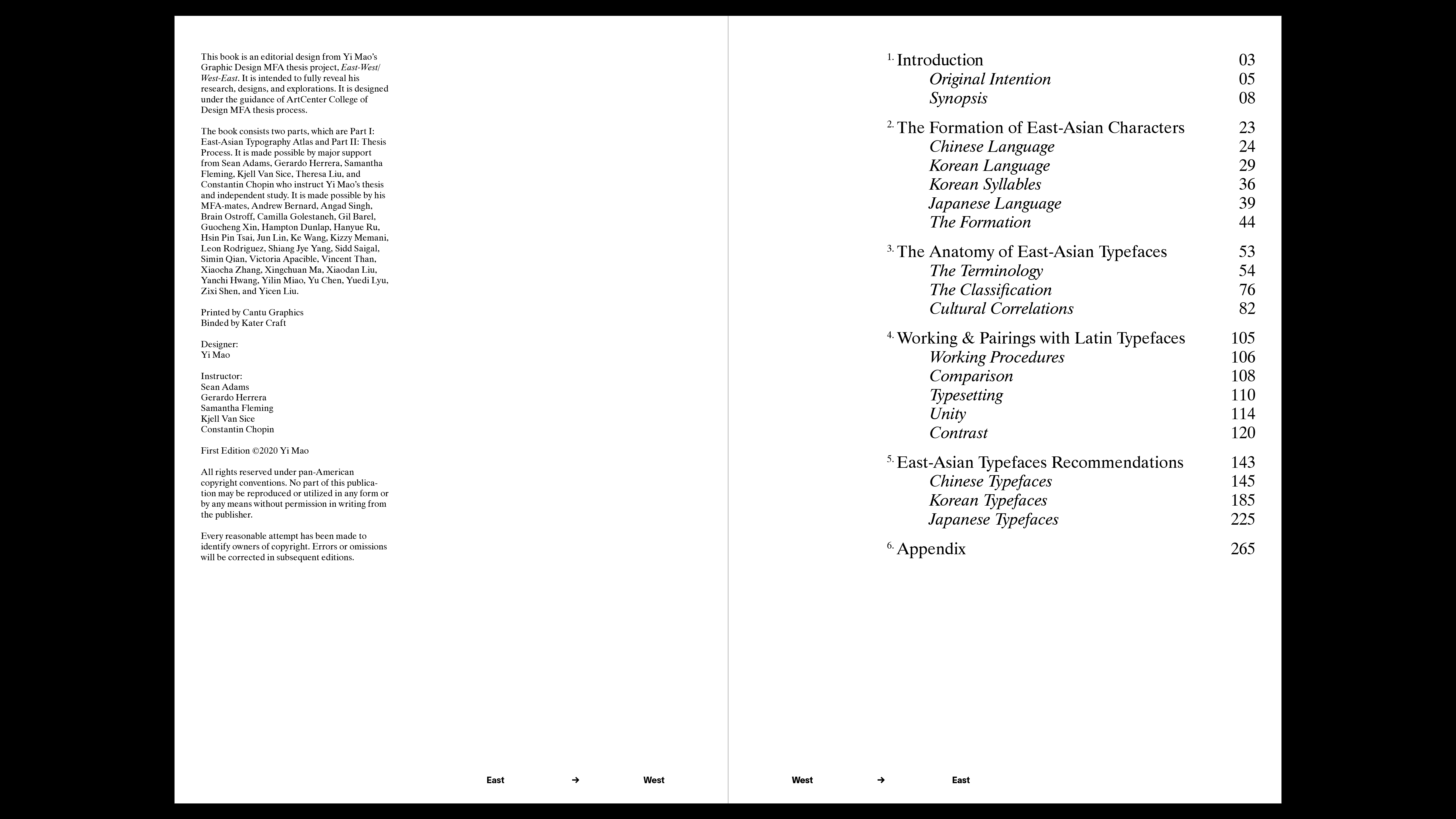
The thesis book Part I contents page
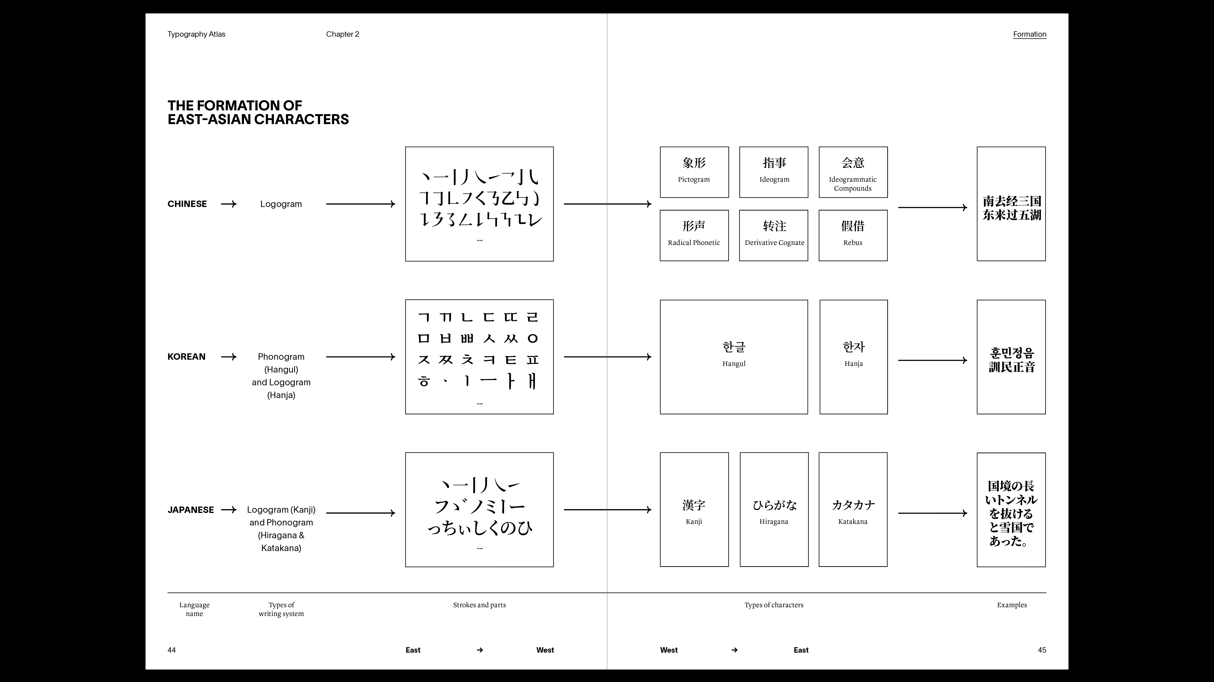
The thesis book Part I example: the formation of East-Asian characters
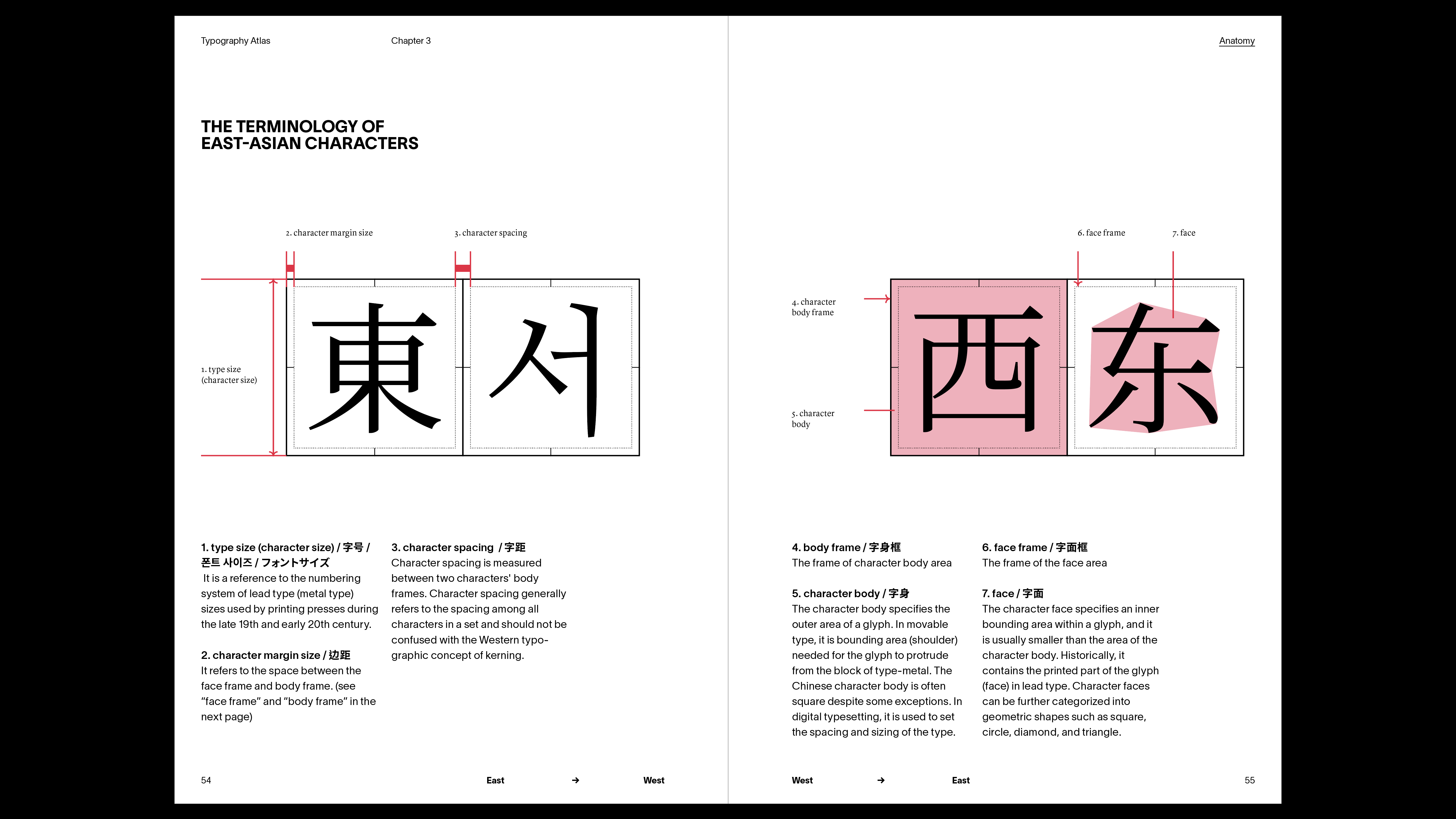
The thesis book Part I example: the terminology of East-Asian characters

typographical rulers for East-Asian typography and Latin-typography


")


