The Black Panther: Black Community News Service
Typewrite, rubdown, and pasteup: 1960s photo-reproduction empowered Emory Douglas to make maximum impact with minimal time and expense.
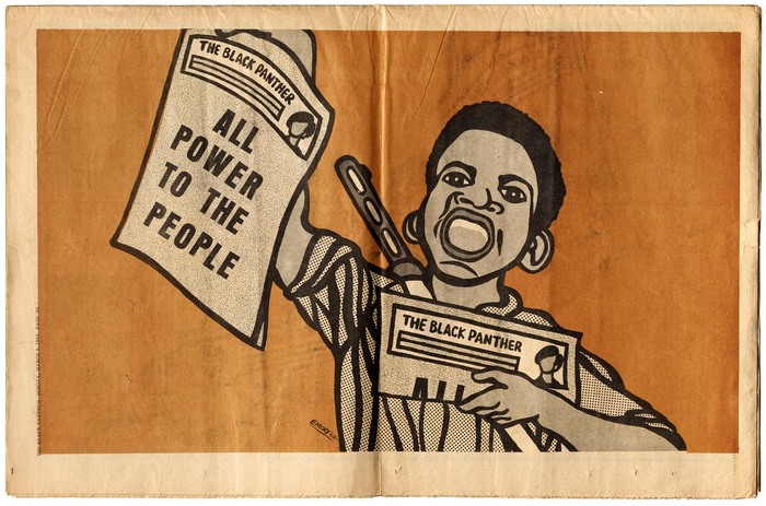
The Black Panther, published weekly by the Black Panther Party, shone a light on injustice, educated and organized the Black community, and promoted the party’s platform, the Ten-Point Program, which demanded full employment, decent housing, education, health care, and an end to police brutality.
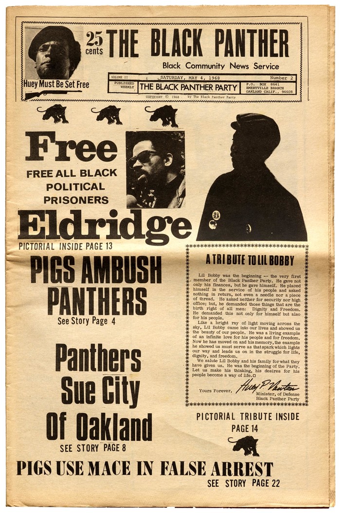
Douglas typically kept font styles to a minimum, but this Black Panther cover explodes with Futura, Alternate Gothic, Ultra Bodoni, Clarendon, Univers, and Compacta. The tribute to Bobby Hutton is set on an IBM typewriter using Bold Face No. 2.
Like other publications of the 1960s and ’70s who sought independence from commercial requirements and cultural conventions, The Black Panther was made possible, in part, by the accessibility of new tools like transfer lettering, composing typewriters, and photographic reproduction. A new era of independent publishing empowered the Panthers to deliver their message on a regular basis to thousands (and, later, hundreds of thousands), despite the government’s continued efforts to shut down the paper and the party.

The pages were filled with news stories and critical essays from party leaders, but it was Emory Douglas’ graphical contribution, in the form of cartoons, collages, and a full-page illustration on each back cover, that struck a chord with the broadest audience. At the age of 22, Douglas was the party’s Minister of Culture and directed the design of the newspaper from its inception in 1967 to the early 1970s.
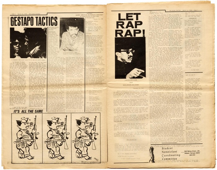
March 16, 1968, with headlines in Haas Inserat-Grotesk / Neue Aurora VIII, Venus Extended, and Grotesque No. 9 Italic, and text set on an IBM Selectric in Prestige. “Student Nonviolent Coordinating Committee” in the bottom right corner shows Lydian Italic and Futura Condensed.
Early issues were an assemblage of typewritten columns, makeshift rules, transfer lettering, and hand-drawn political cartoons. While the conditions were born of necessity, they gave the paper an aesthetic of urgency. In a 2017 interview with Letterform Archive, Douglas recalled the process of making the paper:
Initially, wherever we were set up, [usually someone’s home], that would be our production area. We used regular tables, regular lights, Elmer’s glue, rubber cement. We cut and pasted. We made up our own layout sheets. Non-repro blue markers. A lot of it was done on typewriter. We knew some folks in the publishing business, so every now and then we could get them to typeset the galleys.
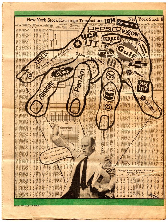
September 21, 1974.
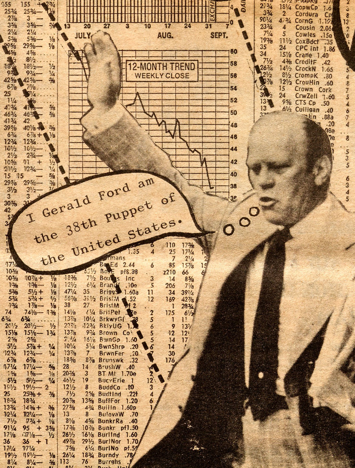
Text set on a typewriter, likely in Wide Elite Victoria.
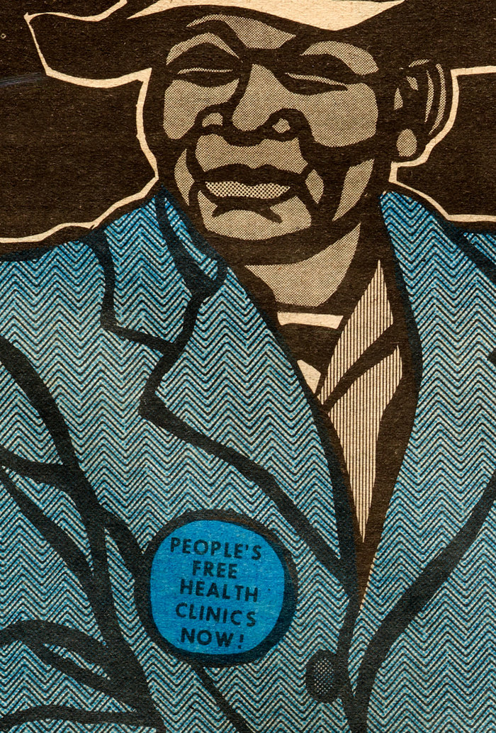
The limitations of the production setup yielded results that came to define the visual style of the paper, especially as Douglas gained experience with each week’s issue. The thick marker lines of his woodcut-inspired drawings were not only graphically appealing, they also masked the imperfect registration of the newspaper press.
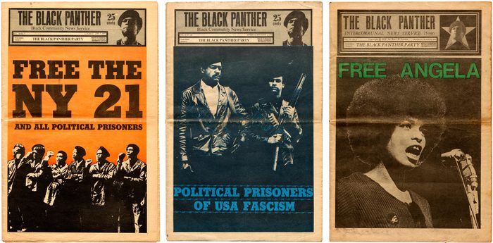
Stymie Black for June 7, 1969 and November 1, 1969. Helvetica for March 13, 1971. These nameplates use Haas Inserat-Grotesk / Neue Aurora VIII (once featuring an R with a curved leg), Times New Roman, ATF Garamond Italic, and Bodoni Italic.
Headlines were typically set in rub-down type, or cut-out acetate lettering from Formatt. Douglas liked the product because it was cheaper than Letraset, and because the letters could be easily reused. Douglas remembers, “they had a line underneath the alphabet so you could set words without having to rub the letters off.”
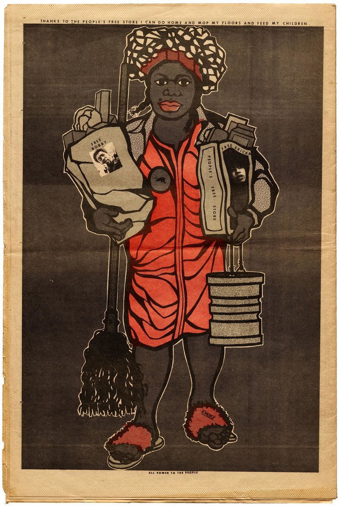
April 10, 1971.

Futura was commonly used for illustrations.
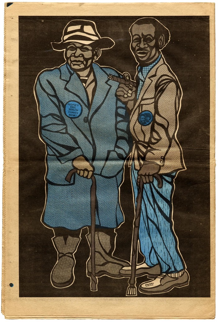
May 1, 1971.
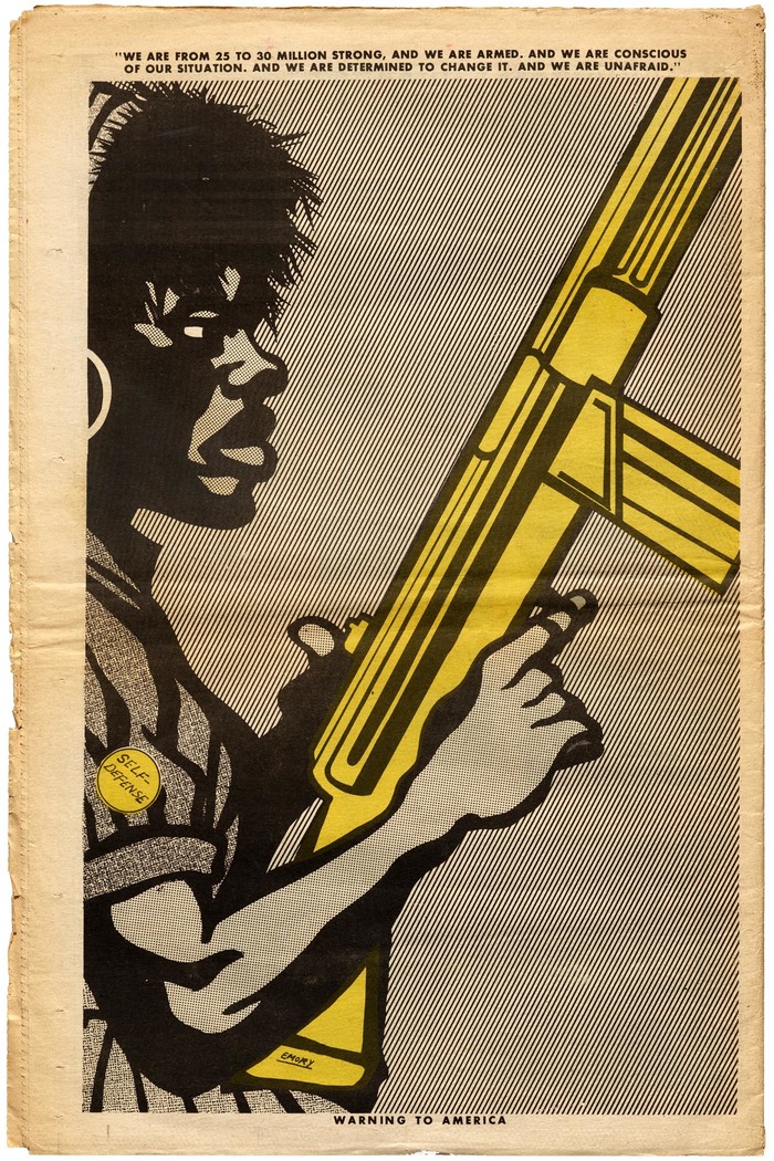
November 21, 1970.
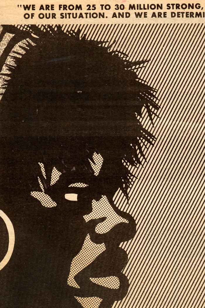
Douglas wasn’t a stickler for typographic rules, but he hung his punctuation here.
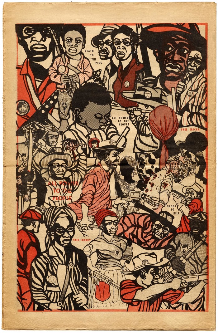
January 23, 1971.
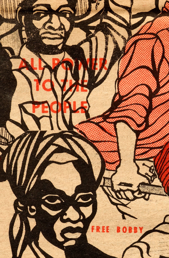
For his back-page posters, Douglas often took advantage of the one-letter-at-a-time flexibility of transfer type. He broke free of traditional grids and alignments and often set the type on curves and angles to fit within the illustration. In my favorite examples of his graphical typesetting, Douglas uses the cut-out letters within the scene of the artwork itself, such as in the protest buttons worn by his hero characters, or the iconic “ALL POWER TO THE PEOPLE” newspaper of March 9, 1969 (top), or the “RENT RECEIPT” of July 25, 1970 (below).
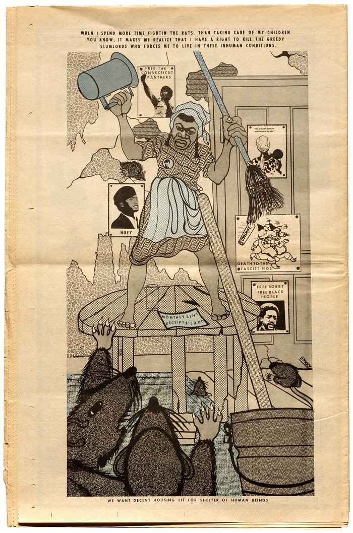
July 25, 1970.
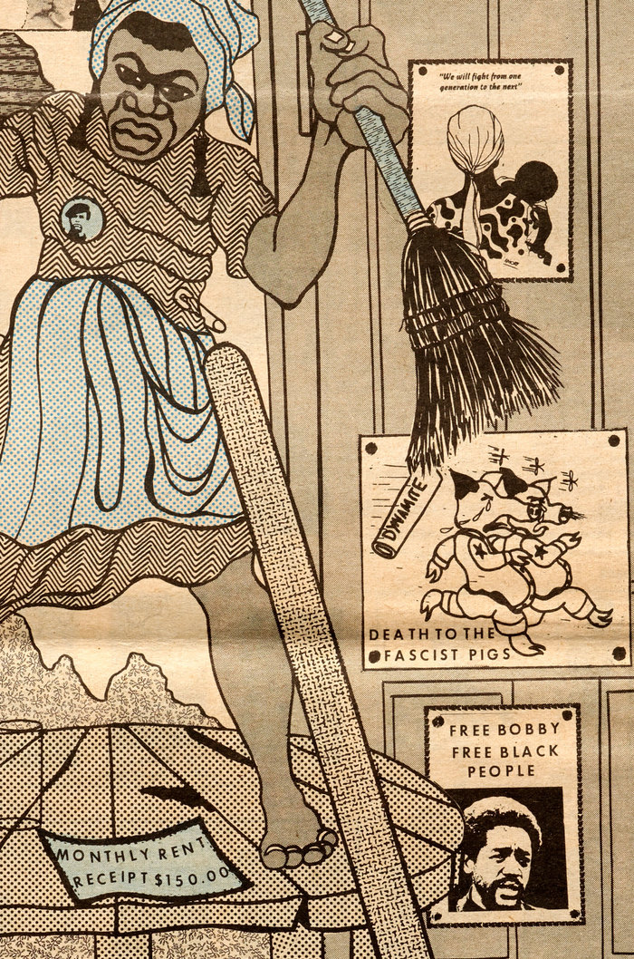
Douglas’ use of Letratone and Formatt shading patterns became another signature of his art. Not only did they add texture and interest to the illustrations, they were an effective, low-cost alternative to multicolor printing. Most issues of the paper were one-color (black) or two-color (black plus one color). At least ten different transfer patterns are used in this piece above. See examples of the source patterns below.
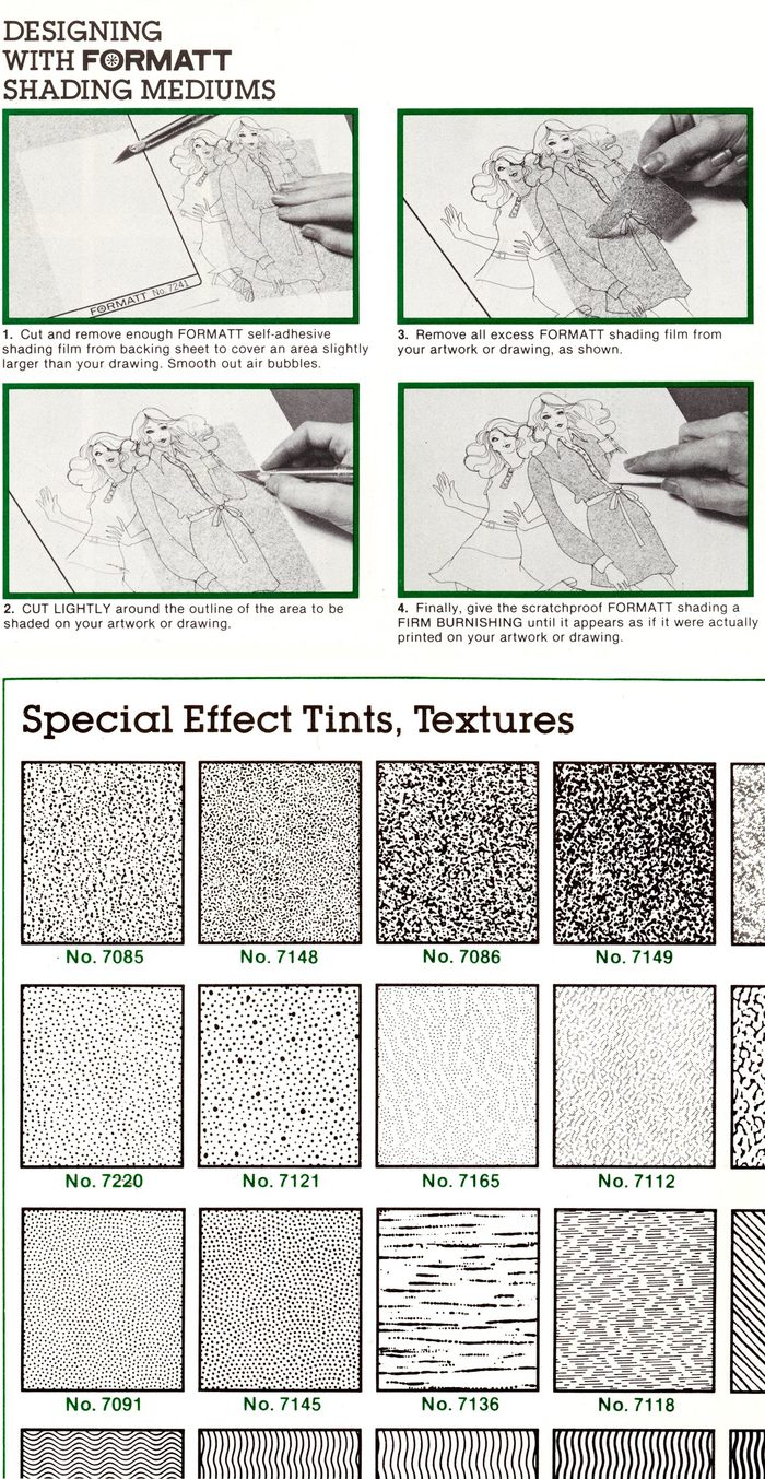
Formatt Catalog No. 6, © 1978 Graphic Products Corp.
At its height, from 1968 to 1971, The Black Panther was the most widely read Black newspaper in the United States. In fact, it was among the most widely distributed publications of any kind, reaching a peak weekly circulation of more than 300,000, rivaling the major newspapers of most US cities. It was eventually distributed internationally, with multiple centers in the US, anchored by the main center in San Francisco.
Portions of this article were excerpted from “Emory Douglas & The Black Panther” at Letterform Archive. All the images were photographed by the Archive from our collection. We are honored to host a special online event with Douglas on August 27, 2020.
All artwork © Emory Douglas / Artists Rights Society (ARS), New York.
Formats
- Newspapers (213)
- Art/Illustration (395)
Designers/Agencies
- Emory Douglas (3)
Tagged with
- African American (91)
- civil rights (21)
- 1960s (498)
- The Black Panther (newspaper) (1)
- protest (81)
- newsletters (23)
- newspapers (112)
- 1970s (1109)
- Black Panther Party (5)
- stacked and staggered (216)
- dry transfer lettering (116)
- screentone (2)
- IBM Selectric & Selectric Composer (19)
- counterculture (32)
- hanging punctuation (40)
- typographic eclecticism (172)
- uncertain typeface ID (160)
- Black Panther Party (5)
- panthers (3)
- Angela Davis (6)
- Gerald Ford (4)
- Bobby Hutton (1)
- newspaper front pages (53)
- newspaper interiors (43)
- newspaper logos (21)
- nameplates (8)
- DIY (75)
- crude production (24)
- historically significant (22)
- US history (52)
Artwork location
- United States (6365)
- Emeryville (4)
- Oakland (24)
- San Francisco (228)




















3 Comments on “The Black Panther: Black Community News Service”
For more about this era of photographic reproduction, I highly recommend the film Graphic Means and director Briar Levit’s 2017 lecture:
Dan Rhatigan’s 2016 lecture on Letraset is also worth watching:
Read a report and see the recording of Making The Black Panther, A Conversation with Emory Douglas.