Giant 45 single record series (AVI Records)
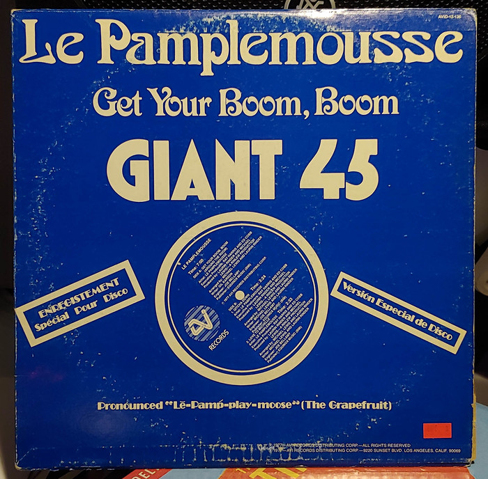
Le Pamplemousse – “Get Your Boom, Boom”, featuring Arnold Böcklin and a phototype version of Victoria (redesigned at Letraset with slightly different forms as Victorian). The smaller bits are in Broadway.
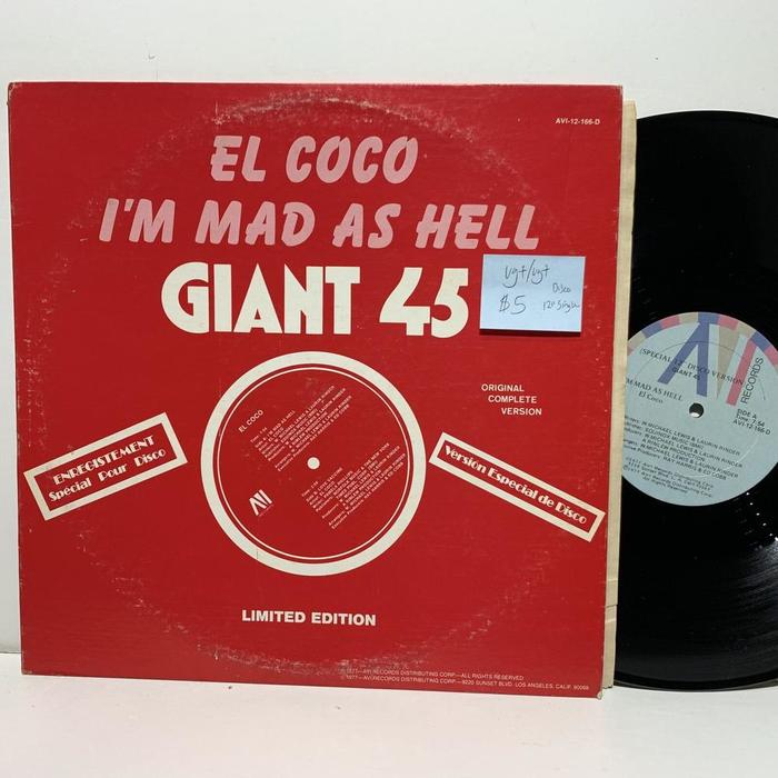
I found this pair of disco 12″ singles – Le Pamplemousse’s “Get Your Boom, Boom” and El Coco’s “I’m Mad As Hell” – the other day and was really taken aback by the typography. Turns out they are some pretty tasty jams as well.
The El Coco is obviously in Balloon, and long time friend, and fellow Fonts In Use contributor, Mark Butchko tipped me off to the Arnold Böcklin. I think I see some Broadway in there as well, and I assume the small print is Helvetica, but the “Get Your Boom, Boom” and “GIANT 45” typefaces are a mystery. I’m especially interested in the “GIANT 45” font. Any leads? [Yes! See comments – FH]
The Giant 45 series was issued between 1976 and 1978 by AVI Records, Los Angeles. Some of the featured acts are aliases by Rinder & Lewis. “During the mid to late seventies the production team of Laurin Rinder and W. Michael Lewis helped to define the Disco sound that was coming out of Los Angeles with studio projects such as El Coco, Saint Tropez, Le Pamplemousse and many others.” – Discogs. All sleeves from this series are printed in a single color, with reversed typography in a wild range of display typefaces. The boxed texts in French, Spanish, and German suggest that the records were aimed at the international market.
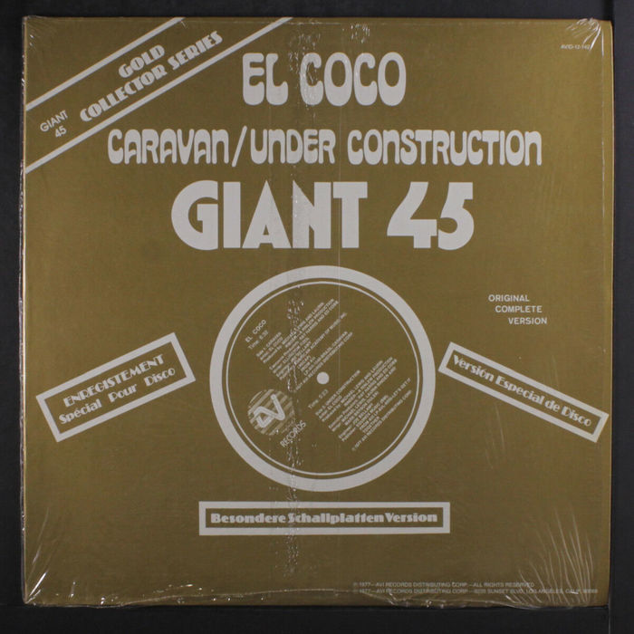
El Coco – “Caravan” / “Under Construction” uses Davison Arabesque AKA Vigus. In addition to Broadway, there’s also Koloss for “Besondere Schallplatten Version” and “Gold Collector Series”. The small “Giant 45” in the top left corner shows ITC Avant Garde Gothic.

El Coco – “Just Be You” with more Broadway, here also for the big stage, in a version with sturdy hairlines and the original alternate S.
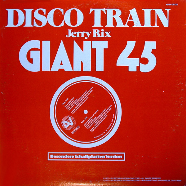
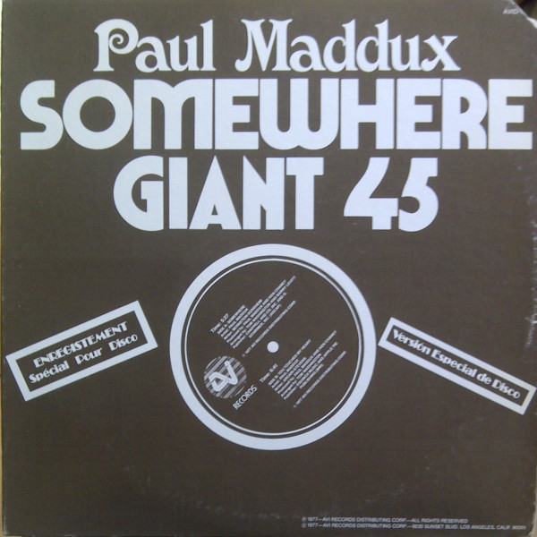
Paul Maddux – “Somewhere” ft. more Victoria and Marvin.
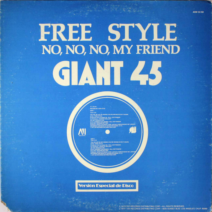
Free Style – “No, No, No, My Friend” ft. Palatino Bold.
Formats
- Album Art (2593)
Topics
- Music (3871)
Designers/Agencies
- unknown (2140)
Tagged with
- disco (58)
- phonetic (9)
- multilingual (1157)
- French (language) (1241)
- Spanish (language) (418)
- English (language) (1061)
- German (language) (1309)
- vinyl records (2228)
- single records (653)
- series (667)
- 1970s (1106)
- AVI Records (1)
- Rinder & Lewis (1)
- El Coco (1)
- Le Pamplemousse (1)
- Paul Maddux (1)
- Jerry Rix (1)
- one color (215)
- reversed type (1934)
- vinyl records (2228)
Artwork location
- United States (6349)
- Los Angeles (342)













4 Comments on “Giant 45 single record series (AVI Records)”
Hi Ian,
Fellow moderator Matthijs and I have added some more examples from this series, with info about the fonts in use.
“GIANT 45” is set in the Black weight from Washington. This series was designed by Australian lettering artist Russell Bean during his time at Lettergraphics, a phototype company in Culver City, California. Washington is shown in 5 weights in a 1974 ad by Lettergraphics. Bean made a digital version that is available through his Type Associates label.
The Victoria version appears to be a phototype adaptation (possibly also by Lettergraphics) of this Art Nouveau face, originally issued by the Flinsch foundry in Frankfurt/Main before 1900. In 1976, Freda Sack made a redesign named Victorian (Letraset, 1976).
Wow, excellent work! Now I feel like I need to collect all of these like Pokemon.
Just as with Pokémon, some look cute while others are rather hideous. And there are way more than one would think!
Still, chances are that one day we have found them all, and have to wonder: what shall we do when the disco’s over? — probably grab a Souvenir and move on.