Fafhrd & The Gray Mouser book series by Fritz Leiber (Ace)
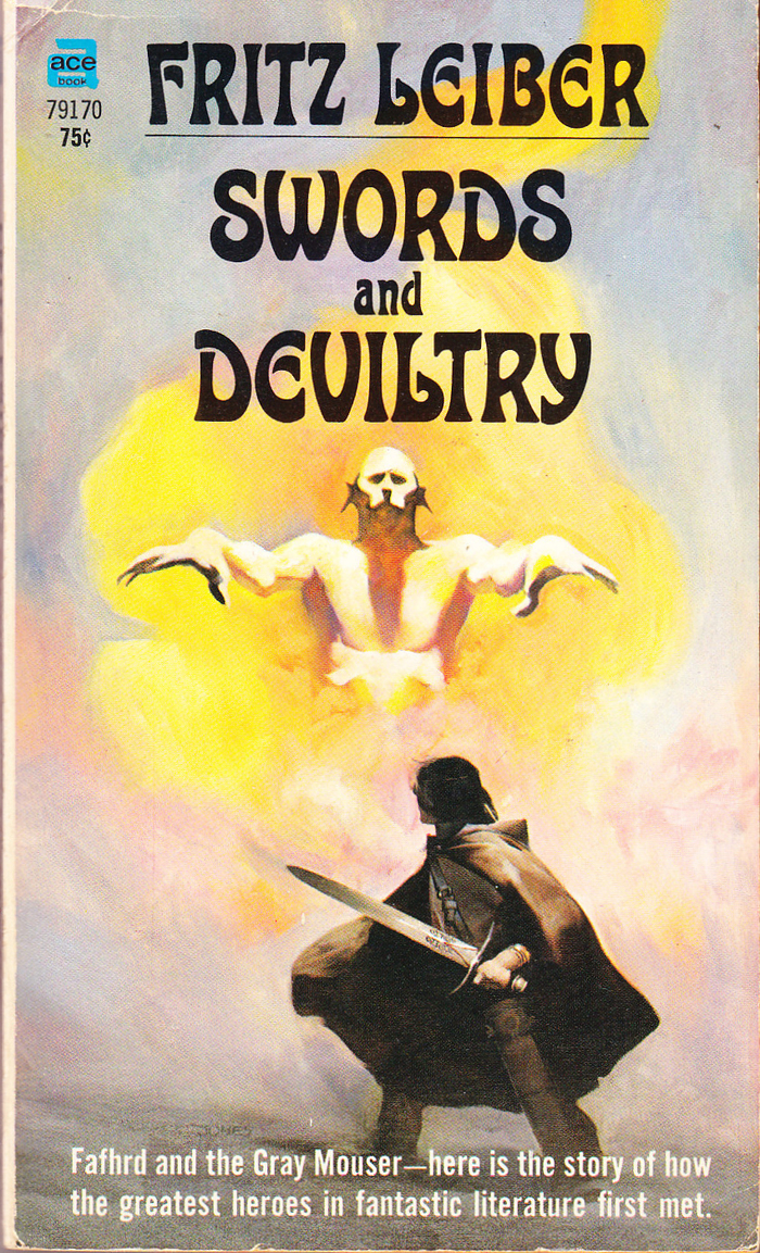
Swords and Deviltry (#1), Ace 79170, 1970. The secondary typeface is Alternate Gothic.
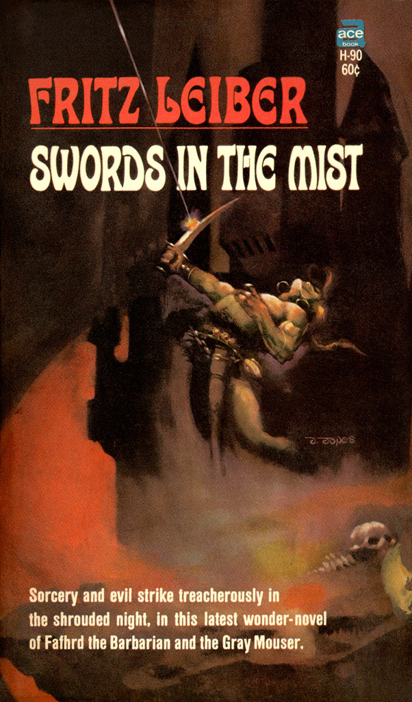
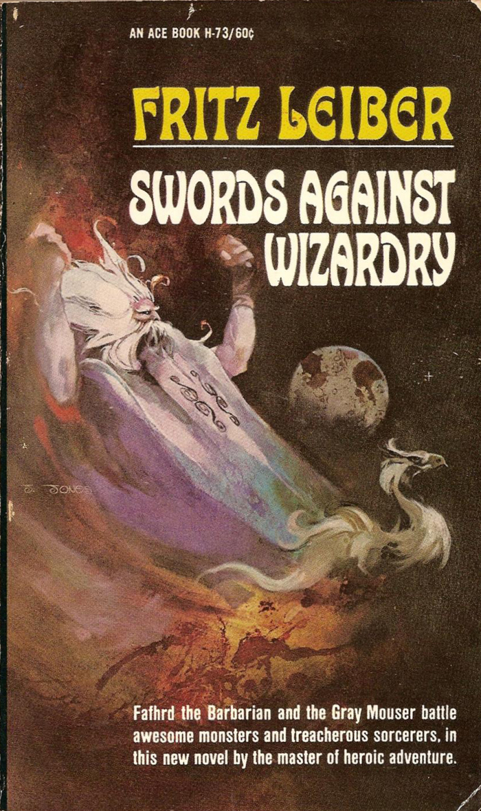
The first edition of the Fafhrd & The Gray Mouser book series is the most prominent in-use example of Ringling Brothers that I’m aware of. Five volumes with collected stories by Fritz Leiber were published by Ace Books between 1968 and 1970, with cover art by Jeff Jones.
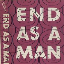
Ringling Brothers originated at Photo-Lettering in New York. The face is shown in their Art Nouveau Xenotypes 1895–1905 from 1962 as Xenotype 3488. It’s a rounder and bolder rendition of an untitled “modern alphabet” shown by Chicago-based lettering artist J.M. Bergling in his Art Alphabets & Lettering from 1914. Photo-Lettering also had a direct adaptation of Bergling’s alphabet, under the name Xenotype 3487, aka Staudel Xenotype K.

Staudel Xenotype N (aka Xenotype 3488) and Ringling Brothers as shown in Photo-Lettering’s One Line Manual of Styles (1971). The latter appears to have slightly larger gaps in letters like a or E.
Their 1971 catalog features the bolder interpretation twice, as Staudel Xenotype N (with catalog number 3488) and as Ringling Brothers (4465). If there are any differences between the two, they are minute. The only obvious variation that I can detect in the limited one-line showings is that the gaps are smaller in 3488 and tend to fill in. My guess is that Ringling Brothers is a revision with slightly larger openings to counter this effect. It’s named after an American circus family active in the late 19th and early 20th century. No designer is credited for either version. The faces were likely drawn under the supervision of PLINC’s art director Ed Benguiat, or maybe even by himself.
The five paperbacks covers feature Ringling Brothers exclusively in all caps. The phantasmagorial Art Nouveau face is paired with various condensed sans serifs.

Swords Against Death (#2), Ace 79150, 1970. The small text on vols 2–4 is set in Helvetica schmalhalbfett. This cut originated at Haas as Commercial-Grotesk.

The Swords of Lankhmar (#5), Ace H-38, 1968. Futura Condensed is used for the blurb.
Typefaces
Formats
- Books (3990)
Topics
- Literature (1911)
Designers/Agencies
- Jeff Jones (6)
Tagged with
- Fritz Leiber (3)
- Ace Books (14)
- fantasy (85)
- book covers (3480)
- paperbacks/softcovers (885)
- book series (348)
- all caps (4046)
- sword and sorcery (7)
- swords (19)
- first editions (93)
- typeface profile (71)
Artwork location
- United States (6363)
- New York City (1705)




















4 Comments on “Fafhrd & The Gray Mouser book series by Fritz Leiber (Ace)”
Love it! Thanks Florian
Thanks, Quentin! This era – mid 1960s to early 1970s – was a very productive and inventive one, even if some of the new faces had origins in previous times, like Ringling Brothers.
Good idea about starting a Set for Science-Fiction/Fantasy paperbacks! I’m using the Advanced Search a lot for viewing this kind of segments, but Sets definitely are a great tool to refine the selection and make it easily accessible to others.
Thank you for posting this, Florian. I did an extensive search back in 2013 trying to track down the title font for this series of Leiber’s Fafhrd and the Gray Mouser stories, but to no avail. I was pleased to run across your article when I was browsing the website this afternoon. On a side note, I believe Ringling Brothers was also used for the title font of the 1970 edition of Man, Myth And Magic: An Illustrated Encyclopedia Of The Supernatural. Finally, I have also been trying to find another font used for a later printing by Ace of these Fafhrd and the Gray Mouser books. The same artwork was used, but framed in a different fashion, and a really fantastic font was used for the Leiber’s name. Any ideas?
Shane, thanks for your comment!
Yes, I can confirm that the 24-volume edition of Man, Myth & Magic represents another use of Ringling Brothers. More specifically, it features the contoured variant, which for some reason got named Staudel Weinerschnitzel A at Photo-Lettering, Inc.
For Ace’s later printing of the Fafhrd and the Gray Mouser books: I’m afraid that the author’s name features custom lettering. That is, it was likely custom drawn, and not based on an existing font. The shaded caps used for the titles seem to be another face from Photo-Lettering, named Pacella Decatur.
Florian, thanks for the reply. I suspected it might be custom lettering, but it’s nice to have it confirmed. Cheers!