Hotel Eisenhut, Rothenburg
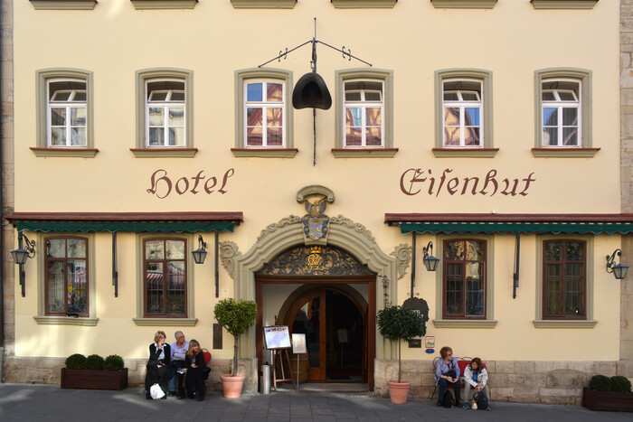
Weiß-Fraktur-Kursiv is one of only a few italic fraktur typefaces. Seemann’s Handbuch der Schriftarten – a compendium of virtually all typefaces that were available from foundries catering to the German-language market (incl. Swiss and Austrian companies) at the time of its publication in 1926 – lists no more than eight such styles, in a dedicated section titled “Deutsche Schrägschriften”. Schräg is “inclined”. Deutsch (lit. “German”) refers to blackletter, and was then used as an umbrella term for gotisch, fraktur, Schwabacher, and other “broken script” styles. Traditionally, these did without an italic counterpart. Typographic emphasis was accomplished through other means. This included letterspacing the word(s) in question, especially for fraktur typefaces, or switching to a larger point size or a different style, for example using a Schwabacher for emphasizing words in fraktur text.
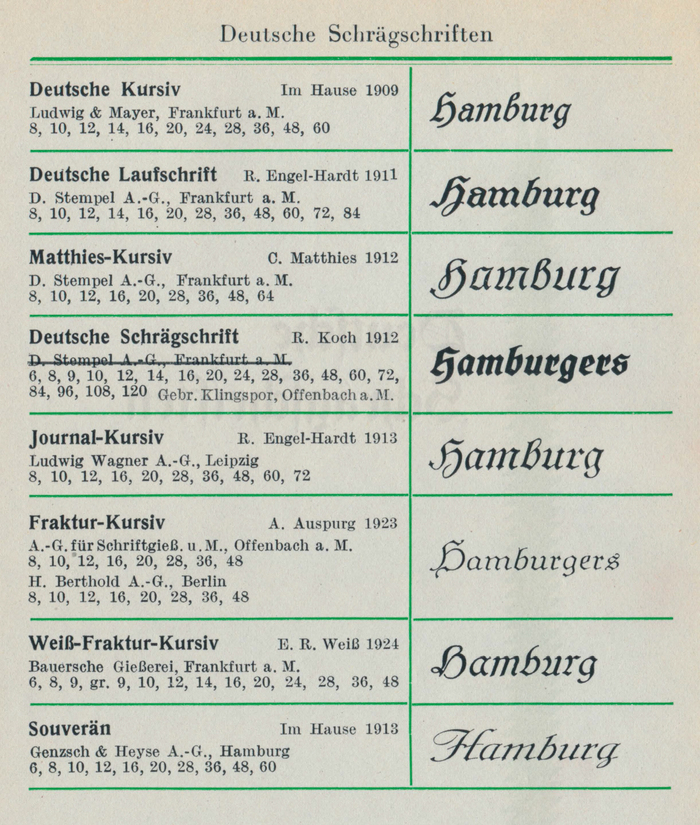
“Deutsche Schrägschriften” as shown in Handbuch der Schriftarten, edited by Emil Wetzig and published by Albrecht Seemann Verlag, Leipzig, 1926. Later addenda list a few more releases in this novelty subgenre.
The idea of having an inclined fraktur emerged around the end of the first decade of the 20th century. It was linked to the reappraisal of blackletter as a token of national pride and expression, which led to new wave of typeface designs, some of which were expanded into larger families, similar to what was already common for roman typefaces. Rudolf Koch, the driving force behind the revival of traditional lettering and calligraphy and a proponent of broken scripts, conceived an inclined companion for his Deutsche Schrift. His Deutsche Schrägschrift was cast by the Klingspor foundry in 1912, making it the earliest inclined blackletter with a matching upright. Weiß-Fraktur-Kursiv is a latecomer: While a first attempt at an italic counterpart was shown in a 1914 specimen for Weiß-Fraktur, it wasn’t released before 1924, eleven years after the original Weiß-Fraktur.
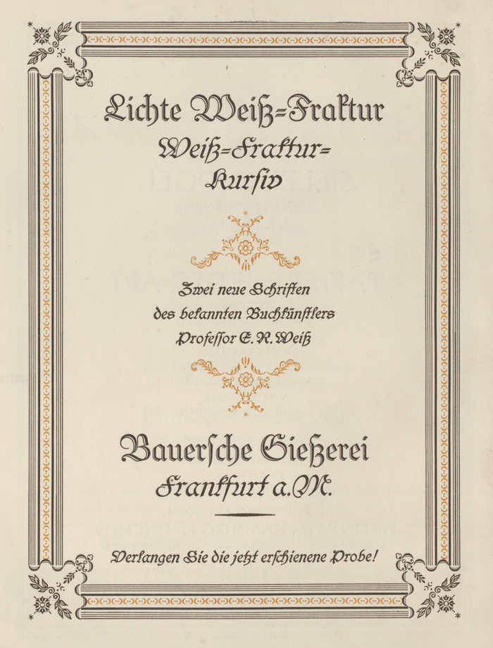
Ad by the Bauersche Gießerei for Lichte Weiß-Fraktur (an open cut of Weiß-Fraktur) and Weiß-Fraktur-Kursiv in Typographische Mitteilungen, vol. 22, no. 2 from February 1925.
Bastardas including fraktur or Schwabacher tend to be cursive already, with an uninterrupted, returning construction. When Emil Rudolf Weiß added an italic to his eponymous Fraktur, he referenced elements of Kurrent, the running script branch of blackletter, to distinguish it from the upright style by more than slant alone. This is particularly noticeable in the design of the capitals, see A, H, K, M, or N with the visible upstrokes.
The lettering on the façade of Hotel Eisenhut in Rothenburg ob der Tauber is an unexpected in-use example of Weiß-Fraktur-Kursiv. The painted letterforms aren’t exactly faithful to the original. They are less inclined and include an e with an enlarged and pointed eye, an h with shortened descender, and an ſ that sits too high – not to mention the phlegmatic dot in i that didn’t get the “italicize!” memo.
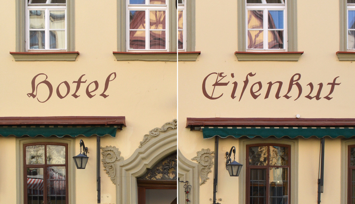
Detail of the façade lettering at Hotel Eisenhut, Rothenburg.
Formats
- Signs (1396)
Topics
- Travel (539)
Designers/Agencies
- unknown (2175)
Tagged with
- hotels (92)
- facades (54)
- painted (75)
- German (language) (1326)
- blackletter (183)
- lettering derived from typeface (483)
- typeface profile (71)
Artwork location
- Germany (2559)
- Rothenburg ob der Tauber (6)





















1 Comment on “Hotel Eisenhut, Rothenburg”
Rothenburg as a well-preserved medieval old town and popular tourist destination is full of historicizing lettering, many examples of which border on kitsch. I had assumed that the Hotel Eisenhut lettering was a rather recent addition, too, probably even patterned after a digitally available version of Weiß-Fraktur-Kursiv. It turns out that it’s in fact much older.
Hotel Eisenhut has several historical photos on their website. They are undated, but one can see that the lettering went through various stages. The letterforms based on Weiß-Fraktur-Kursiv were already in place in the mid 20th century.