
3 – To the Power of Three album art
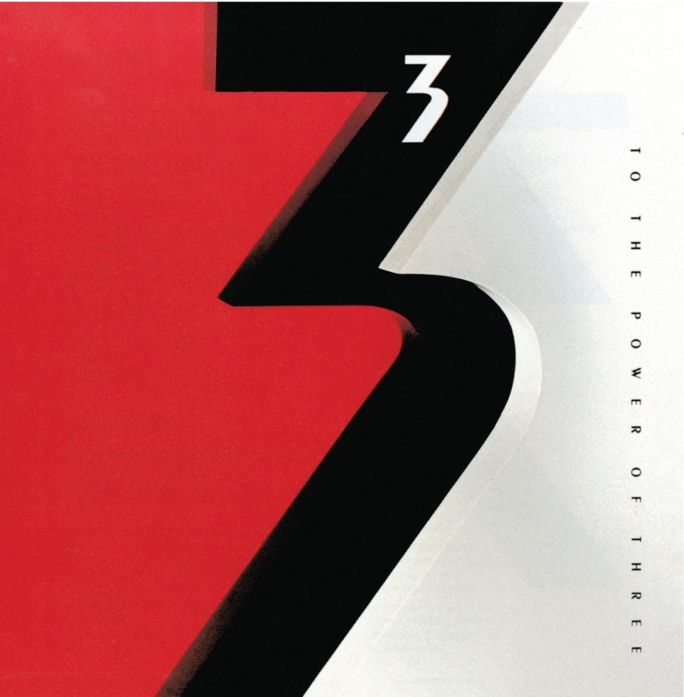
Cover art for To the Power of Three, according to Wikipedia, “the first album by the British-American progressive rock band 3, a spin-off from Emerson, Lake & Palmer. Produced by Carl Palmer and Robert Berry, it was released in early 1988 by Geffen Records.” The album was released on 25 March 1988 and was a critical and commercial failure, though the album’s only single “Talkin’ Bout”, peaked at number 9 on Billboard’s Mainstream Rock chart. The red, back and white cover design by Cream makes interesting use of the number 3 (Peignot Bold), with a small 3 superimposed over the larger one, signifying “3 to the power of 3.” The loosely spaced caps used for the title are from Peignot as well. The design somehow has a very “eighties look” to it: it is not a very warm design, very precise and mechanical.
The same cover art was used in adjusted form for two follow-up albums. From Wikipedia:
In October 2015, Emerson and Berry signed a contract with Frontiers Records to record a follow-up album at last, to be called 3.2. Emerson’s death in March of the following year put a halt to that project. However, in July 2018, Berry released (as 3.2) The Rules Have Changed, built from musical ideas contributed by Emerson, but produced and performed entirely by Berry.
A third album named Third Impression was released in 2021.
![The Rules Have Changed (Frontiers Music SRL, 2021) [More info on Discogs]](https://assets.fontsinuse.com/static/use-media-items/150/149051/full-1500x1500/616bfc10/71XXnEzRiSL-_SL1500_.jpeg)
The Rules Have Changed (Frontiers Music SRL, 2021) [More info on Discogs]
![Third Impression (Frontiers Music SRL, 2021) [More info on Discogs]](https://assets.fontsinuse.com/static/use-media-items/150/149052/full-1500x1500/616bfc02/61dALrV%252ByiL-_SL1500_.jpeg)
Third Impression (Frontiers Music SRL, 2021) [More info on Discogs]


</cite>")


")


")


 album art")


1 Comment on “3 – To the Power of Three album art”
Jeff pointed out the similarity between these album covers and the packaging design of Wrigley’s 5 GUM brand. It likewise features a single big numeral that divides the design in two fields of different colors.
While this 5 is somewhat similar to the one in the Peignot typeface, it’s not a direct match, and probably was custom drawn.