
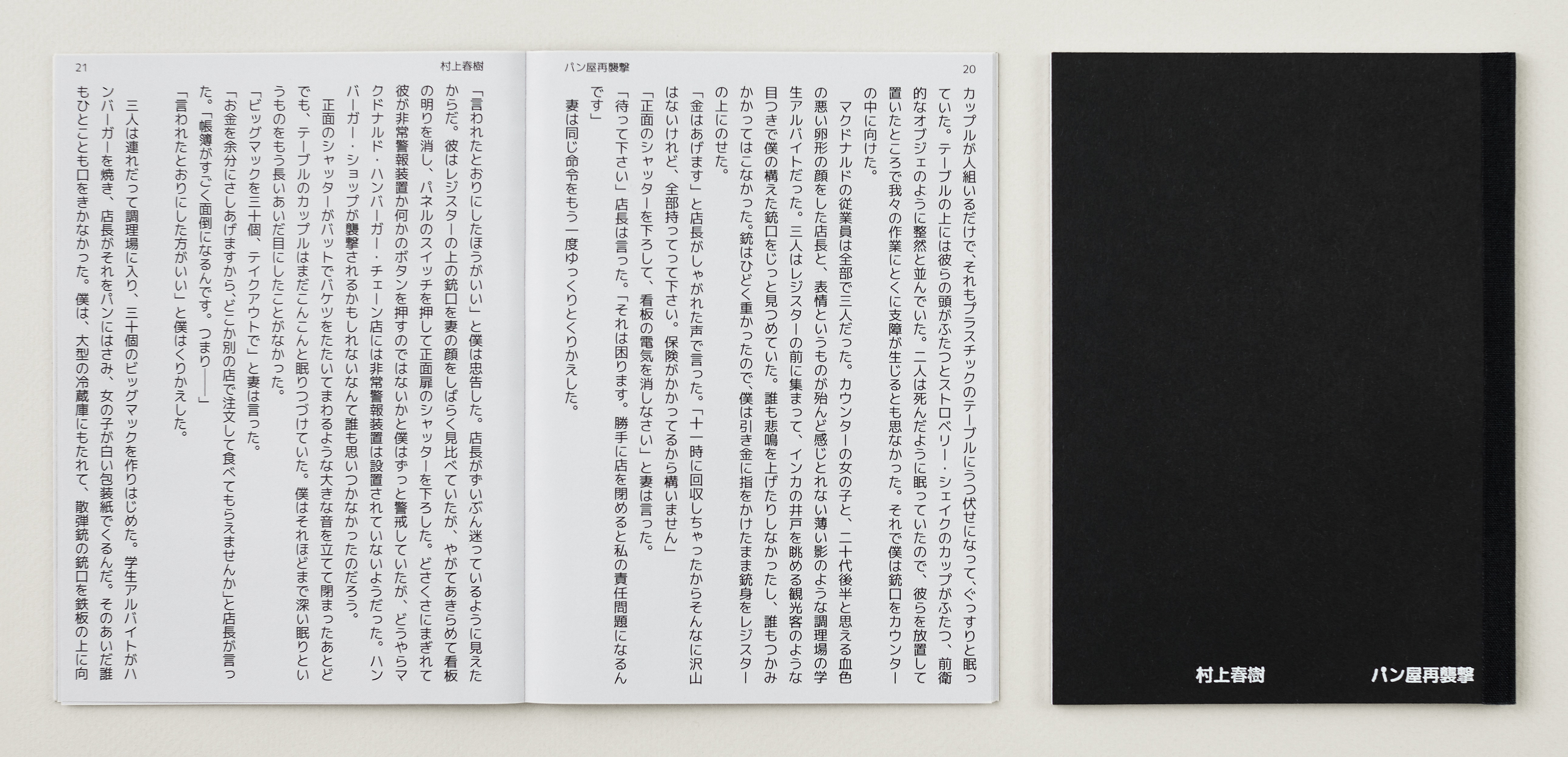
Attack on the Bakery—Again by Haruki Murakami
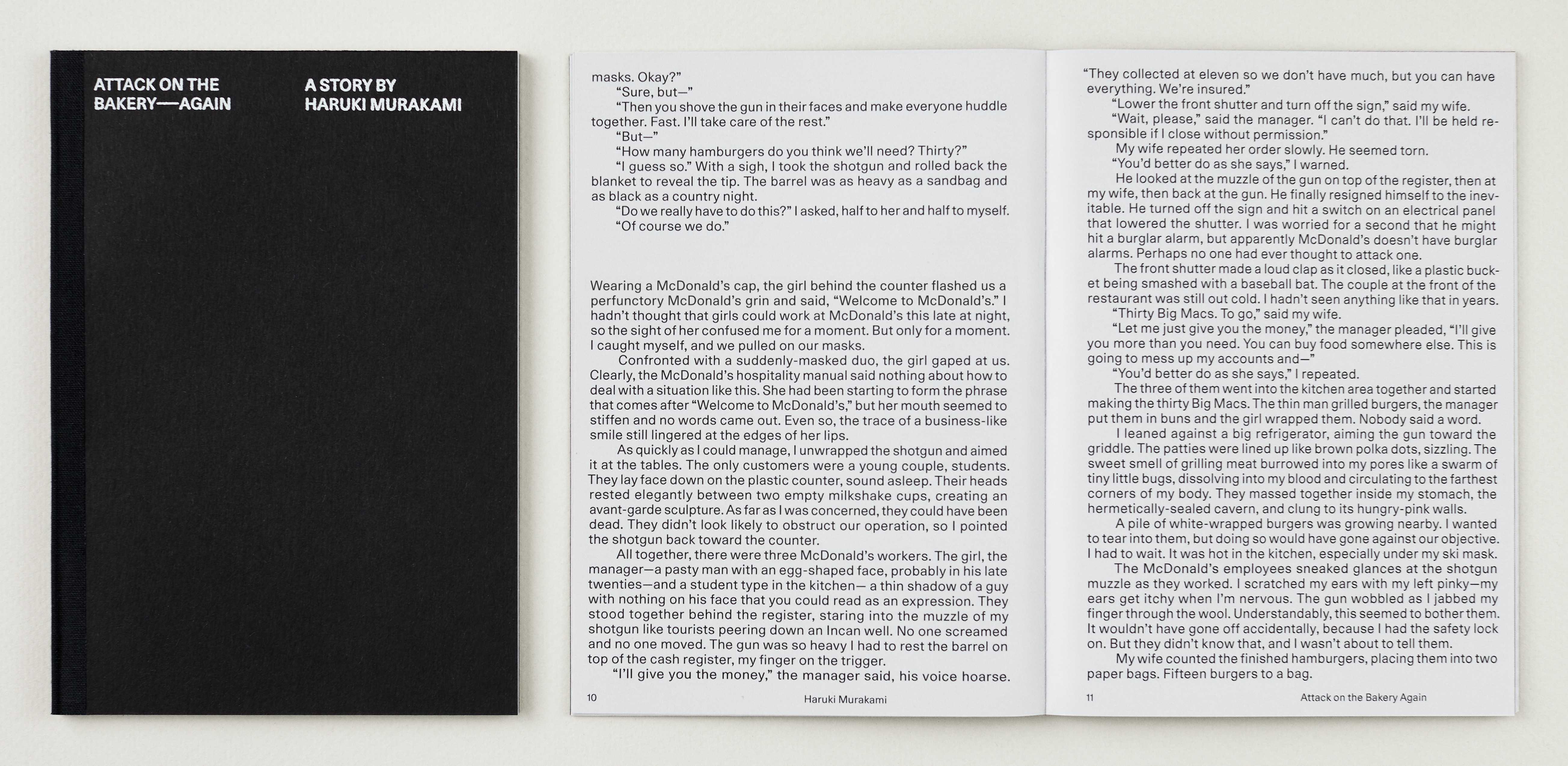
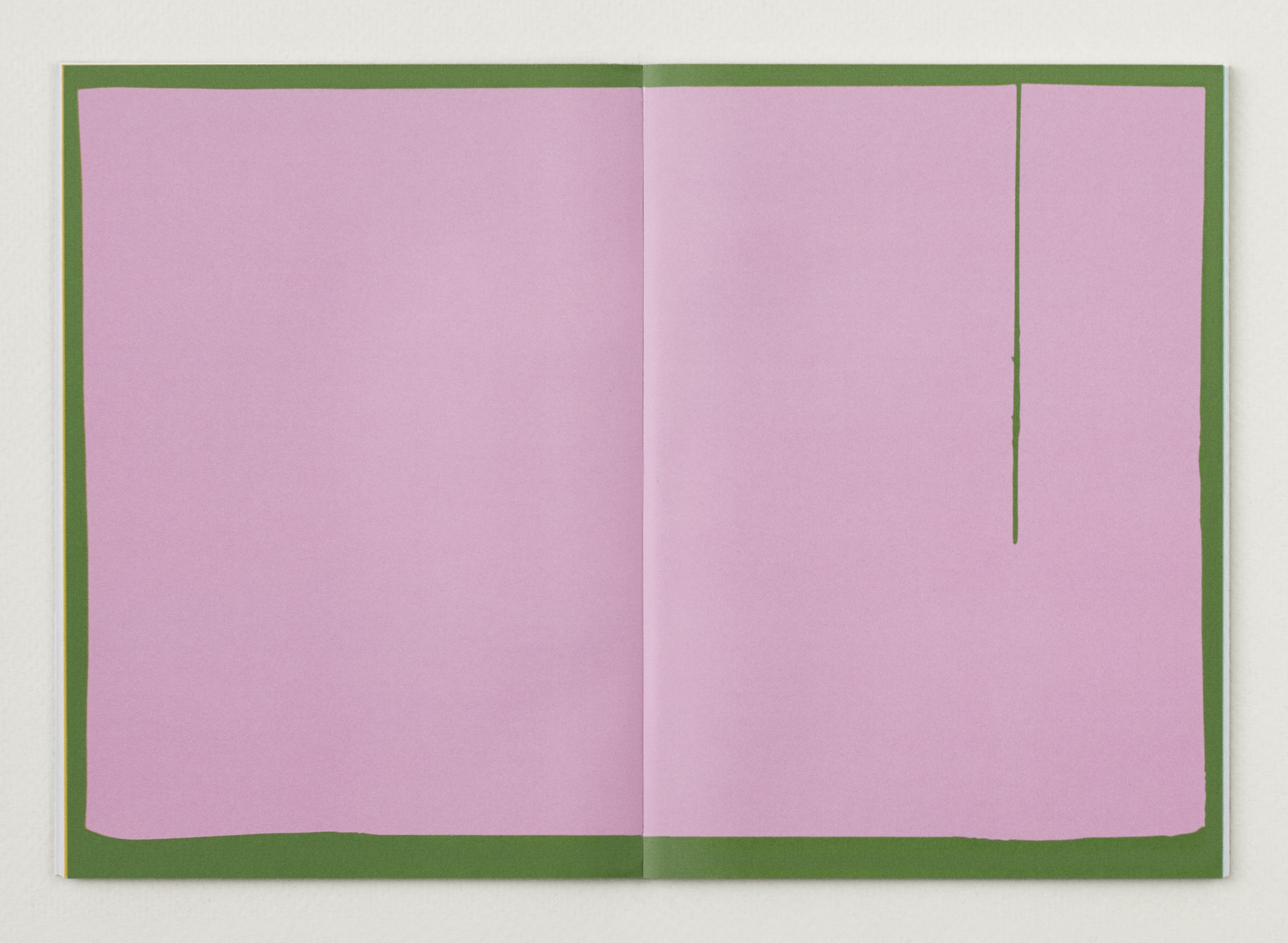
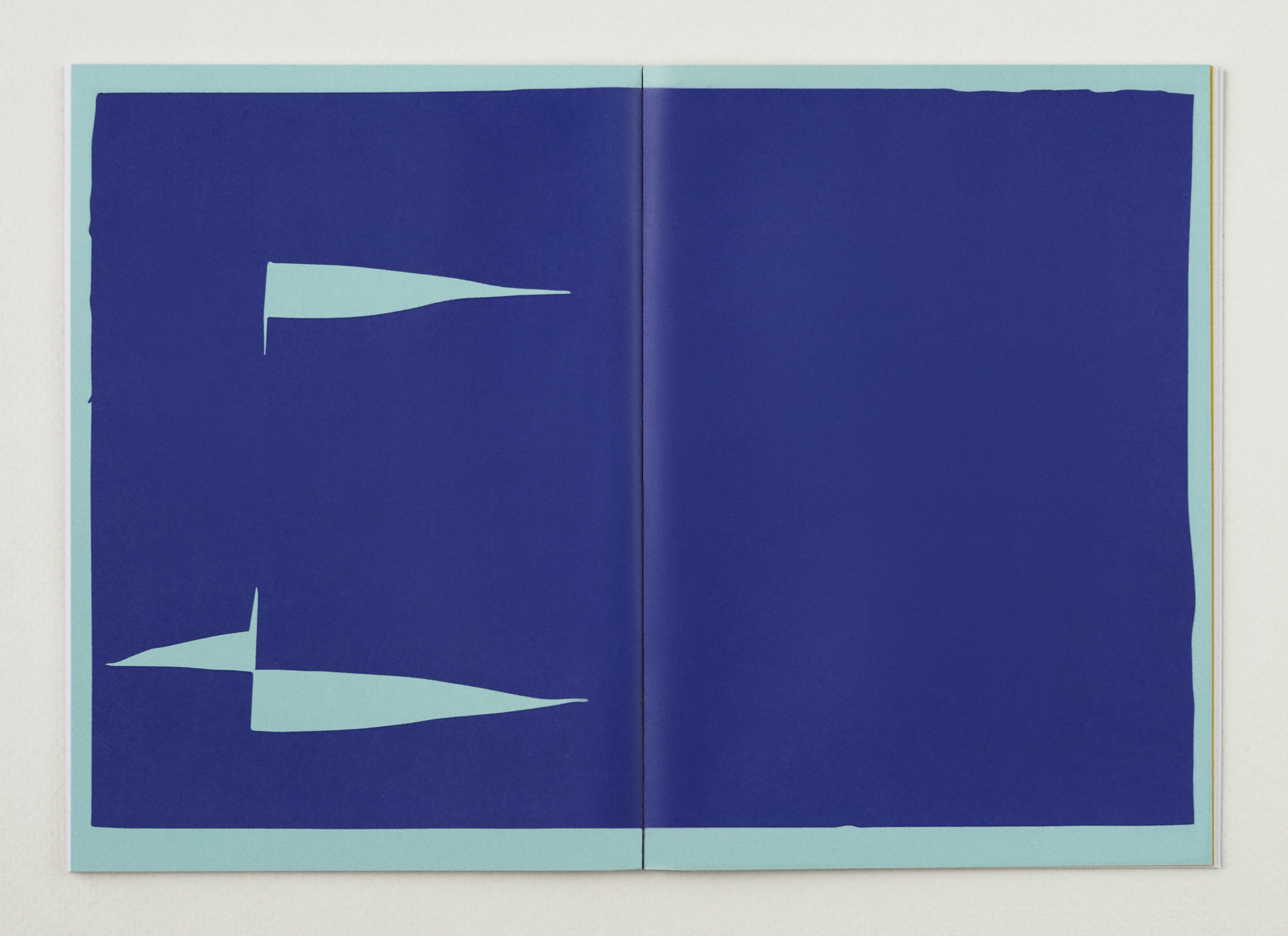
Attack on the Bakery—Again, a short story by Japanese author Haruki Murakami. I translated the piece from Japanese to English during my time as an undergraduate student at Brown University. I typeset my translation, and included the Japanese original. The center, a separator, contains abstract graphics capturing themes from the story.
The design plays between themes of density/fulfillment and emptiness/listlessness. The margins of the book are deliberately tight to convey feelings of confinement, a motif in the story. Abstract graphics in the center provide contrast to the tightly-set body copy—they are expansive, colorful, and saturated. The English portion of the book was set in Lineto’s Unica, selected for its legibility at small sizes and its friendly feel (round tittles, one of the stylistic alternates). Mplus was used for the Japanese text.
The book can be read from either side, with the graphics in the center functioning to separate the English and Japanese versions. The English translation opens and reads left to right, while Japanese original opens and reads right to left. The Japanese text is typeset vertically, customary of Japanese literature.
")

 for FHNW Academy of Art and Design")


")


</span>")


")


</cite> exhibition")


")


3 Comments on “Attack on the Bakery—Again by Haruki Murakami”
Absolutely gorgeous! The ingenious use of blank space, separations, and margins evokes the texture and mood of this haunting story. Beautifully done.
Great design – I love your choice of font, and even though I can’t read Japanese, I appeciate you including it – I love looking at different languages and considering the different constraints that working with another language presents, and it challenges our anglocentrism. Also great choice of colors – the pink and green evokes the cherry blossoms.
Nice work! Always interesting to see how two languages which use radically different means of printed communication can be joined and mirrored on a purely visual level. That the designer also provided the translation is even better!