
Schwinn rebrand
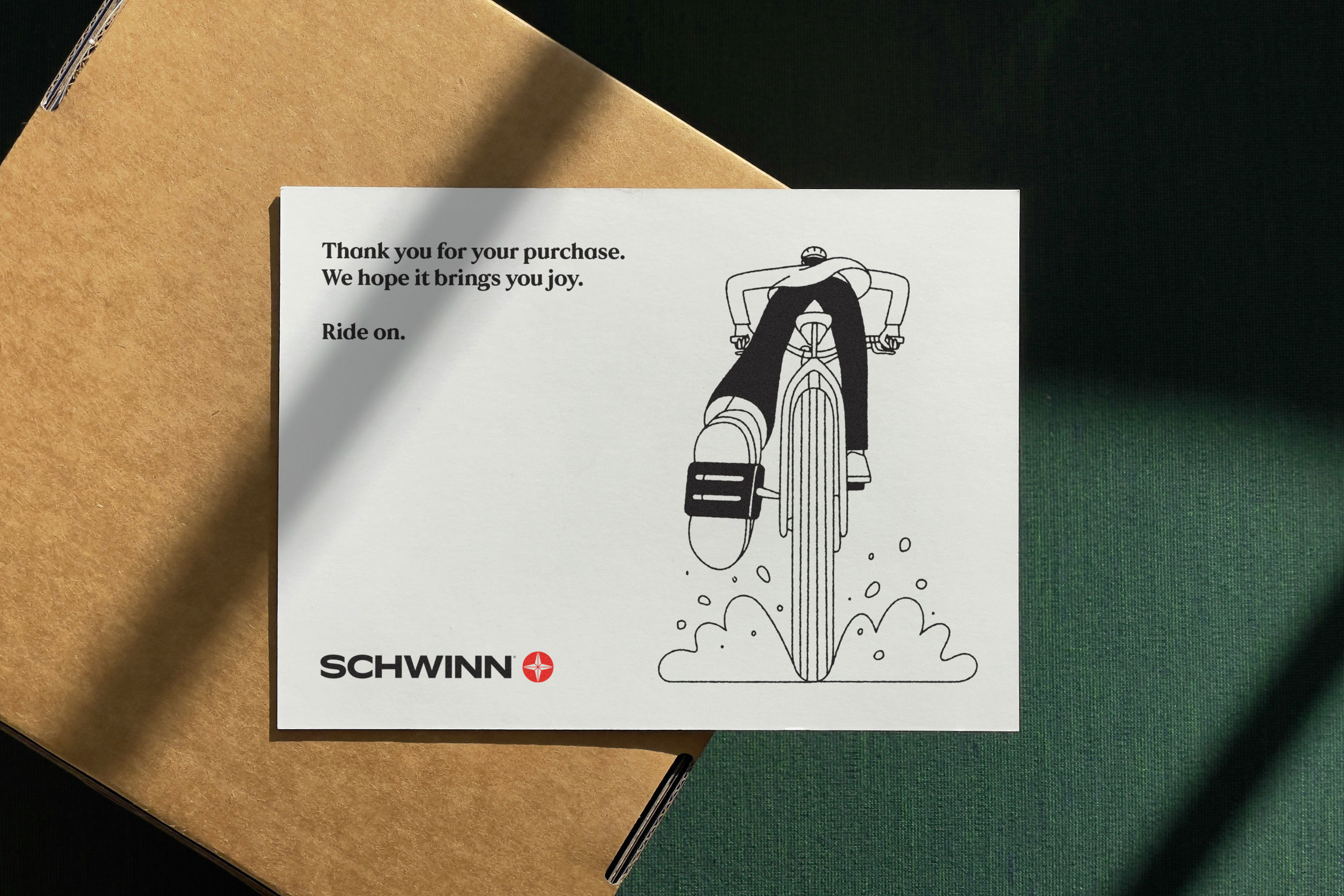
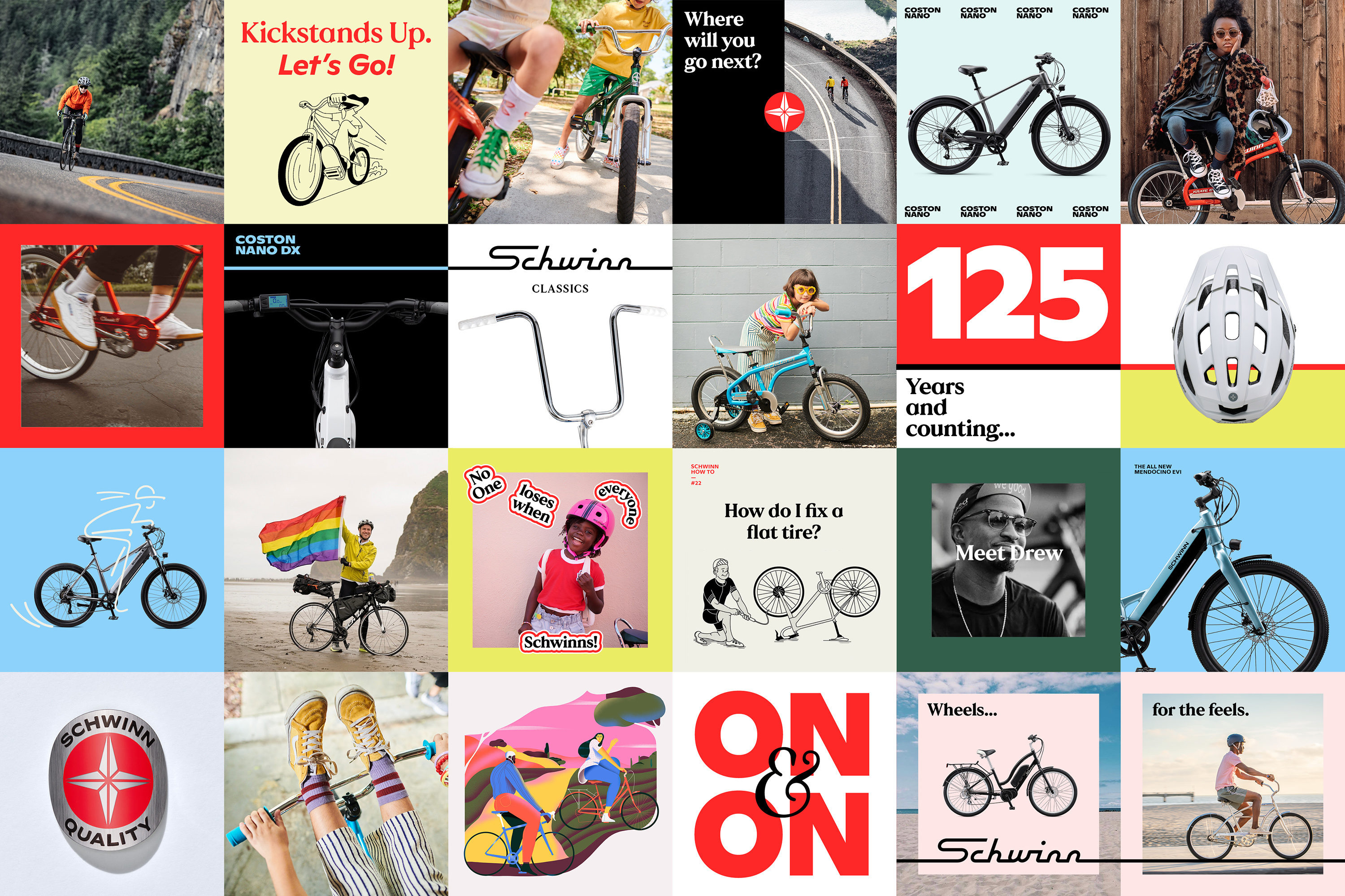
Design brand Manual Creative has just completed a total identity refresh for Schwinn, an American heritage cycling brand with a lifespan and legacy similar to Raleigh. To reinvent an ‘American icon’, Manual sidestepped the approach of leaning heavily on the brand’s history to reflect the brand’s current output, spanning e-bikes to helmet technology innovations.
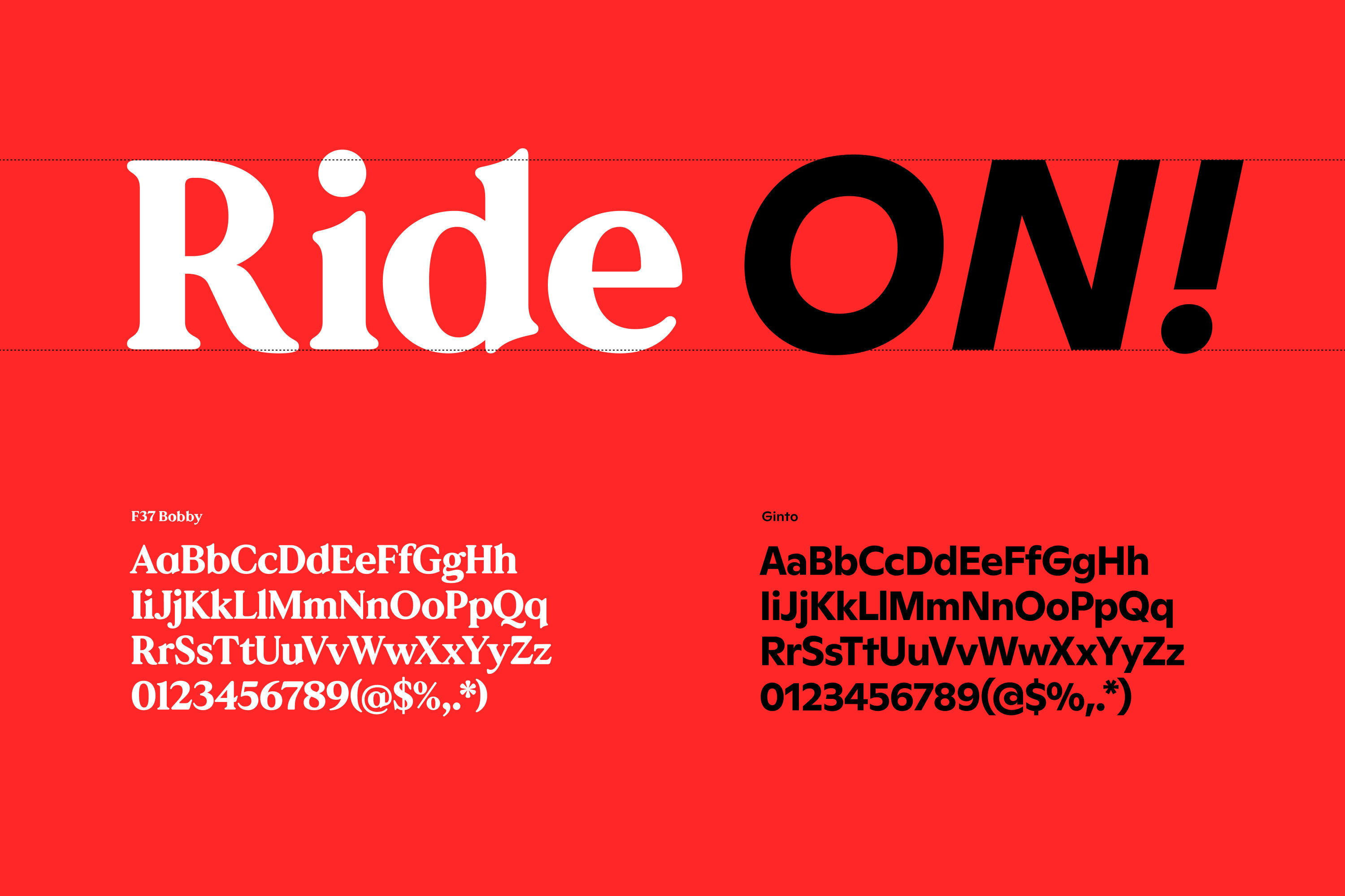
In a unique approach for a cycling identity, Manual introduced illustration as an addition that could adapt over time, initially launching with work from Christopher DeLorenzo and Xoana Herrera. Swapping out the ‘over-used’ and ‘somewhat generic’ Gotham, Manual introduced Bobby, by F37 Foundry, and Ginto, from Dinamo, for typefaces. Finally, a vibrant palette was built around Schwinn adverts from the 1950s–1970s, to subvert the ‘cold’ feel of many cycling brands, says Tom.


")


")


")


")


