
FIT NYC

Halyard is the brand typeface of FIT NYC and is used across the college’s visual communication.
Founded in 1944, the Fashion Institute of Technology (FIT) is part of the State University of New York (SUNY). The public college focuses on design, fashion, business, and technology. Pentagram partner Eddie Opara and his team developed a new brand system which was rolled out in fall 2018. FIT’s typography guidelines detail the reasons for the typeface selection:
Halyard from Darden Studio provides both a carefully crafted design as well as exceptional legibility and visual quality, especially effective for longer body compositions at smaller sizes and in digital environments such as websites and PowerPoint/Keynote presentations.
Apart from Halyard being an all-purpose font, it is empathetic and uncomplicated while also presenting a staunch-yet-playful disposition.
Halyard is employed in all of its three sub-familes; Micro, Text, and Display; largely replacing the previously used Bureau Grotesque. True to its tagline, “Nurturing Unconventional Minds”, FIT employs the size-specific styles in original ways:
Three weights have been selected from the Micro and Text families, and they can be used in combination or separately depending on the composition and desired emphasis of content.
Halyard Micro is used for display text and headlines; Halyard Text is used for longer running copy in denser, text-heavy publications and in business cards.
The logo (shown above) features Halyard Text Regular for the full name, combined with the FIT button in Bureau Grotesque, designed by Michael Bierut in 1999.

Headline on the FIT website, contrasting Halyard Micro Black with the Display Italic
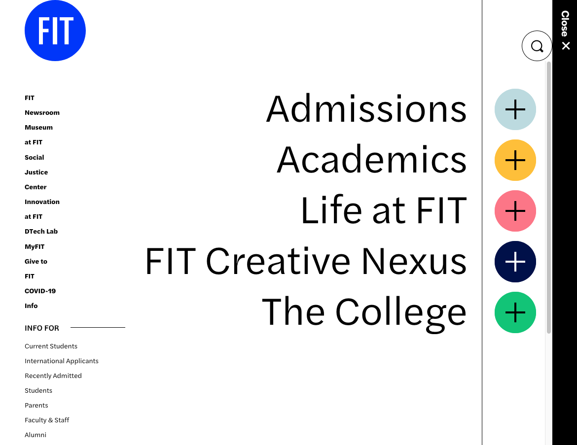
The nested menu is rendered in various weights from Halyard Text.

Halyard Micro with its eye-catching ink traps is used for display purposes.
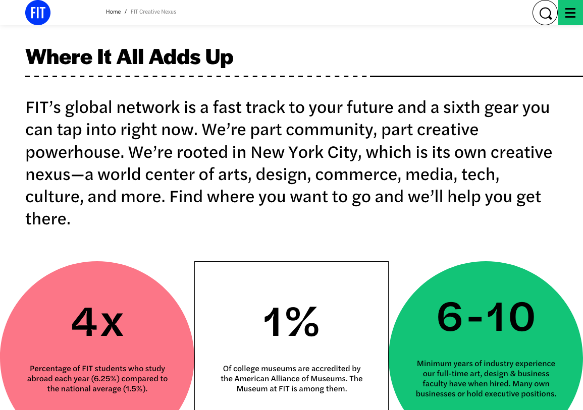
Page detail featuring styles from all three sub-families: while the key figures are in Halyard Micro, the heading is rendered in Halyard Display’s SemiBold style. Halyard Text serves for the reading copy.

Wordmark for the Unconventional Innovation initative, in Halyard Text Bold, with the letter o substituted by the FIT button


Website footer

Business card templates
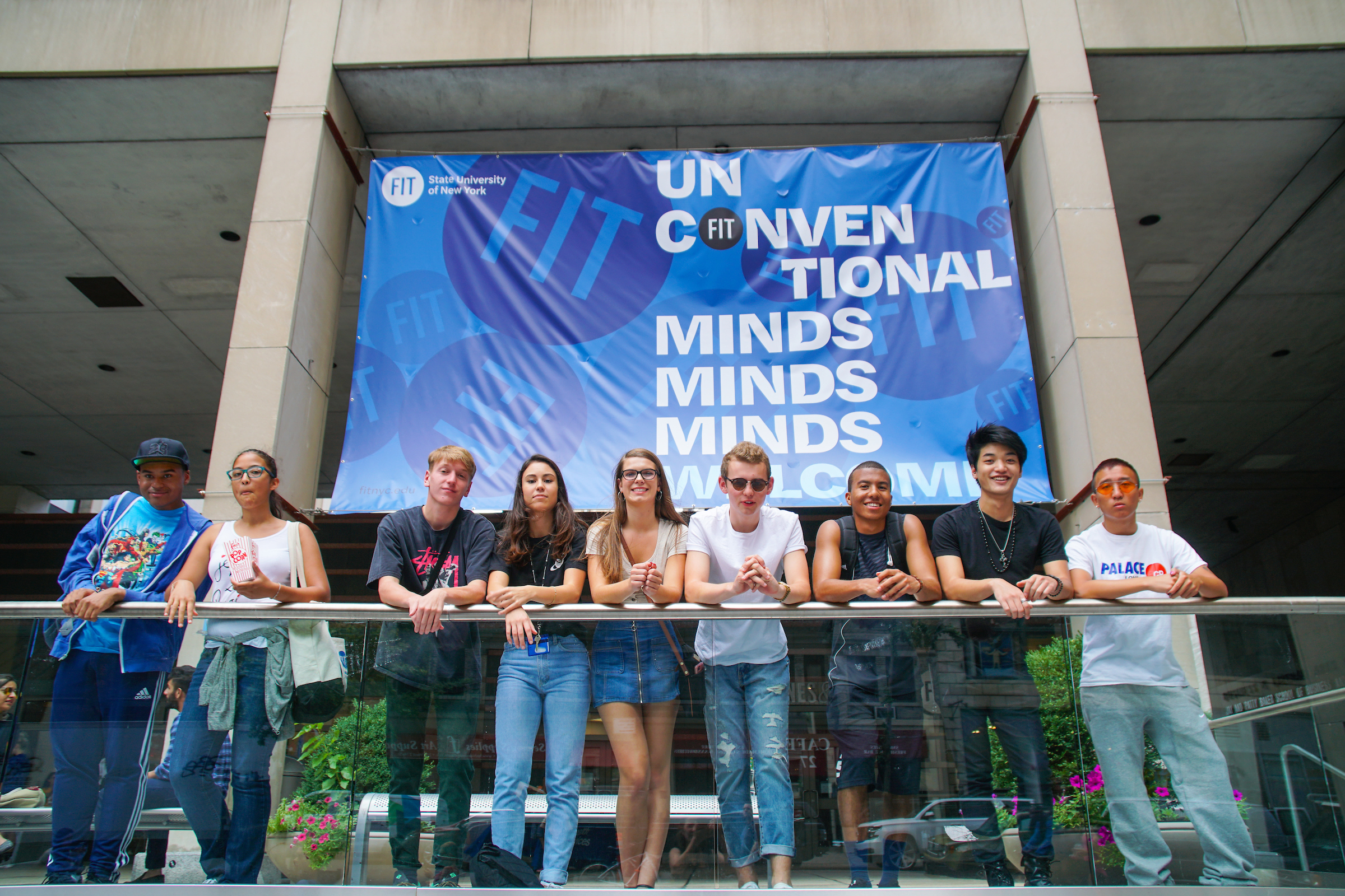
The “Unconventional Minds Welcome” banner in Halyard Micro Bold was one of the first applications of the new brand identity.


