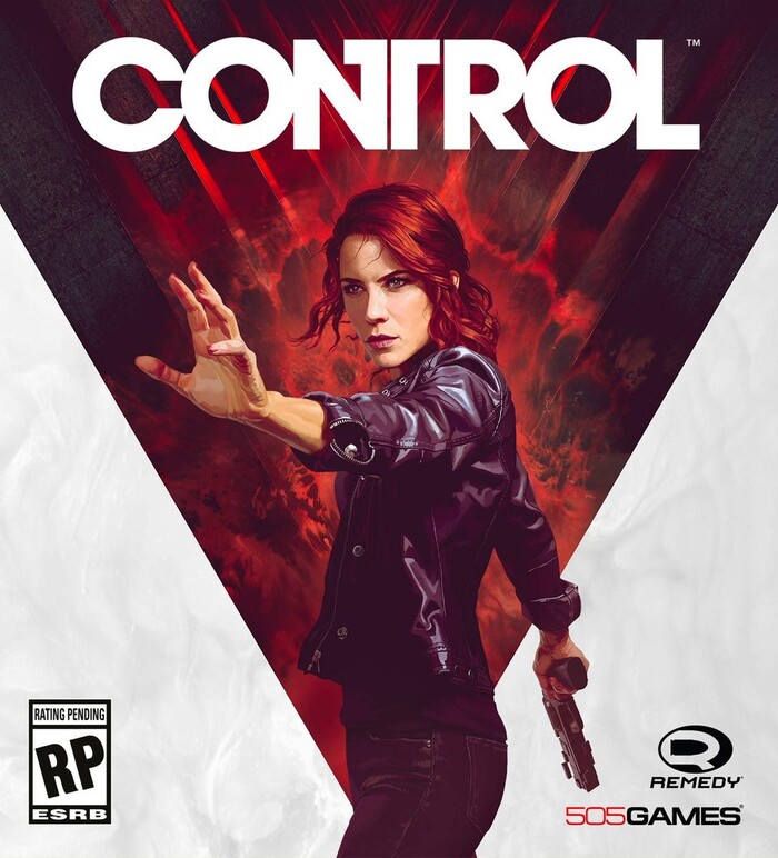
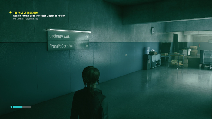
Remedy Entertainment’s 2019 game Control takes place in a paranormal building that appears in a 1960s brutalist design – and that seems intent on making sure nothing inside gets much more modern. The game’s designers expertly reinforce that aesthetic with a limited palette of utilitarian typefaces.
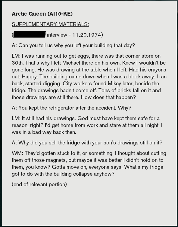
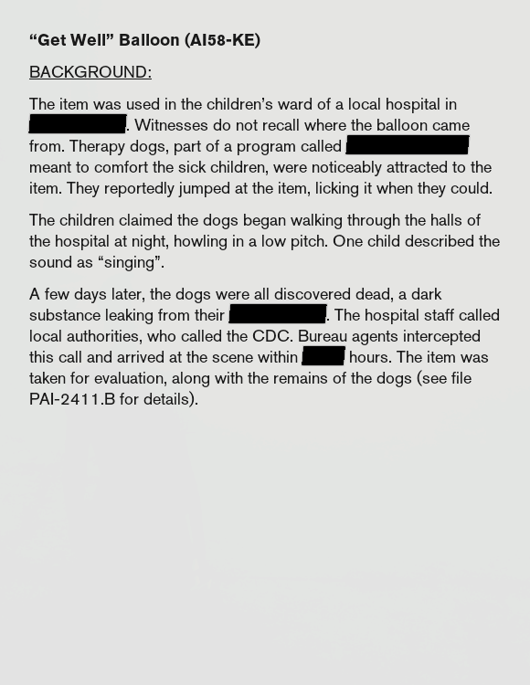
Case files, research papers, and correspondence you come across are set in Linotype’s version of Akzidenz-Grotesk, Basic Commercial (the question mark is the tell tale glyph), a style favored by ‘Swiss’ design which became popular in the 1960s.
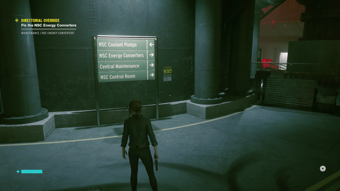
The game warns players the interior of the building shifts around; pay attention to green directional signs to avoid getting lost. What better typeface for green wayfinding signs than Interstate, based on the FHWA fonts that saw wider exposure in the 1960s as the Interstate Highway System expanded.
ITC Avant Garde Gothic sees restrained use with its bold weight announcing the entry to major areas, remaining on screen even while action continues, commanding attention. It also pulls double duty, serving as the wordmark, also with restraint; just a single ligature and no alternate letterforms help give it a plain-but-unique style. While the typeface did not appear until the 1970s, its inspiration, Avant Garde magazine’s logotype, had its origins in the 1960s.
The designers even keep the typographic identity consistent in-world, and out, with both UI and HUD elements set in a mix of Interstate and Basic Commercial.
Typefaces
Topics
- Entertainment (1043)
Designers/Agencies
- Remedy Entertainment (1)
- Cory Schmitz (3)
- Janne Pulkkinen (1)
Tagged with
- video games (125)
- mid-century modern (78)
- signs (352)
- redacted (22)
- PlayStation (5)
- typeface combinations (2278)
- user interfaces (UI design) (167)
- discretionary ligatures (244)
- wayfinding (231)
- censored (15)
Artwork location
- Finland (108)



















6 Comments on “Control video game”
Now you got me curious. I was under the impression that the Akzidenz-Grotesk as sold by Berthold Types and Basic Commercial by Linotype are both based on the same digitization of H. Berthold AG’s Akzidenz-Grotesk, and that Linotype simply had to rename their version in the 1990s because of trademark issues.
As far as I can tell, the question marks are identical between the two. Am I missing something that you’re seeing? Maybe you were thinking of the inconsistent forms for this character across the weights? The Regular is the only weight to feature a question mark with a sharp hook. This exceptional trait was already present in the metal version, from the 18pt size upward. It can be found in both the digital Akzidenz-Grotesk and in Basic Commercial.
What’s different between the two is that Basic Commercial’s italics are merely obliqued uprights, as one can see in the round shapes. The fonts sold by Berthold Types have “true” (specially drawn) italics.
In their version, the hooked question mark also appears in the Light Italic (but not in the Light) – apparently that style was derived from the Regular Italic. This is equally true for the Pro+, BE, BQ, and Std varieties.
Here’s a comparison:
Thanks for the comparison, Florian! I never knew how bad the Basic Commercial italics are. Too bad that can’t be used as a proper alternative to AG.
Indeed. Another example is the percent sign (though I was unable to find a high resolution image featuring it); the circles appear rounded rather than oval, which BC has in its Roman style.
I suppose it could be either one; as far as I can tell the developers did not provide a colophon or licensing credit, but subtleties like this have me leaning toward BC over AG.
The logo for Control (and some branding & press stuff) is by powerhouse video-game-logo designer Cory Schmitz!
Right, it’s special characters like % or # where Basic Commercial is different from Akzidenz-Grotesk. I didn’t mean to suggest it’s not Basic Commercial – it could very well be. Just wanted to record that the question mark (in the upright styles) is not the telltale sign, unfortunately. ;)
That’s great to know, thanks, Jack! Credits added.